Table of Contents |
The explanatory and response variables represent the quantities that are being changed or measured in an experiment. This lesson focuses on Steps 5 through 8 of the experimental method.
Two common ways to classify data are by data type (qualitative or quantitative) and also by the scale of measurement (nominal, ordinal, interval, or ratio).
| Data Types | Data Scales |
|---|---|
|
Qualitative (Categorical) Data Quantitative (Numerical) Data |
Nominal Variables Ordinal Variables Interval Variables Ratio Variables |
Qualitative data is also often called “categorical data”. It is not numerical in the sense that we can do numerical operations with it, like adding numbers together or finding an average, but rather it fits in the category.
EXAMPLE
Gender: male and female. That's a qualitative variable with two categories.Letter grades AND zip codes feature numbers, but you wouldn’t necessarily do mathematical equations with them. You wouldn’t find an average zip code, for instance. The purpose of zip codes is to divide areas into categories. Hair color is another example of qualitative data because you can group those with black hair together and put those with blonde hair in another group.
On the other hand, there is quantitative data. Quantitative data is expressed numerically. It makes sense to do numerical operations with it, like finding averages or adding them together.
Examples of quantitative data include:
It's important to note that data is displayed differently for qualitative data than for quantitative data. Statistical operations depend on the type of data.
The way your data is measured is called the data scale. It is important to identify your data scale because some scales of measurement allow for more robust statistical analysis that is not possible in others. The scales in the table below are listed in order from least versatile to most.
|
Nominal (least versatile) |
Ordinal | Interval |
Ratio (most versatile) |
EXAMPLE
Consider, for instance, favorite color. The order of the listed categories makes no difference. It doesn't matter if you put the colors below in the order of the color spectrum or not.
With nominal data, it only makes sense to reference which category has the largest frequency. In this case, let’s say most people say that green is their favorite color. That is what you would report, and it doesn’t matter that green is the fourth box from the left.
Nominal measurement scales do not show direction or magnitude. Direction means that data can be ordered, and magnitude means that one thing can be considered larger or smaller than another. When something does not have magnitude, then this comparison can’t be made. When something does not have direction, then the order in which it’s presented does not matter.

These choices don’t have magnitude because they can’t be compared to one another. Blue eyes aren’t necessarily bigger or better than brown eyes. Nor do the choices have a direction. The order in which they’re presented doesn’t matter, though they are likely to be in alphabetical order. Nominal variables can also have categories that are numbers.
EXAMPLE
Think of a telephone number; it’s going to have an area code. This is an example of a nominal variable that consists of a number. All numbers within that area code would start with the same three digits. The area code varies from one region to the next.EXAMPLE
Consider the rating scale below. The order of the listed categories is very important because the order is associated with a type of value. You mustn’t mix up the order here because the circle on the furthest left indicates you are feeling no pain.
With ordinal data, it’s important to keep the order straight, or rather, in order, to express a spectrum ranging from lowest to highest, or worst to best.
A variable has an ordinal measurement scale if it provides categories, but only if the categories can be put in a meaningful order. What this means is that for each category, you can decide which is better or worse than others—or, put another way, which item comes before another. A variable like this is called an ordinal variable. While ordinal scales do show direction, they do not show magnitude, because direction refers to the position of categories or numbers.
EXAMPLE
Take a look at the different classes that might exist in a high school or college. We have freshmen, sophomore, junior, and senior. Those are very common categories used to separate students based on how long they have attended the school.For quantitative data, it is often useful to consider the difference between variables on the scale. A variable has an interval scale if it provides numbers so that the difference between two values can be measured. The difference between any two values can always be determined the same way.
Consider SAT scores. The difference between a 1500 score and a 1700 score has the same meaning as the difference between a 1250 score and a 1450 score. This type of variable is called an interval variable.
With an interval variable, the number 0 does not mean that something does not exist. If somebody took the SAT and got a 0, that doesn’t mean that person didn’t take the exam; it means he or she failed to answer any questions correctly.
The Fahrenheit and Celsius temperature scales are also examples of interval scales. An important aspect of interval scales is that they do not have an absolute zero. In these temperature scales, zero is not the coldest possible temperature.
The fourth, and most versatile, measurement scale is the ratio scale. A ratio scale variable is similar to an interval variable but with the added feature of a true zero point. This means that a value of 0 on a ratio scale represents the absence of the variable being measured, or the lowest possible value. Examples include physical measurements like length, width, and mass. Variables that provide a count, such as the number of apps on your phone, are also ratio variables.
This table summarizes just a few of the statistics we can, or cannot, use with the four scales of measurement. Notice that nominal data has the fewest options, whereas ratio data has the most options.
| Nominal | Ordinal | Interval | Ratio | |
|---|---|---|---|---|
| Mode | yes | yes | yes | yes |
| Median | no | yes | yes | yes |
| Mean | no | no | yes | yes |
| Standard Deviation | no | no | yes | yes |
| Analysis of Variation (ANOVA) | no | no | yes | yes |
| Regression Analysis | no | no | no | yes |

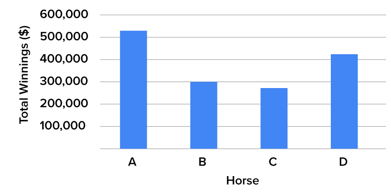
The bar graph above represents four hypothetical horses. For the sake of simplicity, they are called Horse A, Horse B, Horse C, and Horse D. You can see the different types of data here. That’s important because it allows you to visually compare the horses’ winnings, and it’s relatively easy to tell which horse won more money than the others.
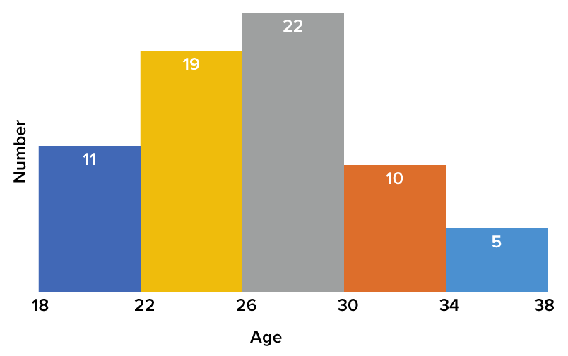
Let’s look at a histogram, which is a different type of data visualization.

In this instance, you’re looking at the age ranges of the jockeys who rode the horses. At the low end, you have 18. The histogram tells us there are 11 jockeys between the ages of 18 and 22. In the next range, there are 19 between the ages of 22 and 26. This goes up to five jockeys over the age of 34.
Source: THIS TUTORIAL WAS AUTHORED BY DAN LAUB FOR SOPHIA LEARNING. PLEASE SEE OUR TERMS OF USE.