In this lesson, you will learn how to use several of the most widely used charts to analyze summarized data. Specifically, this lesson will cover:
1. Basics of Excel Charts
Before diving into analyzing summarized data from Excel charts, it is important to understand the visuals provided in Excel and their purposes. The table below summarizes these concepts.
|
Visual in Excel
|
Purpose
|
|
Column chart (also known as a vertical bar chart)
|
Compare categories/levels of a categorical variable
|
|
Bar chart (horizontal bar chart)
|
Like column chart but with horizontal bars
|
|
Line chart
|
Ideal for showing trends over time. Generally, a time variable (year, month, day) is on the horizontal axis, and a quantitative variable is on the vertical axis
|
|
Scatter plot
|
Shows the relationship between two quantitative variables
|
|
Histogram
|
Represents the distribution of a quantitative variable
|
2. Scenario: Verde Candy
Verde Candy has created a version of tooth-friendly candy that includes lollipops, chocolate bars, and gummy bears. These vegan, sugar-free treats are currently only sold in California. For the past year, the company has been trying to expand into Oregon. Verde Candy has conducted market research specific to Salem, Oregon, trying to understand local preferences, demographics, and existing competitors. They have attempted to target health-conscious consumers, eco-friendly shoppers, and those seeking unique treats. Over the last year, the company has entered the Salem, Oregon market. They have specifically spent money on marketing their product using social media influencers and local bloggers to create buzz.
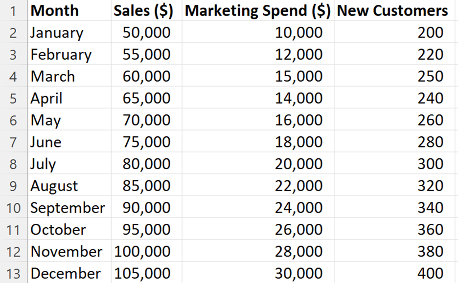
The table below shows the data collected over the last year. The data has been summarized by month. That is, for each month, the company has recorded their sales in the Salem, OR market, how much they spent on marketing, and the number of new customers they have acquired. The company wants to expand to other parts of Oregon beyond Salem, so they have asked you to analyze the data in summarized charts in Excel and report any interesting insights to determine if their efforts in expanding into Salem are paying off.
2a. Line Chart
A line chart (also known as a line plot or line graph) is a powerful tool for visualizing trends and changes in data over time. Here is how a line chart helps business data analysts analyze summary data in Excel:
-
Visualizing Trends: Line charts display data points connected by line segments, emphasizing changes in a single quantitative variable (usually on the vertical axis) over values of another variable (typically time on the horizontal axis). Analysts can easily identify upward or downward trends, seasonality, or fluctuations.
-
Comparing Series: Multiple line graphs can be plotted on a single chart to compare trends across different subgroups or categories. For instance, you can compare sales performance across different product lines or regions.
-
Highlighting Differences: Line charts help highlight differences between data points. By observing the slopes of the lines, analysts can identify variations within the data.
-
Predictive Insights: The linear perspective of line charts allows analysts to make predictions about future trends. For example, if sales have been consistently increasing, analysts might predict continued growth.
Let’s look at an example of how you can construct a line chart for Verde Candy.
-
EXAMPLE
You provide Verde Candy with the following line chart that you created in Excel to show them their sales over the last year in the Salem, OR market.
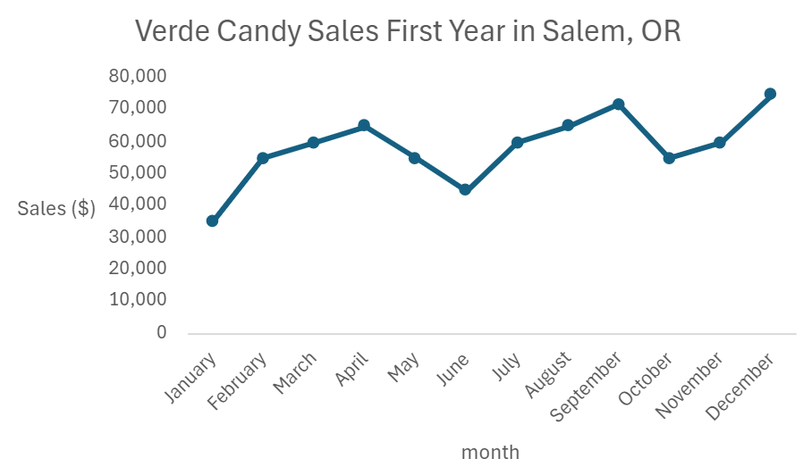
Overall, the company’s sales have increased throughout the year. There were a couple of months in which sales were down slightly, but considering this was the company’s first year in a new market, this line chart provides good news for the company.
-
Create a line chart that shows Verde Candy’s sales over the first year they were in the Salem, OR market.
- Open the Verde_Candy.xlsx data set.
- Select the two columns Month and Sales ($).
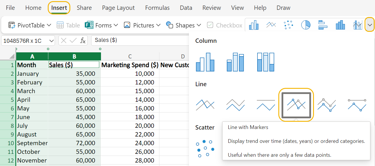
- From the Insert menu, select the drop-down arrow by the pictures of charts as shown in the image below. Select Line with Markers. This places a marker (small circle) for each data point in the line chart.
- To remove the gridlines in the background, in the Chart menu, select Gridlines --> Primary Horizontal Gridlines --> None.
- Label the axes and provide a title for the line chart using Excel techniques from a previous tutorial so that the final line chart looks like the following:

- Check your work by comparing your line chart to the one in the example.
-
- Line Chart
- A graph in which a line connects a series of data points that are plotted over a period of time.
2b. Scatter Plots
A scatter plot is a chart type used to observe and visually display the relationship between two quantitative variables. Here is how scatter plots help business data analysts analyze summary data in Excel:
-
Demonstrating Relationships: Scatter plots show how two variables relate to each other. By plotting individual data points, analysts can identify correlations and trends even from seemingly disparate data.
-
Detecting Data Patterns: Grouping data points based on proximity helps identify patterns. Outliers or gaps become noticeable, aiding decision-making.
-
Detecting Correlation: A scatter plot makes it quite easy to detect how two variables are changing in relation to each other. A scatter plot helps you detect whether one variable is increasing or decreasing, and what the behavior of the other variable is—is it increasing or decreasing.
Let’s look at an example of how you can construct a scatter plot for Verde Candy.
-
EXAMPLE
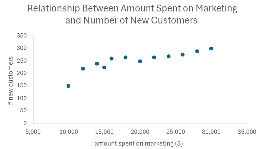
You created a scatter plot for Verde Candy to help them determine if the marketing money spent is helping create new customers. You create the scatter plot below.

It looks like Verde Candy has found the ‘sweet spot’ on how and who to market to in Salem, OR. As the amount the company has spent on marketing is increasing, so is the number of new customers that Verde Candy is acquiring.
-
Create a scatter plot for Verde Candy that shows the relationship between the amount the company has spent on marketing and the number of new customers the company has gained in the Salem, OR market.
- Open the Verde_Candy.xlsx data set.
- Select the two columns Marketing Spend ($) and New Customers.
- From the Insert menu, select the drop-down arrow for the Recommended Charts and select Scatter with only Markers. This will place a marker (small circle) for each data point in the scatter plot.
- To remove the gridlines in the background, in the Chart menu, select Gridlines --> Primary Horizontal Gridlines --> None. Repeat the same process to remove the vertical gridlines.
- Label the axes and provide a title for the line chart using Excel techniques from a previous tutorial so that the final scatter plot looks like the following:
- Check your work by comparing your scatter plot to the one in the example.
-
- Scatter Plot
- A chart type used to observe and visually display the relationship between two quantitative variables.
2c. Bar Charts
A bar chart is a chart type used to compare the categories of a categorical variable. Each bar represents a summary value (such as counts, sum, or mean) for a specific category. By visually comparing bar lengths, you can quickly identify differences between categories. Here’s why they are useful and how they can aid in analyzing summarized data.
-
Understanding Relationships: If your data set includes multiple categorical variables, bar charts help you understand the relationships between them. For example, you can compare sales performance across different product categories or analyze survey responses by demographic groups.
-
Highlighting Trends and Variations: Bar charts are excellent for illustrating trends over time or comparing quantities across various groups. They can highlight significant variations or outliers, making it easier to spot patterns or anomalies.
-
Excel makes a unique distinction between column and bar charts; column charts being vertical bar charts and bar charts being horizontal bar charts. Most analysts would call both of these bar charts and then specify horizontal/vertical. In this course, we will use “column chart” in instructions where Excel is involved, but you should keep in mind that these can all be referred to as “bar charts.”
2d. Bar Charts in Excel
When constructing a bar chart in Excel, your data must be aggregated before you construct it. Aggregating data means summarizing data at an individual row level to a summarized quantity such as a total or average. This summarization should be performed using the group or category level. For example, the data shown below shows sales data over a few days for two products.
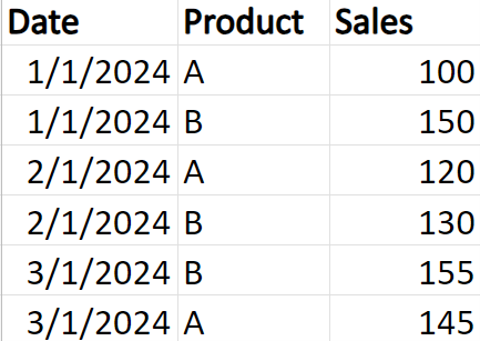
The data in the table has not been aggregated. The data in the table would be described as granular data. Data at the granular level means each row is stored separately at the individual level. For example, daily sales transactions for each product are listed individually rather than being summed up by month or year.
-
Suppose you wanted to know which product was selling more, Product A or B? An Excel novice might be tempted to create a bar chart using the granular data and will receive unexpected results. If your data is not aggregated in Excel and you try to construct a bar chart on the granular data, you will get a bar chart like the figure shown below.
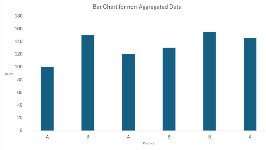
Each product has its own bar, and its height represents the sales value for that product. Each row in the data will be plotted in the bar chart. This bar chart does not provide you with any meaningful information about the data. If you wanted to figure out something simple like which product has more sales, that would be a time-consuming and arduous task even with these very few observations.
When data is not aggregated, a bar chart can become cluttered and difficult to interpret, especially if you are trying to identify overall trends or compare totals across categories. Aggregating the data simplifies the bar chart and makes it much easier to extract meaningful insights.
The easiest way to aggregate data in Excel is by using a pivot chart and then constructing the bar chart from the pivot table. Let’s explore how Verde Candy can use bar charts to compare sales performance across different products.
-
EXAMPLE
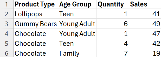
Verde Candy, which is new to the Salem, OR market, decided to obtain a vendor booth at the Salem Sweet & Green Festival. The festival features a variety of plant-based and eco-friendly vendors, live music, cooking demonstrations, and family-friendly activities, all centered around sustainable and healthy living. This is the perfect venue for Verde Candy to showcase its new products. Verde Candy records the quantity and sales of each transaction over the festival for each of their products and the customers' age group. A sample of the data is shown below. This data is at the granular level because each row is an individual transaction.
Verde Candy is interested in knowing how their sales compare across products and age groups. You construct the following
side-by-side bar chart.
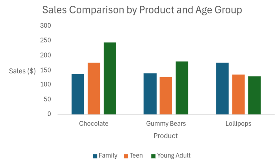
A side-by-side bar chart is used to compare categories of multiple categorical variables side by side. Each category has multiple bars that correspond to another category of a different variable. For example, the Chocolate product has three bars that represent the sales of the categories of the Age Group. Side-by-side bar charts allow you to make comparisons between multiple categorical variables. Below are some interesting insights you can share with Verde Candy using the side-by-side bar chart.
-
Lollipops Popularity with Families: Lollipops are the top-selling product among the Family age group. This suggests that families prefer Lollipops over other sweets.
-
Young Adults Love Chocolate: For the Young Adult age group, Chocolate is the most popular, with sales right at $250.
-
Wide Range for Chocolate: Chocolate has the widest range of sales among different age groups. It is very popular with Young Adults but less so with Teens and Families.
-
Create a side-by-side bar chart for sales for the products and age groups for Verde Candy.
- Open the VerdeCandy2.xlsx data set.
- From the Insert menu, select Pivot Table --> From Table/Range.
- The Insert Pivot Table dialog box opens. Select + New Sheet to place the pivot table in a separate sheet from the data.
- Drag the column Product Type to the Rows box, drag Age Group to the Columns box, and drag Sales to the ∑ Values box.
- From the Insert menu, select the drop-down arrow for Recommended Charts --> Clustered Column.
- Label the axes, provide a title, and remove the gridlines for the side-by-side bar chart using Excel techniques from a previous tutorial so that the final line chart looks like the following:

- Check your work by comparing your side-by-side bar chart to the one in the example.
You have learned about a lot of different types of graphs and their uses in an applied business analytics scenario in this tutorial. The table below summarizes the key uses for each of the graphs.
|
Chart
|
Key Uses
|
Data Type
|
|
Bar charts
|
Comparing Categories: Ideal for comparing different categories or groups. For example, comparing sales figures across different regions or product lines.
|
Categorical variables
|
|
Line charts
|
Tracking Changes Over Time: Excellent for showing trends and changes over time, such as stock prices, sales growth, or website traffic.
Comparing Multiple Data Sets: Compare multiple data sets on the same graph, such as comparing the performance of different products over time.
|
Continuous variables
|
|
Scatter plots
|
Identifying Relationships: Used to identify relationships between two variables, such as advertising spend and sales revenue.
|
Continuous variables
|
|
Histograms
|
Visualize Distribution of a Single Variable: Perfect for analyzing the distribution of customers’ ages, income levels, or purchase histories.
|
Continuous variables
|
-
- Aggregated Data
- Summarizing a set of individual data points into a single representative value, such as a total or average.
- Granular Data
- Individual information about a data point that is broken down into the smallest possible unit.
- Side-by-Side Bar Chart
- Bar chart that displays multiple bars next to each other for each category of the categorical variable being displayed.
In this lesson, you were introduced to some of the most popular graphs used in business data analytics for analyzing summarized data such as line charts, scatter plots, and bar charts. You were provided with guidance on selecting the best chart to showcase your data based on the data types of the variables.