Table of Contents |
We will now discuss measuring cost by using marginal cost. This method measures the added cost of an added unit of production, or marginal cost. More formally, marginal cost is the cost of producing one more unit of output. Mathematically, marginal cost is the change in total cost divided by the change in output, as shown in the marginal cost formula below. Calculating marginal cost is similar to calculating marginal utility for the consumer and calculating marginal product of labor.

Using C&C Family Farm’s data, we can use the marginal cost formula to calculate the marginal cost. To do that, take the difference between row two and row one for total cost, and divide it by the difference between row two and row one for total output. In the second row, you can see that the marginal cost per unit is $1.00 ($200 - $100) / (100 - 0). Marginal cost is calculated in the same manner for the remaining levels of output. The formula is the same one you used to calculate marginal utility in the lesson about consumer choice, and in the lesson about the marginal productivity of labor in production. To verify the calculations, review marginal cost in column 3 of the following table.
|
Total Output (Pounds) (1) |
Total Cost (TC = FC + VC) (2) |
Marginal Cost (MC = Change in TC / Change in Total Output) (3) |
|---|---|---|
| 0 | $100 | - |
| 100 | $200 | ($200 - $100) / (100 - 0) = $1.00 |
| 230 | $300 | ($300 - $200) / (230 - 100) = $0.77 |
| 290 | $400 | ($400 - $300) / (290 - 230) = $1.67 |
| 350 | $500 | ($500 - $400) / (350 - 290) = $1.67 |
| 380 | $600 | ($600 - $500) / (380 - 350) = $3.33 |
| 400 | $700 | ($700 - $600) / (400 - 380) = $5.00 |
The marginal cost of the first unit of output is always the same as the total cost. Marginal cost decreases at low levels of output, and it rises as the level of output rises. We expect the MC curve to be a “U” shape. Let’s confirm that by plotting marginal cost against total output, so that we can visualize the shape.
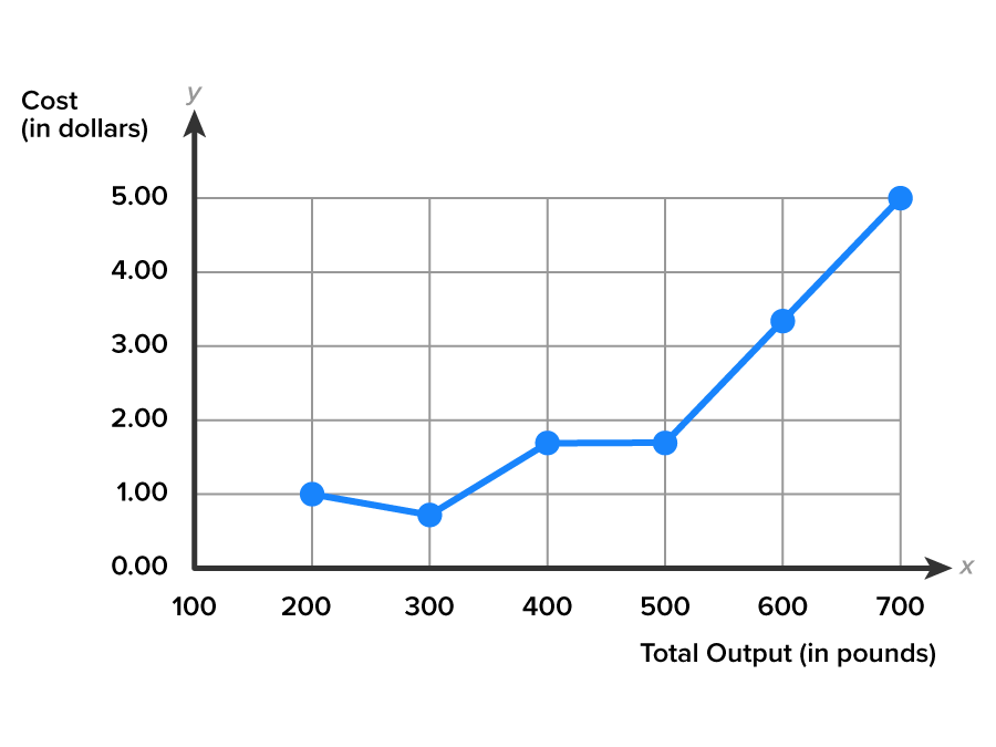
In the graph below, which is based on the data from the table above, the MC curve hasn’t taken a typical U-shape, but rather more of a “J” shape. This is, in fact, correct. You can confirm it by comparing the points on the MC curve with the data in the marginal cost data table above.

Once the cost with total output data is plotted in the graph above, you can see that it results in more of a “J” shape. The starting values of AVC and MC are the same value ($1.00) because the level of output begins with a “0.” Notice that the MC curve has a lower starting point at lower levels of output, and the cost curve extends upward, rising, as output increases. This explains the J-shape.
EXAMPLE
Can Duangjan use cost information to help set the price of the clothing items to make sure her business is successful? Duangjan has already calculated the average cost per item. Is there an alternative to average cost pricing? Yes, she can use the marginal cost information as an alternative to average cost pricing to decide how to price her items. Duangjan wonders if it matters whether she uses average cost or marginal cost pricing.We’ve covered a lot of ground in analyzing costs. Now let’s consider how a business could use cost information to set prices.
Each pricing strategy produces different results, with both advantages and disadvantages. With a pricing strategy related to average cost pricing, you would use the information your accountant collects, which makes the calculations easier to obtain. Average cost pricing treats each unit of production as if the cost is the same, whether it’s unit one or unit five million. This strategy, however, may overstate costs, which means the product price will be set too high, perhaps making sales more difficult. A second pricing strategy uses marginal cost pricing: you would first decide how much to produce, and then set the product price based on the marginal cost of the last unit produced. From an economic perspective, marginal cost pricing leads to the most profitable price in any type of market. But it can be difficult to calculate for a firm in the real world.
EXAMPLE
When Duangjan received her first shipment of clothing, she was concerned about being able to make enough to cover her costs. The average cost information was easy to calculate. She calculated the average cost of the floral Kawaii Girl dress at $28.50 per dress, and the Gothic Girl dress at $34.00 per dress. Duangjan approximated the marginal cost at $26 and $35 for the Kawaii Girl and Gothic Girl dresses, respectively. Duangjan now wonders if one pricing strategy is a better option. For the Kawaii Girl dress the average per-unit cost was lower than the marginal per-unit cost. For the Gothic Girl dress the average per-unit cost was higher than the marginal per-unit cost. With this information, Duangjan will be able to price her clothing items with an understanding of both average and marginal cost.Production and cost have an inverse relationship. The more complicated and time-consuming it is to produce something, the higher the cost of producing it. The lower the productivity of labor, the higher the cost of producing a product. To hold down costs, productivity must be increased to offset the higher costs.
IN CONTEXT
The Bureau of Labor Statistics (BLS), a government agency, gathers quarterly data on production and cost for the U.S. economy. When the BLS reports that productivity, the amount of worker output, has slowed between July and September, it is not good news. When productivity slows, the labor cost for businesses rises. While businesses may choose to absorb some of the added cost of production, it is more likely to be passed on to the buyer as higher product prices. The next time you are at the store and notice higher prices, ask yourself: “Does this mean worker productivity has declined?”
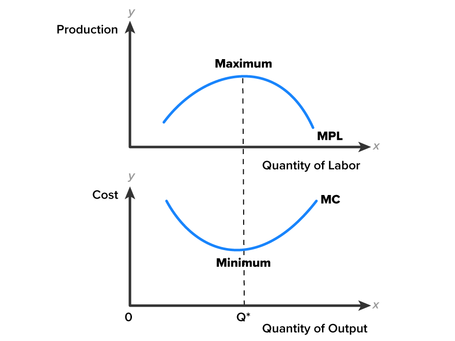
We can use graphs to visualize the nature of the inverse relationship between production and cost. The relationship we should see is the following: when productivity rises, costs fall. When productivity falls, costs rise.
The top half of the diagram below relates to the cost of production, and the bottom half relates to productivity. The two halves are mirrors of one another. If you were to take a printout of the graphs below and fold it in half, with the fold between the two graphs, you would see that the curves rise and fall together. The marginal productivity of labor (MPL) curve represents the added output from the addition of one more worker to production. The marginal cost (MC) is the added cost of an added unit of output. The Q* on the horizontal axis indicates the optimal quantity, where the maximum point for labor productivity corresponds to the minimum point of marginal cost. For firms to hold costs down, worker productivity must be kept up.

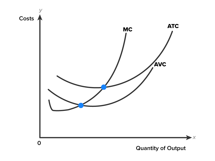
The typical shape of each average curve is a U-shape, with average and marginal values both falling at low levels of output, and then rising at higher levels of output. In the graph below, note the relationship between the marginal curve and the two average curves, AVC and ATC. When the marginal values lie below the average values, the MC is pulling the averages down. When the marginal values lie above the average values, MC is pulling the averages up.

EXAMPLE
Using a sports analogy might help explain this relationship. Suppose a quarterback is averaging two touchdown passes per game. If they have a bad game, and in their next game—here “next” is interpreted as “additional”—their marginal passes per game is worse, it will pull the quarterback’s average down. Suppose instead the quarterback throws five touchdown passes in the next (marginal) game. It will pull the average up. This is simply the law of averages.This effect is shown in the above graph. The average curves sweep down until they cross the MC curve, then sweep back up. The point where the MC curve intersects the ATC curve is the minimum of the ATC curve. The point where the MC curve intersects the AVC curve is the minimum of the AVC curve. These are important conclusions, because you can use marginal cost to more easily locate the minimum points for both AVC and ATC. If you are asked to identify the minimum of ATC or AVC, simply identify where MC intersects the ATC or AVC curve from the bottom side, or where the values of ATC and AVC are close to marginal cost.
Having processed all the cost data for the strawberry business, the manager of C&C Family Farm now has useful information for making some decisions. The margins will tell the firm what to do in order to be profitable in the short run. Should the level of output be increased, decreased, or stay the same?
The averages will tell the firm how well it’s doing in the short run. The average total cost will be used to decide if the firm is making short run profit. The average variable cost will be used to decide if the firm should continue to operate in the short run, or temporarily shutdown. To complete our analysis of C&C Family Farm, we will need to study its revenue situation.
Source: THIS TUTORIAL HAS BEEN ADAPTED FROM LUMEN LEARNING’S “Microeconomics”. ACCESS FOR FREE AT https://courses.lumenlearning.com/wm-microeconomics/. LICENSE: CC ATTRIBUTION 4.0 INTERNATIONAL.