Table of Contents |
Frame is a layout style characterized by the use of a border. While we typically think of borders as solid lines, the following image shows how typography and shapes can be used to create a border.
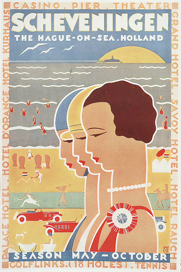 Notice how the text is evenly distributed around the illustration and the display type. Four simple squares are placed on each corner. These squares not only mark the corners, but they also create stopping points for the reader, serving in the same capacity as a period at the end of a sentence.
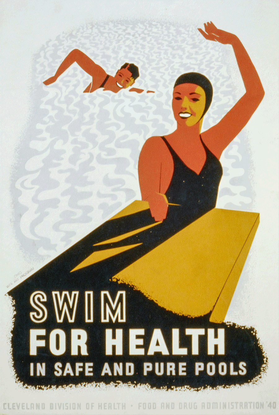
Just like frames don’t have to be solid lines, they also don’t have to be in the form of squares and rectangles. The poster below, created for the Ohio Work Projects Administration in 1940, shows an organic frame. Pay attention to the implied shape of the swimming pool bordering the two swimmers. Notice how the arm of the swimmer in the forefront follows the curve of the pool, creating the top right corner of the design. The black area at the bottom of the design has an eroded edge, keeping with the smudged frame of the pool, maintaining consistency through texture.
Picture window is a vertical layout style characterized by a large picture at the top, with a headline and body copy below. Picture window layouts are frequently used in magazines and newspaper layouts. They were once popularized in web design via the inclusion of graphical banners placed at the top of web pages. This trend has slowed in recent years because graphic files take up more memory and run the risk of slowing down a website’s loading time.
The example below shows a large picture at the top with a clear headline. The body copy is placed below that.
In picture window layouts, the headline may be stylized or at different angles to set it apart; however, the distinction between the elements is the placement of the image and headline above the body copy.
Circus is a layout style characterized by the use of a wide variety of shapes and sizes of design elements.
Notice the varying sizes of the elements in the design below. The character’s head and the mug of beer create an asymmetrical balance, while the different sizes of typography build a layered hierarchy.
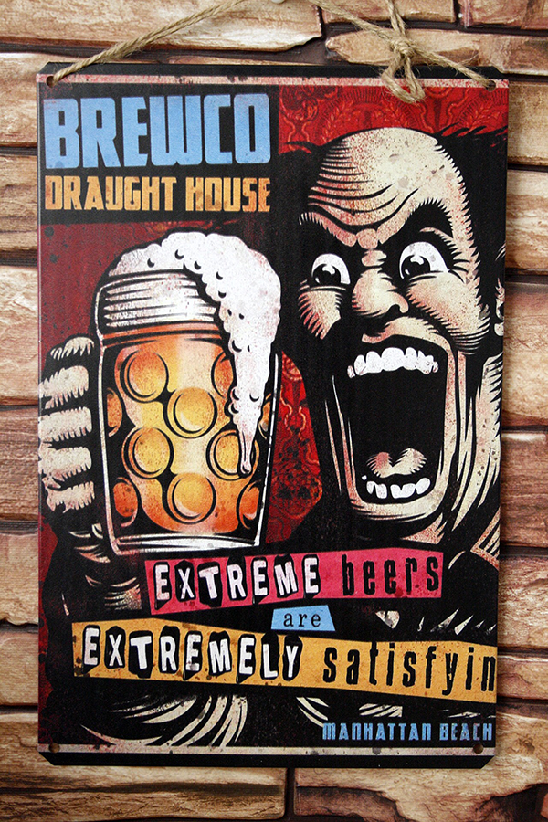
A variety of typefaces are used in different colors and sizes. There is a use of line throughout the design, highlighting different positions and orientations. You can notice the shapes and texture as well. The end result is a fun, dynamic design.
Silhouette is a layout style characterized by picture elements that are cut out of their backgrounds. It is frequently used in illustration and photography.
The example below shows actual silhouettes. Notice how the text in the upper third of the design uses a thick, black typeface to maintain consistency with the silhouettes of the performers, while the text at the bottom of the layout uses reverse type to stand out against the black field. The reverse type in this layout is a smart design choice because it creates a stark contrast that easily calls the reader’s attention to the typography.
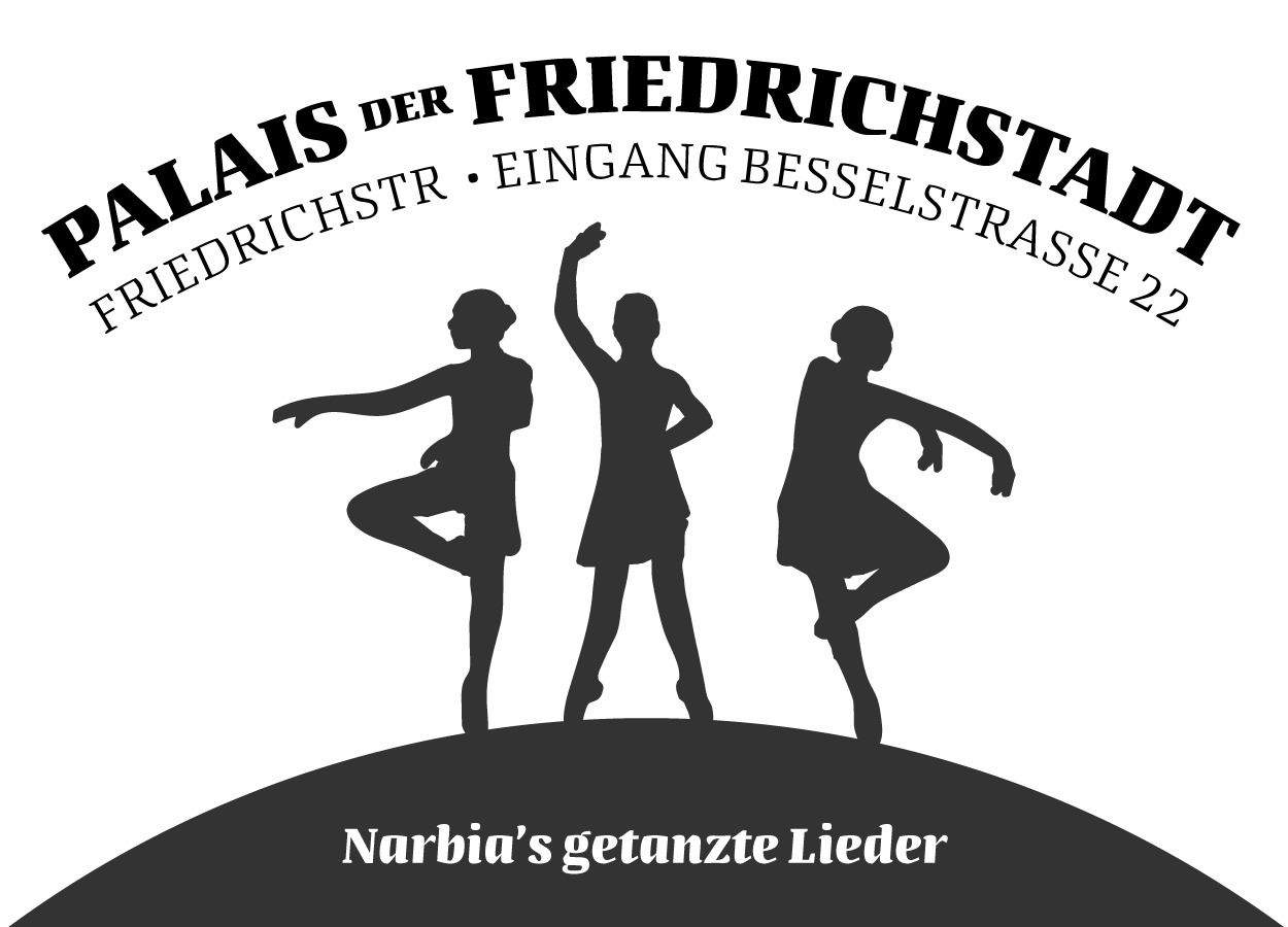
Even the headline itself appears to be a silhouette, as it unifies well with the silhouettes of the dancers. The type below the headline appears as though it were cut out with paper.
The rebus layout style is characterized by a headline with some of the words replaced with pictures. Perhaps the best example of rebus is the “I Love New York” slogan and design created by the Wells, Rich, and Greene marketing firm in 1977. The design is iconic and recognizable worldwide. Implemented to promote tourism in the state of New York and New York City proper, tourists still find the design printed on t-shirts, mugs, keychains, signs, and practically any other souvenir imaginable.
The example below shows an adaptation of the “I Love New York” rebus layout applied to a neon sign.
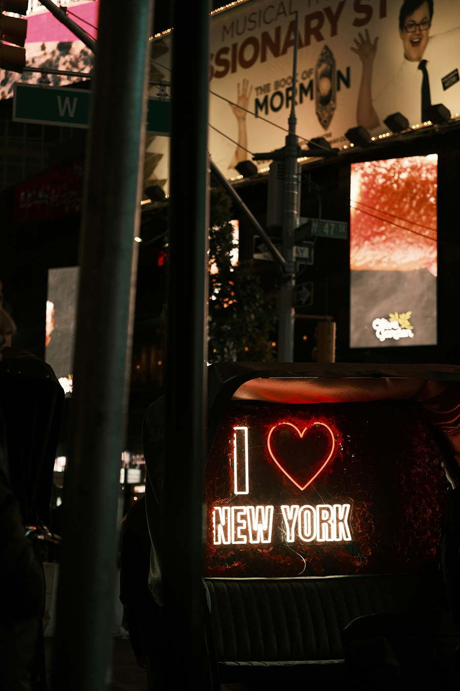
Rather than include the actual word “love,” the word has been replaced with the symbol of a heart. It's a very simple but effective design.
As the name implies, big type is a layout style characterized by large headlines. Big type draws the user’s attention to maximized typography.
Notice how the typography is a graphical element in the layout. The size of the letterforms creates emphasis on the text. Remember that one of the basic methods of communicating hierarchy in design is by increasing the size of design elements.
In the above example, the headline is very large, which affects the hierarchy; the headline is meant to be seen first due to its position, color, and size.
Source: THIS TUTORIAL WAS AUTHORED BY MARIO E. HERNANDEZ FOR SOPHIA LEARNING. PLEASE SEE OUR TERMS OF USE.