Table of Contents |
Mondrian is a layout style named after a Dutch painter and characterized by emphasis dividing the space into obvious sections.
As you can see in the image of the webpage below, there are very clear distinctions between spaces.
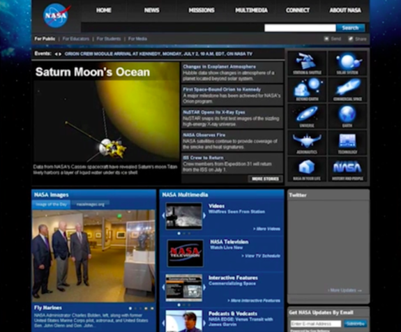
Everything is in its own block or window with clear divisions. This is an example of grid layout, in which elements are set in rows and columns.
Frame is a layout style characterized by the use of a border.
In the image below, you can see a newspaper ad for Columbia Bicycles.
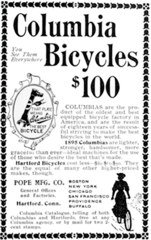
This ad is surrounded by a lovely border of flowers; within the ad, there is a graphic of a bicycle frame. The type on the right-hand side is surrounded by another border or graphic, giving it the appearance of a seal.
Thus, this layout appears as a picture frame because of the way the border surrounds the design.
Picture window is a vertical layout style characterized by a large picture at the top, with a headline and body copy below.
The example below shows a large picture at the top with a clear headline. The body copy is placed below that.

Oftentimes, you'll see the headline stylized or at different angles to set it apart; however, the distinction here between the elements is the placement of the image and headline above the body copy.
Circus is a layout style characterized by the use of a wide variety of shapes and sizes of design elements.
In the image below, you can see a lot going on.
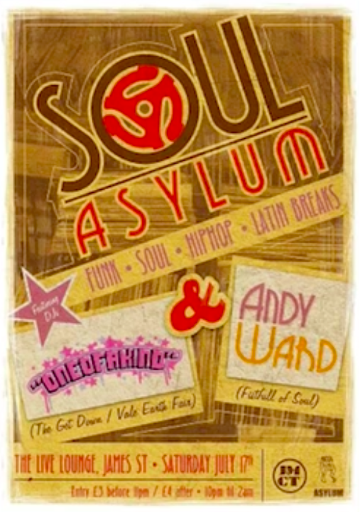
A variety of typefaces is being used in different colors and sizes. There is a use of line throughout the design, highlighting different positions and orientations. You can notice the shapes and texture as well. This design is very fun and dynamic.
Silhouette is a layout style characterized by picture elements that are cut out of their backgrounds.
The example below shows actual silhouettes.
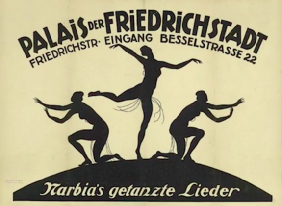
Even the headline itself appears to be a silhouette, as it unifies well with the silhouettes of the dancers. The type below the headline appears as though it were cut out with paper.
The rebus layout style is characterized by a headline with some of the words replaced with pictures.
Take a look at the example below.
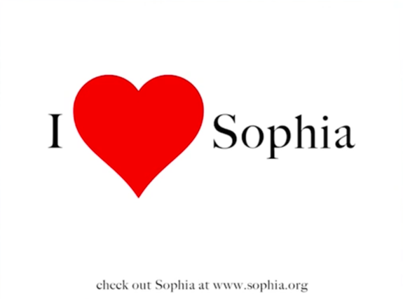
Rather than include the actual word, it's been replaced with a graphic or a picture, very much like the "I Love New York" logo. It's a very simple but effective design.
In recent years, the big craze has been the mustache. You'll see posters and t-shirts that will say "I" and then have a picture or graphic of a mustache, with the end of the sentence saying something like "you to dance." So the whole thing will read, "I mustache you to dance," as a play on "I must ask you to dance."
As the name implies, big type is a layout style characterized by the use of very large headlines.
As you can see in the image below, that's really all there is to it.
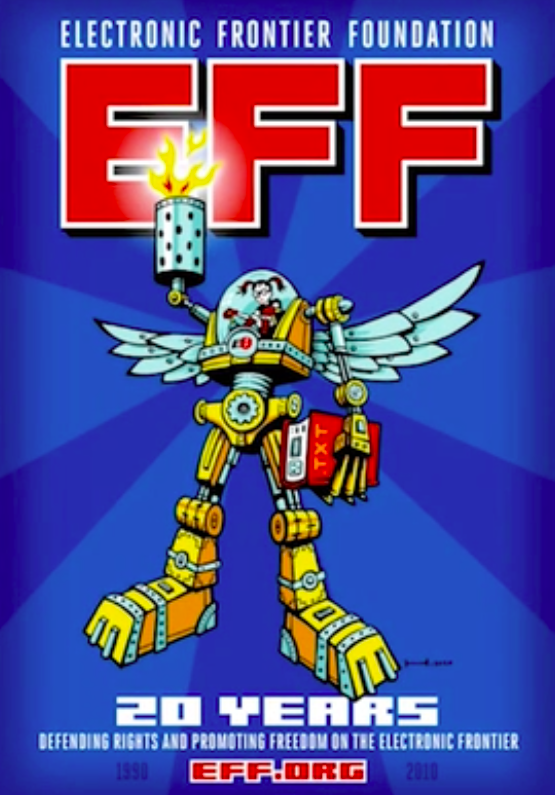
The headline is very large, which affects the hierarchy; the headline is meant to be seen first due to its position, color, and size.
Source: THIS WORK IS ADAPTED FROM SOPHIA AUTHOR MARIO E. HERNANDEZ