Use Sophia to knock out your gen-ed requirements quickly and affordably. Learn more
×

Color Relationships

Author: Sophia

what's covered
In this lesson, you will learn about color relationships and their importance in recognizing harmonious color schemes. Specifically, this tutorial will cover:

Table of Contents

before you start
Color relationships are important when selecting hues for any design. Color pallets used in designs are called color schemes. Certain colors naturally form harmonious relationships, or harmonies. A color wheel allows users to define color harmonies based on the colors’ locations to each other.

term to know
Color Schemes
Color pallets used in designs.

1. Complementary Colors

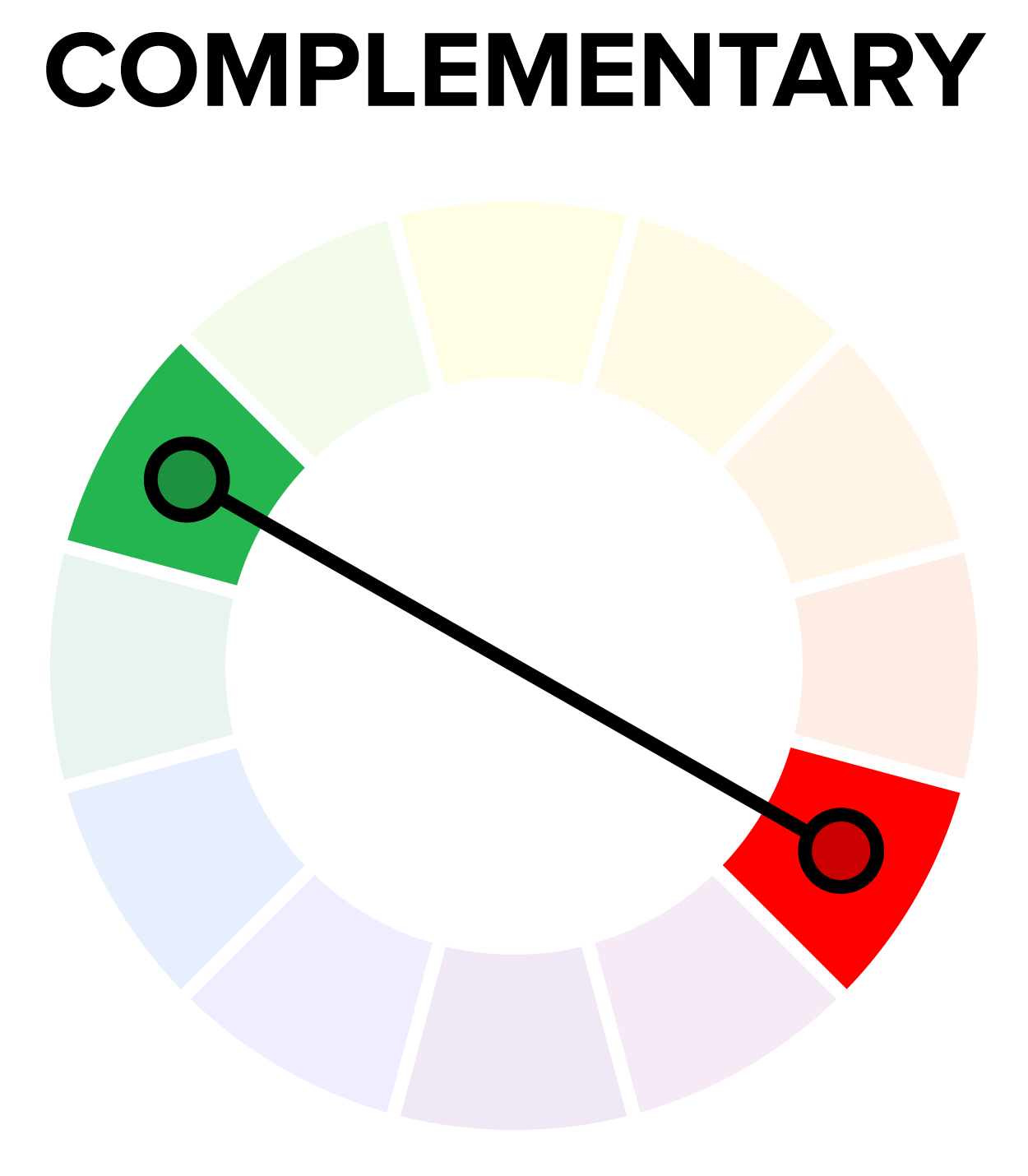
Complementary colors are two hues which sit directly opposite each other on the color wheel. If you were to draw a straight line from one color to another color on the opposite side of the wheel, you'd get that color's complement. Yellow and purple are complementary colors, as are red and green.

This digital illustration of an anthropomorphic fox showcases the application of the complementary colors orange and blue. This complementary color scheme creates a visual harmony based on the color relationships established by the color wheel.

term to know
Complementary Colors
Two hues which sit directly opposite each other on the color wheel.


2. Split-Complementary Colors

Split-complementary colors are a combination of three colors, consisting of a main hue and the two hues that sit on either side of its complement on the color wheel.

If you draw a line that forks two ways, you get split-complementary colors.

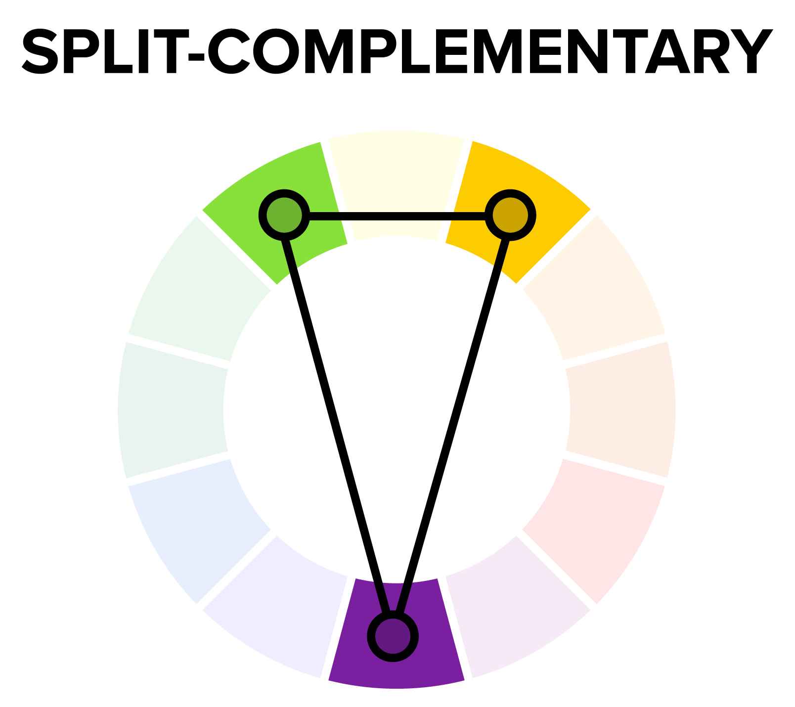
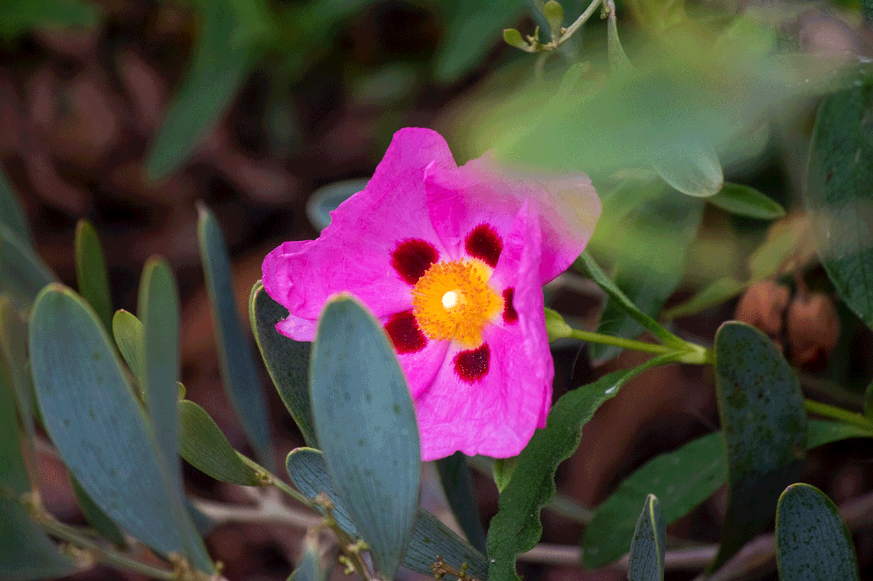
The image of the flower below demonstrates a split-complementary color scheme in nature photography. The three dominant colors, green, violet, and orange, sit in a split-complementary position on the color wheel, as shown in the graphic above.

term to know
Split-Complementary Colors
A combination of three colors, consisting of a main hue and the two hues that sit on either side of its complement on the color wheel.


3. Analogous Colors

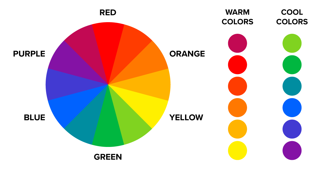
Analogous colors are colors that sit side by side on the color wheel. Analogous colors on one side of the color wheel are considered warm colors and on the opposite side are considered cool colors.

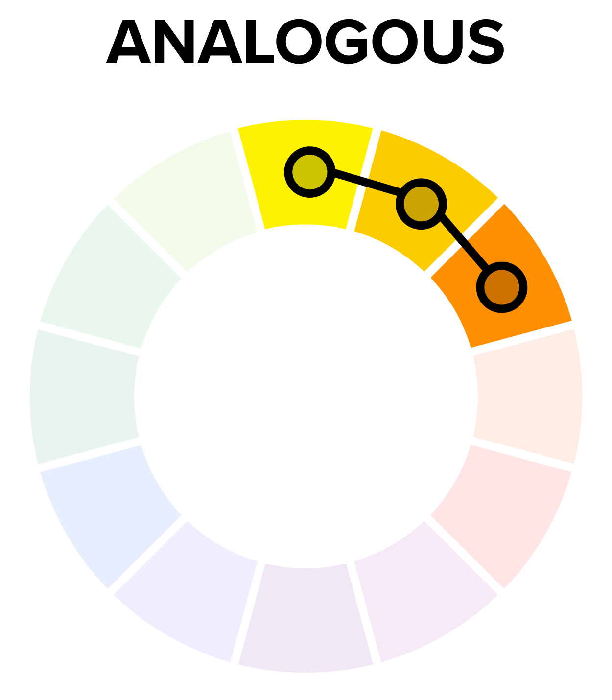
Yellow, orange, and red and their secondary and tertiary counterparts are considered warm colors. Greens, blues, and purples are cold colors. We refer to these color sets as warm and cold colors because of their psychological influences. Warm colors remind users of heat and are often used in designs to stimulate mental impressions of warmth, such as fire and sunlight. Cold colors have the opposite effect, suggesting cool or cold environments.

Warm and cool colors are often used in the same color schemes. Because many color relationships pair hues on opposite sides of the color wheel, they are aligned in warm and cold spectrums. From a color psychology standpoint, they can counterbalance each other in a design. For example, a painting of a cabin in a snowy forest may use yellow light in the window of the structure to show warmth juxtaposing the dark blue of the winter sky. In the image below, orange and yellow stimulate feelings of warmth, contrasting the blue-green, which triggers thoughts about swimming pools and the ocean. The colors in the image warm up and cool down the scene, balancing each other. On a deeper cognitive level, this makes users think about cooling off in the water on a hot day.

watch

term to know
Analogous Colors
Hues which are next to each other on the color wheel; analogous colors on one side of the color wheel are considered warm, and on the other side, cool.


4. Josef Albers

Josef Albers was an American artist, teacher, and author of Interaction of Color. Albers was actually a student at the quite prestigious Bauhaus in 1920 and studied under Johannes Itten, who developed the commonly used color wheel.

Josef Albers was a very accomplished artist and is best remembered as an abstract painter and theorist. He was fascinated by the effects of color and their interaction; he created pieces that seemed rather simple but played with the notion that colors interact with one another in interesting ways.

EXAMPLE

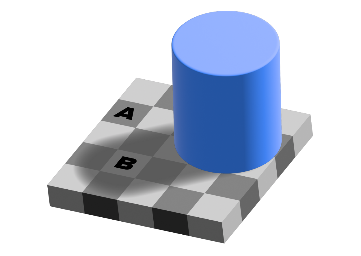
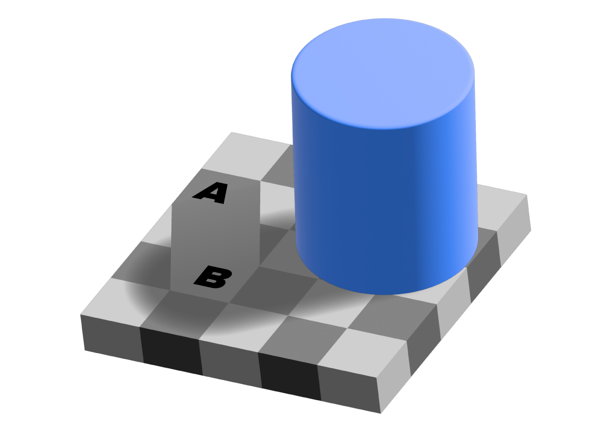
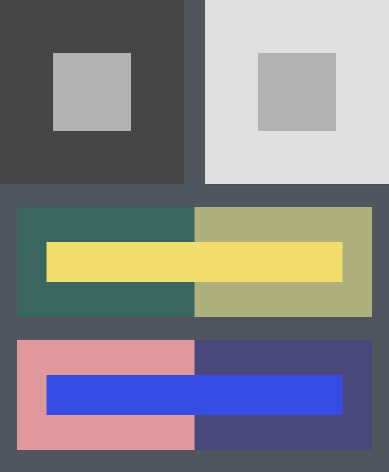
Simultaneous contrast, or the effect that two neighboring colors have on one another, is contained in one of Albers's laws of interaction.

Below is a basic example of simultaneous contrast. You can see in the top image, there's a darker square on the left, with a gray square enclosed. On the right, there's a lighter square and another gray square enclosed within it.

try it
Try to answer the question below, then click on the plus sign to see if you answered correctly.
Which gray square is lighter?
A fair number of people would say the one on the left. The reality is that they are both the same color and value. But the contrast between the light gray and the dark gray, and the light gray and the same gray again, gives you this perception of contrast and value.

Josef Albers tried to drive home the idea that those combinations of colors create interesting interactions.

try it
Try to answer the question below, then click on the plus sign to see if you answered correctly.
Which checkerboard is lighter in the two images below?


If you chose the first image, you were close. If you chose the second image, you were still close to the correct answer. In fact, they're the same value. The values interact in such a way that your eyes perceive different contrasts.

If you were to draw an extra line between the first and second checkerboards, it would really change your perception of color and value in this image again.

watch

people to know
Josef Albers
American artist, teacher, and author of Interaction of Color, one of the most important books on perception and the study of color theory.


term to know
Simultaneous Contrast
The effect two neighboring colors have on one another; this effect is contained in one of Albers's laws of interaction.

summary
In this lesson, you learned how to use the color wheel to identify complementary colors, split-complementary colors, and analogous colors. Complementary colors are opposite each other, while analogous colors appear as three in a row on the wheel. You also learned that Josef Albers was the artist responsible for the idea of simultaneous contrast, explaining how neighboring colors can impact perception.

Source: THIS TUTORIAL WAS AUTHORED BY MARIO E. HERNANDEZ FOR SOPHIA LEARNING. PLEASE SEE OUR TERMS OF USE.

Attributions
Terms to Know
Analogous Colors

Hues which are next to each other on the color wheel; analogous colors on one side of the color wheel are considered warm, and on the other side, cool.

Color Schemes

Color pallets used in designs.

Complementary Colors

Two hues which sit directly opposite each other on the color wheel.

Simultaneous Contrast

The effect two neighboring colors have on one another; this effect is contained in one of Albers's laws of interaction.

Split-Complementary Colors

A combination of three colors, consisting of a main hue and the two hues that sit on either side of its complement on the color wheel.

People to Know
Josef Albers

American artist, teacher, and author of Interaction of Color, one of the most important books on perception and the study of color theory.