Table of Contents |
Below is Étretat: The Beach and the Falaise d'Amont by Claude Monet.
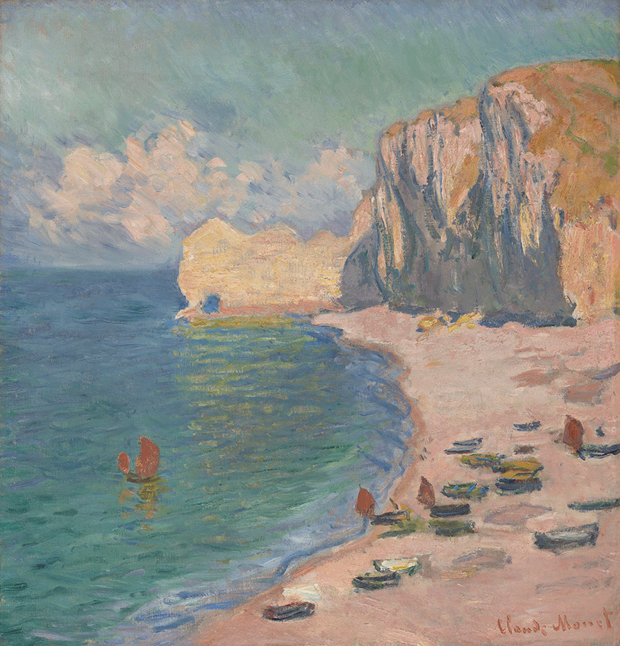
This painting uses the subtractive color process because the pigments are mixed to create a variety of colors.
In this particular piece, the assortment of colors is a blend of both warm and cool. Recall that on the color wheel, the warm side has reds, oranges, and yellows, while the cool side has greens, blues, and violets.
Therefore, we can say that this painting uses analogous colors with the blues and greens of the sea and the sky because it uses colors that sit next to each other on the color wheel. There is contrast between the cold blues and greens of the sea and sky and the warm pinks and yellows of the sand and the rocky cliffs.
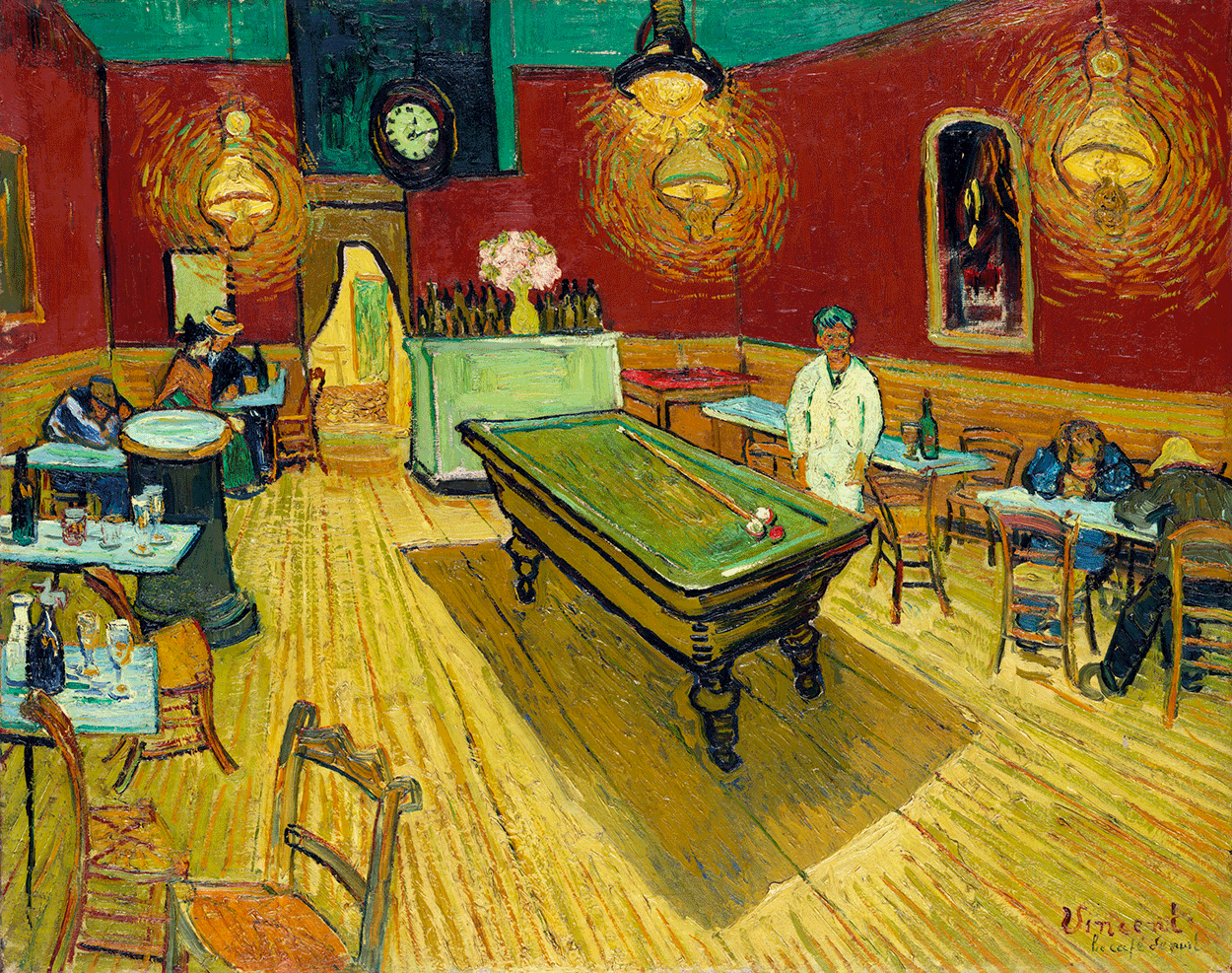
Le Café de nuit (The Night Café) (1888) by Vincent Van Gogh is a bit more striking than the previous image. Van Gogh uses complementary colors, which are the colors that sit opposite each other on the color wheel, to create visual harmony, specifically the colors red and green.
Van Gogh uses these colors on the wall and ceiling, then mirrors them on the pool table and the base. This also uses repetition to establish a rhythm of green, red, green throughout the painting.
The following image is the movie poster for the 1933 theatrical release of King Kong. In the King Kong poster, you'll again notice the use of complementary colors in the purple tower against yellow skies.
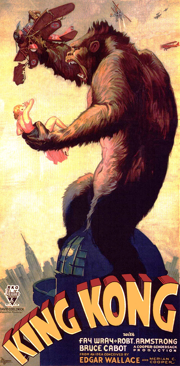
While this contrast doesn't seem like a big deal, painting that tower gray or black to resemble a real building or a shadow being cast would take away the harmony that exists between the colors now. Because this image is illustrated and printed, it also uses the subtractive color process. Notice the yellow in the lettering and the background. Now pay attention to the red in the airplane, the color of Fay Wray’s dress, and the dimensioning of the letters in "King Kong." There are also red hues in Kong’s fur. These colors create rhythm and similarity, tying all of the elements together.
Because this poster was created in the 1930s, it was produced by a traditional artist using paint. Had this design been created today, the image would no doubt be authored in a digital media software application using the additive color process. This means that light would be used to combine or create different colors.
However, since the image would also be printed for movie posters, it will also involve the subtractive color process. This means that designs are created using the RGB color model and then converted into CMYK files. This allows users to design with light and then save specific formats for print.
In a previous lesson, you learned about hexadecimal color, which is an additive color system for colors on the web.
Below, you have an example of two website layouts: a desktop website and its mobile counterpart. If you were to look at the source code for the website, you'd find the hexadecimal color codes that correspond to certain colors on the page. Remember that "hexadecimal" means six numbers, and the six numbers correspond to the same red, green, and blue color channels as RGB. The first two numbers in the hexadecimal code stand for red, the second set for green, and the third set for blue.

Photography also uses the subtractive color process when photos are printed. The image below shows New York City at night.
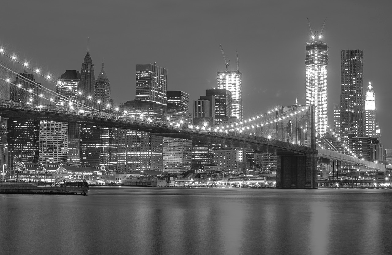
This image is achromatic because there is no discernible hue. We know that the additive color process was used because digital images are edited with computers, and black and white images are often desaturated from the original color photographs.
If you took this image into Photoshop and looked at a color chart of the colors used to create the image, you'd also notice the use of grayscale since there is a progression in value from white to black. On the other hand, if the colors were intense and pure, that would be considered saturation.
Below is the Google logo.

Immediately, you can spot a few things. In the subtractive color process, the three primary colors are blue, red, and yellow. This is if you're talking about pigments in painting, for example. You also have the primary colors for the additive color process, which are red, green, and blue.
If you use any of the Google services, like Google Chrome or Google Drive, you'll start to notice these colors in their logos. It's important that the logos be appealing, so although each color is clearly different, the colors are analogous.
Source: THIS TUTORIAL WAS AUTHORED BY MARIO E. HERNANDEZ FOR SOPHIA LEARNING. PLEASE SEE OUR TERMS OF USE.