Use Sophia to knock out your gen-ed requirements quickly and affordably. Learn more
×

Causes of Shifts in Supply

Author: Sophia

what's covered
In this lesson, you will learn about what causes movement along a supply curve versus what causes a shift of the supply curve itself. Specifically, this lesson will cover:

Table of Contents

1. Causes of Shifts in Supply

What factors, other than price, might affect how much of a good or service a supplier chooses to supply? From the supply side of a market, a number of factors beyond price affect suppliers’ willingness and ability to offer products.

EXAMPLE

When workers concerned about the health effects of Covid became less available, hotels began using robots to make room deliveries replacing hotel workers. In this case, an event changed the overall supply.

The list below provides a concise summary of the non-price factors that economists recognize as affecting the overall supply of a product. A change in any one of these factors will alter an individual seller’s willingness and ability to offer a product in a given time period and cause a shift in supply.

  1. Input prices
  2. Technology
  3. Producer expectations about the future
  4. Business taxes and subsidies
  5. Number of sellers
hint
Keep in mind that anything that improves the seller’s “bottom line” and makes it less expensive to produce will cause an increase in supply. Anything that reduces the “bottom line” and makes it more expensive to produce something will cause a decrease in supply.

1a. Changes in Input Prices

Lower prices on inputs such as land, labor, capital or technology are favorable events for suppliers. It means that the cost of producing the good or service is lower; this increases the possibility of keeping more of the income earned from the sale of each unit of the product. The supplier is now more willing and able to offer the product at each of the same prices as before the change in input prices.

As such, overall supply increases and the supply curve shifts rightward away from the original curve, as shown in the following supply graph.

Let's imagine that the price of fertilizer has gone up. For Farmer Jones, the price of apples didn't change, but if fertilizer costs more, then apple production becomes more expensive. Therefore, the farmer will supply fewer apples at all prices, which represents an decrease in supply.
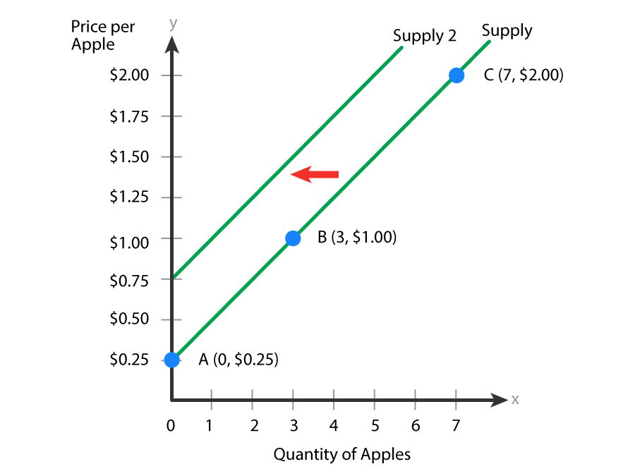
A graph with the x-axis labeled ‘Quantity of Apples’, ranging from 0 to 7, and the y-axis labeled ‘Price per Apple’, ranging from $0.25 to $2.00 at intervals of 0.25. Two upward-sloping lines represent supply curves, with the lower one labeled ‘Supply’ and the one above labeled ‘Supply 2’. The ‘Supply’ line starts from the marked point at (0, $0.25), labeled  ‘A’, and passes through marked points labeled ‘B’ (3, $1.00) and ‘C’ (7, $2.00). A horizontal arrow points to the left from the line ‘Supply’ to the line ‘Supply 2’.
Changes in Input Prices Shift the Supply Curve

key concept
As you can see in the graph above, a change in input prices causes a shift in the supply curve.
  • As input prices rise, the curve shifts left; supply decreases.
  • As input prices fall, the curve shifts right; supply increases.

Suppose, however, the farmer got a better deal on his fertilizer, or if there was a decrease in another input price, like lower rent on a neighbor’s fam land, or workers who are paid less, or lower cost on machinery, it would create an increase in supply, shifting the curve to the right instead.

hint
An increase in supply will always be a shift to the right of the original curve, while a decrease in supply will always be a shift to the left of the original curve.

1b. Changes in Technology

Technology isn’t what you think it is! It’s not the latest electronic gadgets or software. In economics, technology refers to the way in which resources are mixed in a technical recipe for producing a good or service.

EXAMPLE

Suppose we want to start a small business teaching people how to sail. We would need to figure out the technical "recipe" needed to accomplish this task–what mix of tools, processes, personnel, and other resources would allow this business to thrive. This could include questions like what size of space to rent and where, how many sailboats to buy, and how many workers to hire. As you can imagine, there are a multitude of ways we can write the technical "recipe" for a successful sailing school business. If you are a wise entrepreneur, you will choose the technical recipe, the technology, that provides both quality and low cost.

Changes in technology can both improve and reduce our “bottom line.” Most advances in technology provide improvements in the way things get done. These typically reduce the cost of doing business. Hanging on to outdated techniques can raise the cost of production over time.

EXAMPLE

Businesses that rely on dial-up Internet rather than 5G, the fifth-generation technology standard for broadband cellular networks, spend more on lost worker productivity than other firms that adopt the new service.

Suppose that our farmer purchases a new autonomous harvesting robot, a piece of capital equipment like a tractor, which is able to identify, pick, and deposit apples in seconds. This new technology makes apple picking more efficient and less expensive, compared to human farmworkers. Because the new technology improves production, the farmer is willing and able to supply a greater quantity of apples at all prices. The farmer now increases overall supply, causing the supply curve to shift right, shown below. Conversely, if the farmer insists on hand-picking every apple, then this technique would certainly decrease the overall supply due to higher costs.

The following graph shows the increase in supply, a rightward shift of the curve when Farmer Jones adopts a new technology that reduces production costs.
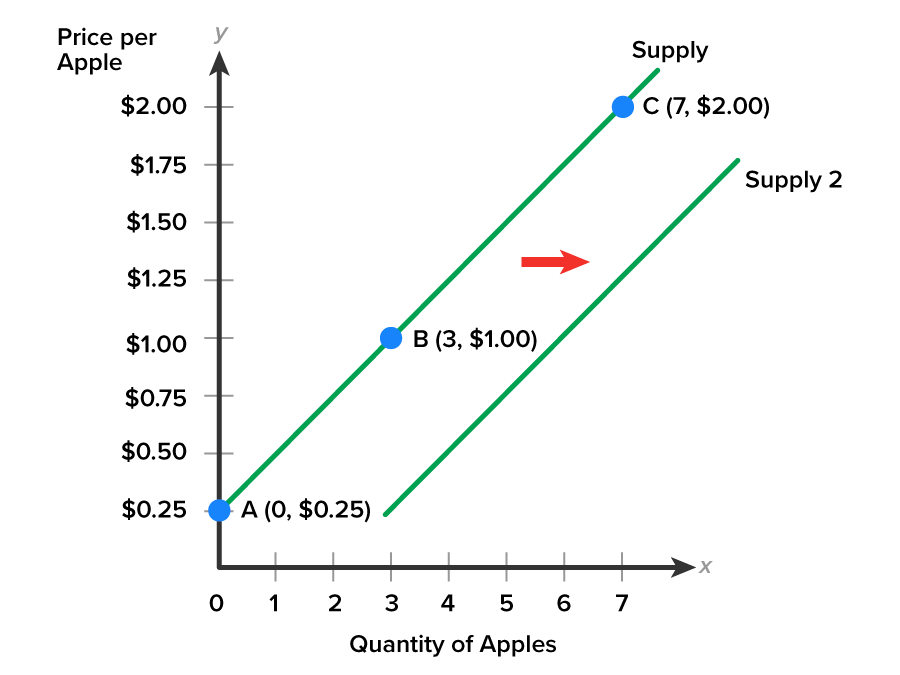
A graph with the x-axis labeled ‘Quantity of Apples’, ranging from 0 to 7, and the y-axis labeled ‘Price per Apple’, ranging from $0.25 to $2.00 at intervals of 0.25. Two upward-sloping lines represent supply curves, with the lower one labeled ‘Supply 2’ and the one above labeled ‘Supply’. The ‘Supply’ line starts from the marked point at (0, $0.25), which is labeled A, and passes through the marked points labeled ‘B’ (3, $1.00) and ‘C’ (7, $2.00). A horizontal arrow points to the right from the line ‘Supply’ to the line ‘Supply 2’.
Changes in Technology Shift the Supply Curve

key concept
As you can see in the graph, a change in technology causes a shift in the supply curve.
  • Adopting technology improvements, the curve shifts right; supply increases.
  • Failing to adopt technology improvements, the curve shifts left; supply decreases.

1c. Producer Expectations about the Future

Both buyers and sellers make decisions based on their expectations about what might happen in the future. We have learned that consumers respond to expectations about future price changes. If buyers believe peanut butter will be priced higher in the near future, there will likely be a mass buying of peanut butter in the present. Similarly, suppliers make current production decisions based on their expected future income as it is dependent on the prices they can charge for their products.

If suppliers have good reason to believe that consumers will be slowing their spending, then businesses will adjust their production levels down and supply will decrease. Business income will decline because prices tend to fall during periods of low economic activity. When suppliers determine that economic activity will pick up, production levels will rise and supply will increase. As the economy comes out of a recession, shoppers become less cautious in spending. Businesses will step up production in anticipation of higher future sales.

A graph with the x-axis labeled ‘Quantity’ and the y-axis labeled ‘Price’. Two upward-sloping lines represent supply curves, with the lower one labeled ‘Supply 2’ positioned below the upper one labeled ‘Supply’. The line ‘Supply’ starts from the y-axis (near the origin), and the line ‘Supply 2’ starts from the x-axis (near the origin). A downward-sloping line labeled ‘Demand’ intersects both supply curves at different points, with the intersection on the upper supply curve marked ‘1’. An arrow between the two supply curves, and above the demand curve, points to the right.
Increase in Expectations about Future Economic Activity Shift the Supply

key concept
A change in producer expectations about the future causes a shift in the supply curve.
  • With expectations of growing economic activity, the curve shifts right; supply increases.
  • With expectations of falling economic activity, the curve shifts left; supply decreases.

1d. Business Taxes and Subsidies

Businesses are subject to taxes just like households. You are likely accustomed to paying taxes by having them deducted from your paycheck, and so you think about taxes as a reduction from your income. Most businesses, on the other hand, consider their taxes as one of the costs of production. As a result, an increase in taxes raises the cost of doing business, so higher taxes can lead to a decrease in overall supply.

On the other hand, businesses are sometimes recipients of financial payments from public funds, which are known as subsidies. Because a subsidy can lower the cost of doing business, it leads to an increase in overall supply; often, increasing supply is the reason why the government paid out the subsidies in the first place. Increases in government subsidies to businesses result in increases in the supply of those businesses' goods, while reductions in subsidies shift costs back to the businesses and may reduce the supply of their goods.
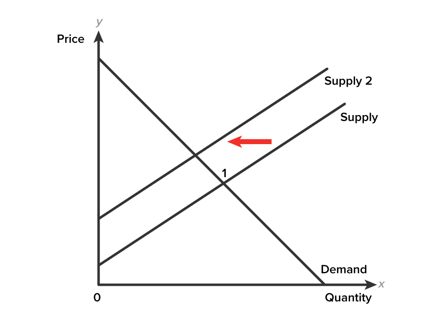
A graph with the x-axis labeled ‘Quantity’ and the y-axis labeled ‘Price’. Two upward-sloping parallel lines starting from the y-axis represent supply curves, with the upper line labeled ‘Supply 2’ and the lower one labeled ‘Supply’. A downward-sloping demand curve intersects both supply curves at different points, with the intersection on the lower supply line marked ‘1’. An arrow between the two supply curves, and above the demand curve, points to the left.
Decrease in Supply due to Increase in Business Taxes

EXAMPLE

Agricultural businesses are recipients of farm subsidies. Boeing, General Motors, and Intel are the top three business recipients of subsidy payments; $15 billion, $8, and $6 billion dollars, respectively. Production subsidies reduce the cost of producing goods and services.

key concept
A change in business taxes and subsidies causes a shift in the supply curve.
  • With higher subsidy payments or lower business taxes, the curve shifts right; supply increases.
  • With lower subsidy payments or higher business taxes, the curve shifts left; supply decreases.

1e. Number of Sellers

So far we have focused on a number of factors that influence the willingness and ability of individual suppliers to offer products. What happens when the number of sellers overall changes?

Suppose we aggregate all the sellers who produce and sell bicycles meaning we consider together all the producers of bicycles and the bike shops that sell them. Doing so gives us a picture of the market supply for bicycles. Increasing or decreasing the number of sellers causes a change in supply. If the number of businesses producing bicycles increases, then market supply increases. If a number of sellers are bought out by one company, then the market supply of bicycles decreases.

EXAMPLE

One shrinking market is the global razor market and Procter and Gamble, the parent company of Gillette, is not so happy. Shaving has been a mainstay in the men’s grooming industry. So what changed? The ‘bearded look” has gained popularity among the millennials. Will the number of sellers in the global razor market shrink also?

A graph with the x-axis labeled ‘Quantity’ and the y-axis labeled ‘Price’. Two upward-sloping parallel lines starting from the y-axis represent supply curves, with the upper line labeled ‘Supply 2’ and the lower one labeled ‘Supply’. A downward-sloping demand curve intersects both supply curves at different points, with the intersection on the lower supply line marked ‘1’. An arrow between the two supply curves, and above the demand curve, points to the left.
A Decrease in Number of Sellers

key concept
A change in the number of sellers of a product causes a shift in the supply curve.
  • If the number of sellers of a product increases, the curve shifts right; supply increases.
  • If the number of sellers of a product decreases, the curve shifts left; supply decreases.

reflect
Can you explain how a seller’s “willingness and ability” to offer a product affects supply? Can you visually illustrate how various non-price factors shift the supply curve? You have been introduced to five different non-price factors of supply. The key to interpreting is first to decide whether a change makes the seller better off or worse off. Any change that makes the seller more willing and more able to offer a product will increase supply, shifting the supply curve right toward higher overall quantities at all prices. Any change that makes the seller less willing and less able to offer a product will decrease supply, shifting the supply curve supply left toward lower overall quantities at all prices.

hint
Here is a final reminder: it is important that you understand the difference between “movements along a supply curve” and “changes in supply.”
  • When the product’s price changes, it causes a movement along the curve to the new product price and quantity, ceteris paribus.
  • When a non-price factor changes, the curve shifts, ceteris paribus. Shifts to the right show an increase in product supply, while shifts to the left show a decrease in product supply.

term to know
Technology
The way in which resources are mixed in a technical recipe for producing a good or service.


2. Market Simplification

When analyzing supply, demand, and market equilibrium, we simplify by assuming ceteris paribus and examine only one change at a time.

But in reality, there are potentially many factors that could impact either demand or supply or both demand and supply simultaneously. To figure out how economic events affect the two market outcomes of equilibrium price and equilibrium quantity, we use a four-step process.

step by step
Step 1 Draw a demand and supply model of the good or service with the typical curves. Circle the initial equilibrium where the curves intersect and locate the equilibrium price (bold italic P subscript bold E) and quantity (bold italic Q subscript bold E) along the axes in the diagram. We will need to know four standard pieces of information:
  • The law of demand, which tells us the slope of the demand curve.
  • The law of supply, which gives us the slope of the supply curve.
  • The list of factors for demand.
  • The list of factors for supply.
Step 2 Decide whether the event you are analyzing affects demand or supply. In other words, does the event refer to something in the list of demand factors or supply factors?
Step 3 Decide whether the effect on demand or supply causes the curve to shift to the right or to the left, and sketch the new demand or supply curve on the diagram. In other words, does the event increase or decrease the amount consumers want to buy or what suppliers want to sell?
Step 4 Circle the new equilibrium where the new curve intersects. Locate the new equilibrium price (bold italic P subscript bold 2) and quantity (bold italic Q subscript bold 2) along the axes in the diagram.
Step 5 Finally, compare the original equilibrium price and quantity to the new equilibrium price and quantity, and describe how the event affected equilibrium.

try it
Practice makes perfect! Let’s walk through an example using the 5-step process. We will consider only one change on the market, ceteris paribus. Consider this scenario and question:
Scenario: Through the news you learn that consumers are rejecting environmentally unfriendly bottled water.
Question: How will this event affect the market for bottled water?

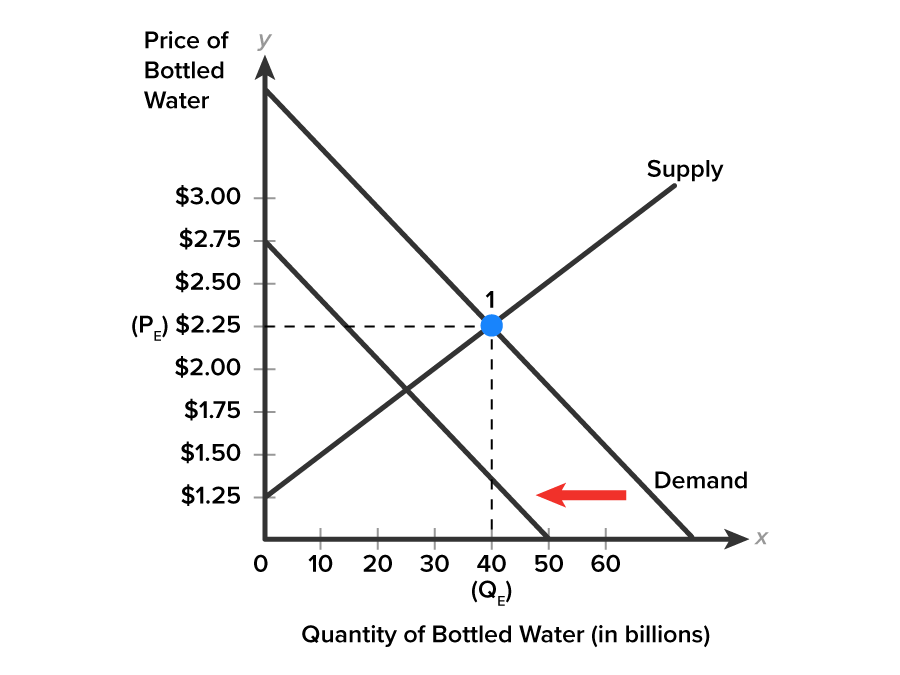
Step 1 Draw a demand and supply model of the good or service with the typical curves. Circle the initial equilibrium where the curves intersect and locate the equilibrium price (bold italic P subscript bold E) and quantity (bold italic Q subscript bold E) along the axes in the diagram.

A graph with the x-axis labeled ‘Quantity of Bottled Water (in billions)’, ranging from 0 to 60 in increments of 10, and the y-axis labeled ‘Price of Bottled Water’, ranging from 0 to $3.00 in increments of 0.25. A downward-sloping line labeled ‘Demand’ represents the demand curve, and an upward-sloping line labeled ‘Supply’ intersects the demand curve at the marked point labeled ‘1’. A dashed line extends from both the axes, where one line extends from $2.25, labeled PE, on the y-axis and another line extends from 40, labeled QE, on the x-axis, intersecting at the marked point ‘1’ (40, $2.25).
Market Equilibrium for Bottled Water


Step 2 Decide whether the event you are analyzing affects demand or supply. In other words, does the event refer to something in the list of demand factors or supply factors.
Conclusion: Buyers are rejecting bottled water. Consumer preference has changed.

Step 3 Decide whether the effect on demand or supply causes the curve to shift to the right or to the left, and sketch the new demand or supply curve on the diagram. In other words, does the event increase or decrease the amount consumers want to buy or what suppliers want to sell?
Conclusion: Demand decreases for bottled water. Demand curve shifts to the left toward smaller quantities at all prices.


A graph with the x-axis labeled ‘Quantity of Bottled Water (in billions)’, ranging from 0 to 60 in increments of 10, and the y-axis labeled ‘Price of Bottled Water’, ranging from 0 to $3.00 in increments of 0.25. Two downward-sloping lines represent demand curves, with one line positioned below the other. The lower line extends from the point (0, $2.75) to (50, 0), and the upper line extends from the end of the y-axis to the end of the x-axis. An upward-sloping line labeled ‘Supply’ intersects the upper demand curve at the marked point labeled ‘1’. A dashed line extends from both the axes, where one line extends from $2.25, labeled PE, on the y-axis and another line extends from 40, labeled QE, on the x-axis, intersecting at the marked point ‘1’ (40, $2.25). An arrow between the two demand curves points to the left.
Decrease in Market Demand for Bottled Water


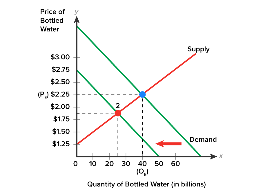
Step 4 Circle the new equilibrium where the new curve intersects. Locate the new equilibrium price and new quantity along the axes in the diagram.

A graph with the x-axis labeled ‘Quantity of Bottled Water (in billions)’, ranging from 0 to 60 in increments of 10, and the y-axis labeled ‘Price of Bottled Water’, ranging from 0 to $3.00 in increments of 0.25. Two downward-sloping lines represent demand curves, with one line positioned below the other. The lower line extends from the point (0, $2.75) to (50, 0), and the upper line extends from the end of the y-axis to the end of the x-axis. An upward-sloping line labeled ‘Supply’ intersects both demand curves at different points, with the intersection on the lower demand curve marked ‘2’ and the intersection on the upper demand curve represented by an unlabeled marked point. Two dashed lines extend from both axes, where one line extends from $1.875 on the y-axis and another line extends from 25 on the x-axis, intersecting at the point marked ‘2’ (25, $1.875). Similarly, a dashed line extends from the point $2.25, labeled PE, on the y-axis, and another line extends from the point 40, labeled QE, on the x-axis, intersecting at the unlabeled marked point at (40, $2.25). An arrow between the two demand curves points to the left.
New Market Equilibrium


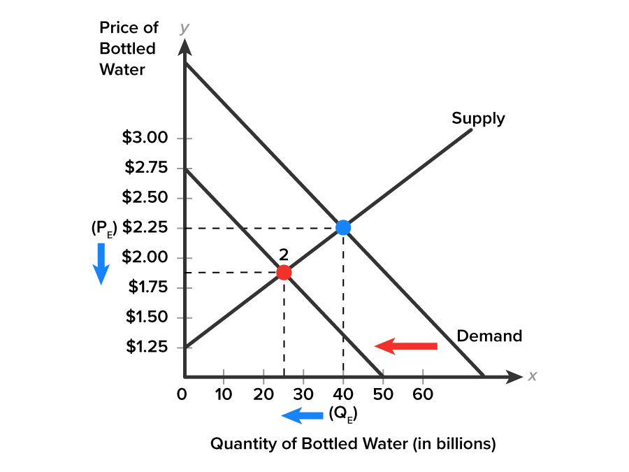
Step 5 Finally, compare the original equilibrium price and quantity to the new equilibrium price and quantity, and describe how the event affected equilibrium.

A graph with the x-axis labeled ‘Quantity of Bottled Water (in billions)’, ranging from 0 to 60 in increments of 10, and the y-axis labeled ‘Price of Bottled Water’, ranging from 0 to $3.00 in increments of 0.25. Two downward-sloping lines represent demand curves, with one line positioned below the other. The lower line extends from the point (0, $2.75) to (50, 0), and the upper line extends from the end of the y-axis to the end of the x-axis. An upward-sloping line labeled ‘Supply’ intersects both demand curves at different points, with the intersection on the lower demand curve marked ‘2’ and the intersection on the upper demand curve represented by an unlabeled marked point. Two dashed lines extend from both axes, where one line extends from $1.875 on the y-axis and another line extends from 25 on the x-axis, intersecting at the point marked ‘2’ (30, $1.875). Similarly, a dashed line extends from the point $2.25, labeled PE, on the y-axis, and another line extends from the point 40, labeled QE, on the x-axis, intersecting at the unlabeled marked point at (40, $2.25). An arrow between the two demand curves points to the left. A second arrow points downward on the y-axis below (PE), and another arrow points leftward from (QE).
New Lower Equilibrium for Price and Quantity


Explanation: Buyers reject bottled water. Consumer preferences become less favorable. Demand decreases for bottled water and the demand curve shifts leftward from the original curve. The equilibrium price falls and equilibrium quantity falls.

Events occurring both inside businesses and outside in the world impact markets. Market analysts keep in touch with the latest news to make predictions. You can do the same. Simply follow the five step analysis process.

summary
In this lesson, in Causes of Shifts of Supply, you considered the effects of Changes in Input Prices, Changes in Technology, Changes in Producer Expectations about the Future, Changes in Business Taxes and Subsidies, and the Number of Sellers that shift the overall supply of a product. Changes favorable to suppliers will shift supply rightward, while changes unfavorable to suppliers shift the supply curve leftward, assuming product price is unchanged. In Market Simplification, you were reminded once again of the important role of the assumption, ceteris paribus, which allows us to isolate one change at a time in our model analysis, while holding all other possible changes constant. In reality, change can come from both sides of the market simultaneously, causing both supply and demand curves to shift. Finally, you learned that the impact on the market is best examined by drawing a market model, determining how the change affects the market (either supply or demand), sketching a new line, and comparing the new price and quantity to the original price and quantity.

Source: THIS TUTORIAL HAS BEEN ADAPTED FROM OPENSTAX “PRINCIPLES OF ECONOMICS 2E”. ACCESS FOR FREE AT https://openstax.org/books/principles-economics-2e/pages/1-introduction. LICENSE: CC ATTRIBUTION 4.0 INTERNATIONAL.

REFERENCES

Subsidy Tracker Top 100 Parent Companies. Good Jobs First. (n.d.). Retrieved May 25, 2022, from subsidytracker.goodjobsfirst.org/top-100-parents

Terms to Know
Technology

The way in which resources are mixed in a technical recipe for producing a good or service.