Table of Contents |
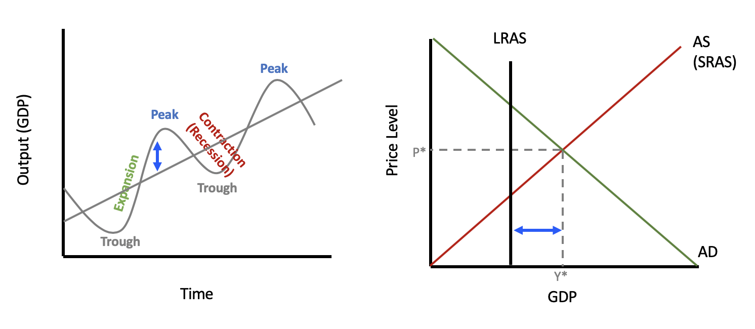
In review, this is a business cycle. We know that it is normal for the economy to go through periods of growth and contraction.
Over time, GDP tends to grow, represented by the gray line, which shows the overall growth trend.
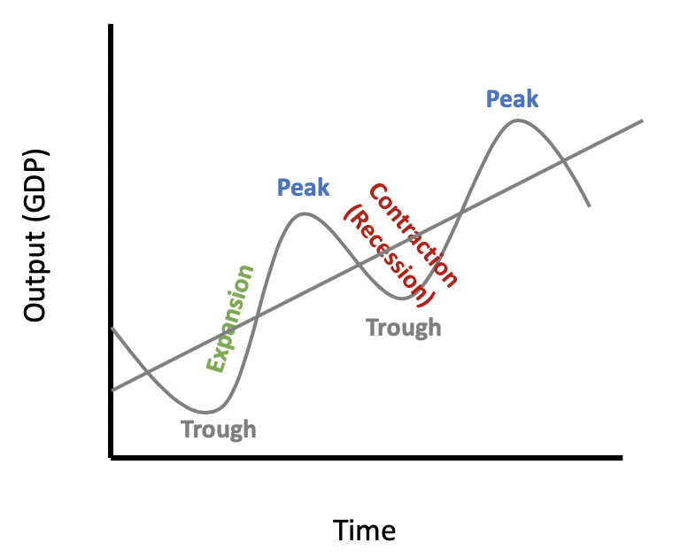
Now, there are times the GDP grows quickly and times when it can shrink.
We can see these periods of growth and contraction in more detail using our aggregate demand and aggregate supply model, so let’s review the components of this model.
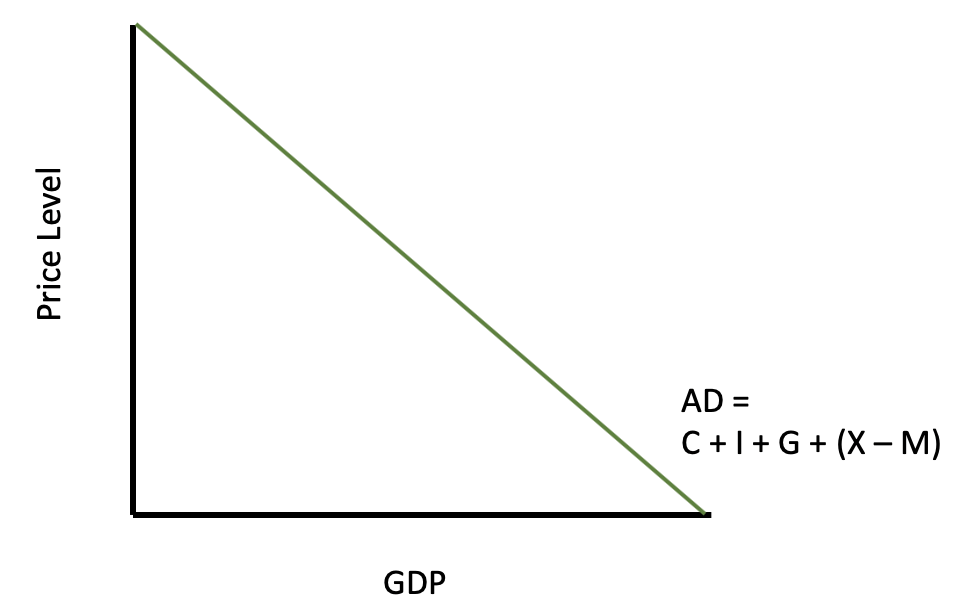
Aggregate demand, as you will recall, is the total amount of goods and services demanded in the economy at a specific point in time and at a prevailing price level.
Here is our aggregate demand curve. It is a downward-sloping curve, showing an inverse relationship between the price level and real GDP. This means that people—the consumers, firms, governments, and net foreign purchasers of U.S. goods—will want to purchase more as the overall price level falls.
This is because of the following three effects:
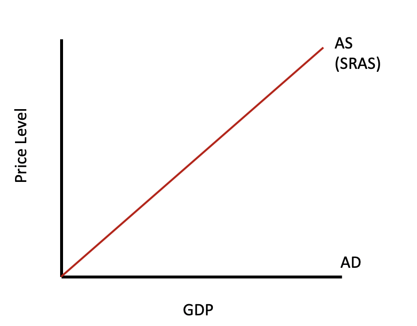
Short-run aggregate supply, or SRAS, is assumed to maintain a positive price and quantity correlation, showing that more can be produced in the short run through increased resource utilization, technological improvements, or other factors.
Here is an SRAS curve. It is an upward-sloping curve because, in the short run, businesses can actually produce more as prices go up because they won’t have to pay their workers more immediately. They can also use inventories that they already have.
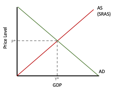
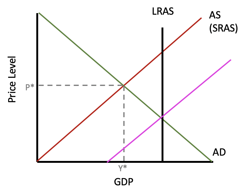
If we put the aggregate demand and aggregate supply curves together, we can see that the intersection gives us equilibrium, where Y* is the real GDP, or current level of production, and P* is the current price level.
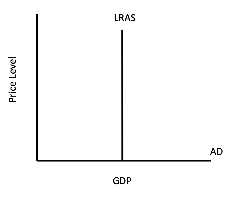
Now, we have to add the long-run aggregate supply, or LRAS. Recall that LRAS is assumed to be constant in the long run because, in the long run, resources are assumed to be used optimally.
If we are at the LRAS curve, we can see that there is no potential for increasing capacity, so it is represented by a vertical line, as shown below. This shows our economy’s full potential in terms of production, given our current resources.
Ramping up production in the short run can only get us so far because, in the long run, we have a limited amount of resources, such as materials, workers, and so forth.
So, if we put these three things together, this graph shows the economy currently producing where the LRAS curve intersects the SRAS and aggregate demand curves.
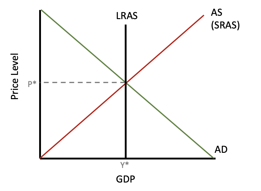
This means that, currently, the economy is fully employed and producing the maximum amount possible, given our current resources.
So, if we want to compare this to the business cycle, we place that growth trend there. The LRAS curve is a similar concept to the overall growth trend in our business cycle.
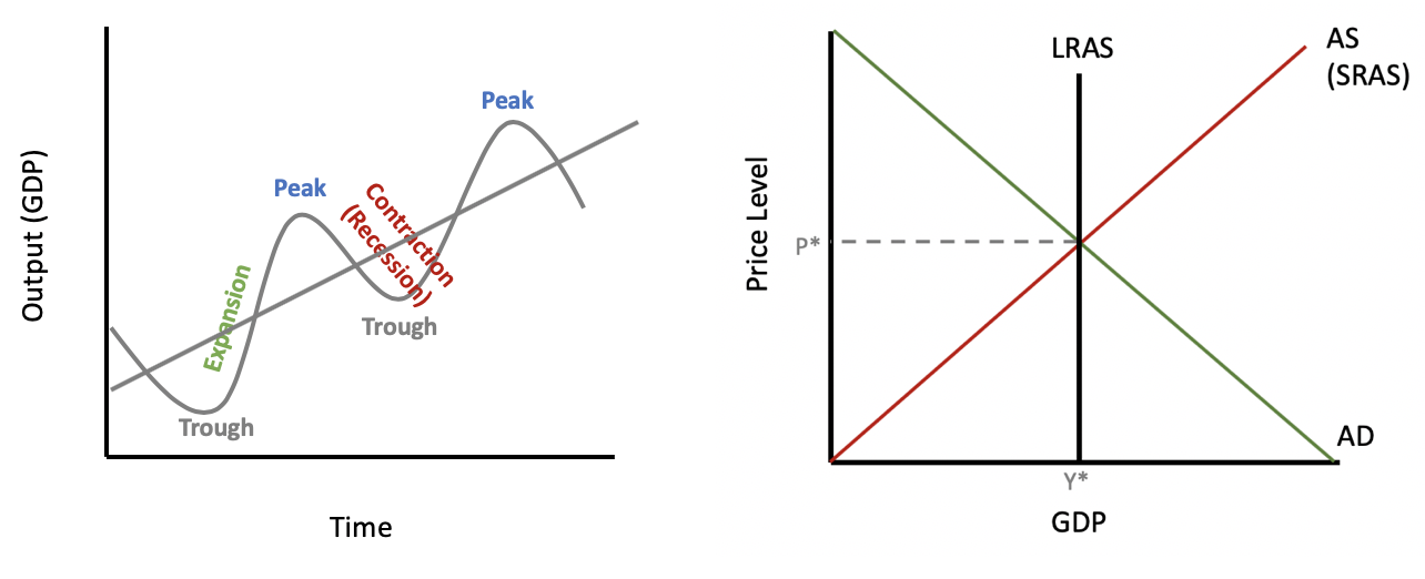
When the economy is producing in equilibrium, we are precisely on our growth trend in the business cycle, producing exactly a sustainable quantity with our resources.
Note, the business cycle model doesn’t show price level, whereas the AD/AS model does because it provides a snapshot of a point in time. The idea, though, is that we are on the growth trend in the business cycle if we are producing at our LRAS curve.
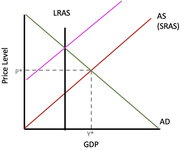
Now, the economy during a recession is different. This graph shows the economy currently producing a real GDP less than the LRAS.
This means that the unemployment rate has risen; we are not fully employed. We are producing less than our full potential. This recessionary gap can be seen in the business cycle at a point below the growth trend, possibly near a trough.
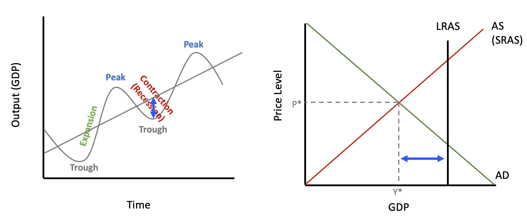
Notice the blue arrows. We can compare the distance horizontally on the AD/AS graph, which shows how much unemployment has increased, with the vertical distance on the business cycle.
A trough, remember, is the business cycle period that coincides with the lowest GDP for a given point in time.
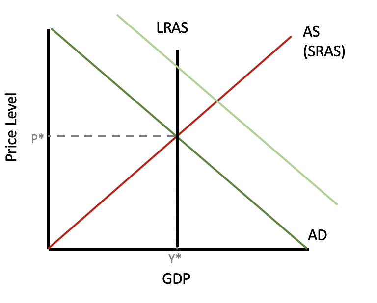
Now, let’s look at an expansion. In an expansionary period, our economy is currently producing a real GDP greater than the LRAS. In the business cycle, we are producing above our growth trend.
Once again, you can see by the blue arrows that the horizontal difference in the AD/AS model is the same as the vertical difference in the business cycle.
This is possible because, if you recall, a peak is the business cycle period that coincides with the maximum obtainable GDP for a given point in time.
So, when we’re at an unsustainable price or output combination at a peak, it looks like the AD/AS model above. It is possible, in the very short run, because we can move beyond that, but let’s look at what is going to happen.
Because demand has risen, prices are going to rise. Consumers are willing to pay more.
Producers now want to produce more, and they can by drawing down their inventories and using resources faster than they are being replaced.
However, this is not sustainable, which is why the LRAS curve is located where it is. Once inventories are depleted and producers need to order more, there will be shortages at those previous prices, and the prices of inputs will start to rise.
This is going to shift our SRAS curve to the left. As input prices go up, SRAS shifts to the left and brings us right back to our LRAS.
IN CONTEXT
There was a housing boom that occurred in the early 2000s during which there was a huge increase in demand, represented here with the new aggregate demand curve.
Because prices were rising, as you can see on the curve, builders responded by trying to build more and more—and they did.
At some point, though, their costs—like lumber, for instance—began to rise, because there was only so much that could be produced in a given time frame.
It is actually possible for the market to self-correct. With increased costs of production, as mentioned, the SRAS curve can shift to the left because builders have to charge higher prices for homes.
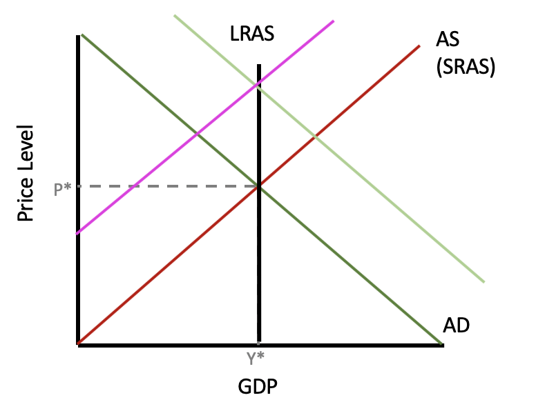
We move right back to our sustainable LRAS level of real GDP. The market has essentially corrected itself through changes in the price level.
However, keep in mind that although we are back at the sustainable level of real GDP, notice that prices have significantly risen from where they were.
Now, will this same self-correction occur when the economy is in a recession?
Here is an AD/AS model during a trough, or in a recession. In theory, since inventories are starting to build up because of low demand, suppliers might start to lower prices.
If they did, that would allow SRAS to shift to the right. Workers might even be willing to work for less as unemployment is high during a recession.
If prices do fall, then the market can naturally correct, bringing the economy back to full employment.
However, this isn’t as common as we saw with the opposite, in an expansionary economy.
So, if it doesn’t occur, if prices do not adjust downward, then we could be stuck here:

Prices do not always adjust downward. When suppliers are reluctant to lower prices, as they commonly are, prices are said to be sticky. These sticky prices refer to prices that do not easily move below the threshold value, even though the theory would anticipate a decline to reestablish our market equilibrium.
In this case, the economy could be stuck in a recession indefinitely. For this reason, the government and/or Federal Reserve System will often intervene to try to increase aggregate demand to get us back to full employment.
Source: Adapted from Sophia instructor Kate Eskra.