Table of Contents |
A good presentation is a mix of visual elements, spoken and nonverbal communication, and audience engagement. The visual elements are usually created and delivered using slide deck software like PowerPoint, Keynote, or Google Slides. They usually include text, images, and supporting graphics. Slide deck software can also be useful in planning your presentation. Each concept, activity, or planned interaction with the audience can be recorded on a slide and the deck arranged and rearranged until you have a good plan.
However, it’s important not to be over-reliant on the slide deck, loaded with talking points that you will use, as a teleprompter. Use them instead as cues for you and to emphasize the most important words and ideas for the audience. You may have heard (or even voiced) complaints about boring slide presentations; that feeling usually comes from text-heavy slides.
As noted in the last lesson, the font size should be no smaller than 30 points. This is an approximate; in fact the readability of text across the room will depend a lot on the size of the screen and the size of the room. The important thing is to think about minimizing text and maximizing font size.
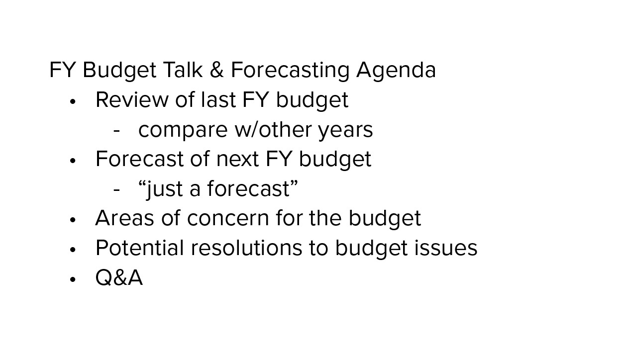
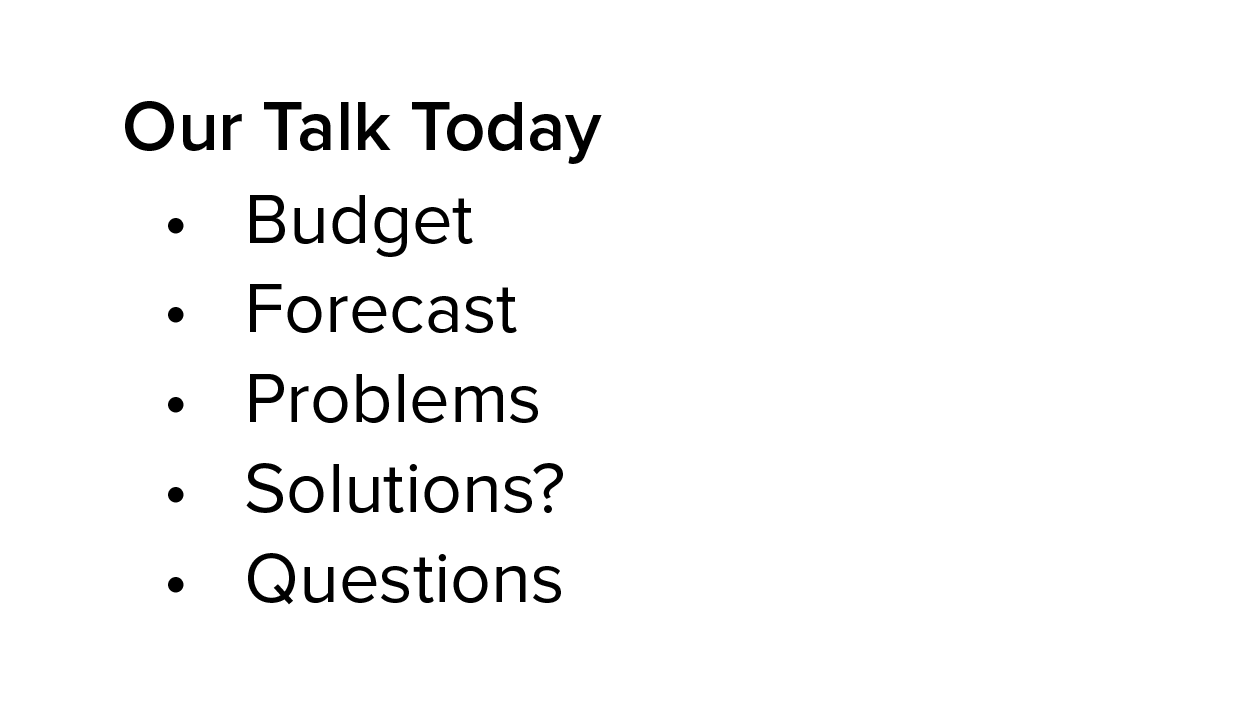
A good font size limits you to seven or eight lines of text, which is fine if they are short lines. However, be careful—seven or eight long lines of text will create a block of text for the audience. For example, the two slides below have the same content but the first presents a block of text, while the second is optimized for easy scanning.
|
|
In addition to watching the size and quantity of text, make sure the font itself is easy to read. Remember that a sans serif font is preferred for screens, and this is especially true when the screen is viewed from a distance. Opt for something like Arial, Helvetica, or Futura.
Your workplace may have a template or organizational colors to use in your slide decks. If not, make sure that there is a good contrast between the background and the font color, especially being mindful of combinations that are hard (even impossible) for people with color blindness to read, such as green on blue or red on green. Good combinations include a dark blue against a very light tan or amber background, or a dark brown or orange font against a very light blue background.
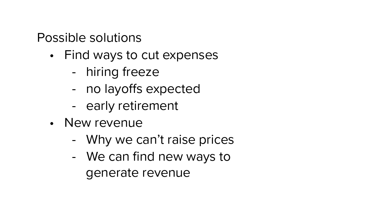
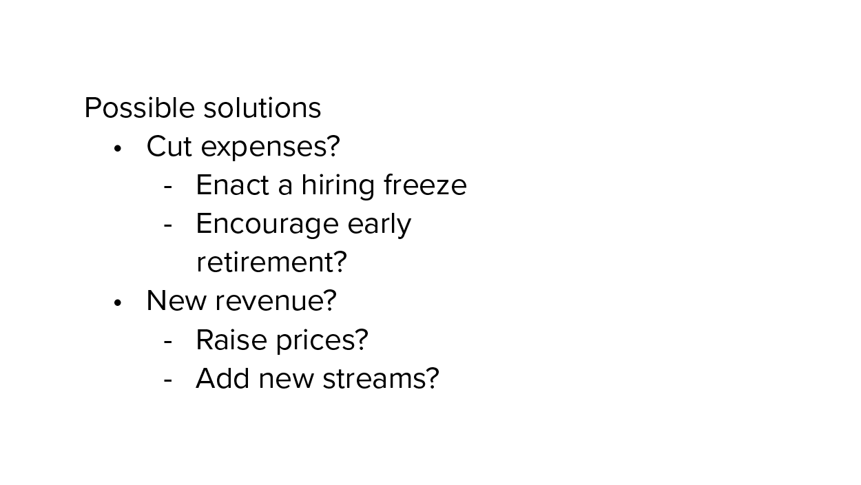
As with writing messages and documents, make sure your bullet points are parallel in phrasing. For example, consider the following slide about the budget shortfall. In the first slide, the bullet points are a mix of action verbs and noun phrases. Some of the supporting points are clearly action steps, others are vague, and yet others stifle the conversation. On the second slide there is consistency in the phrasing with action verbs; audience participation is encouraged more by phrasing them as questions.
|
|
In short, make sure your text is readable (even from forty feet away) and compelling.
There are compelling reasons to add images like photographs or illustrations to a slide deck (we discuss other kinds of graphics below). Images can also improve the comprehension of the message, capture audience interest, or communicate a mood. But how do you choose the right picture to match your content?

The most important question to ask is whether (and how) the image supports the main point of the slide or helps engage the audience. Is it a literal illustration, like showing an intersection in a presentation on traffic safety? Or is it a metaphorical use, like showing an intersection to represent a “crossroads,” a time for a crucial decision? Either way, the reason you selected that image should be immediately clear to the audience unless you are being mysterious on purpose to engage the audience, perhaps posting an intersection with the question, “Why did the organization cross the road?”
The second most important question is whether the quality of the image represents you and the organization well. For example, using stock images or photographs with poor resolution (and perhaps a visible watermark!) are going to do more harm than good. But an effective image will help communicate your message or keep the audience engaged and looking at the screen.
Keep the following rules in mind when selecting images:

|

|
Another well-known feature of a slide deck is the chart or graph. Though these can be extremely useful in communicating facts and figures. If you use one in your presentation, it’s important to keep three questions in mind:
Bar graphs are used to compare quantities across categories. For example, in the chart below the audience may not be able to read the labels, but can see at a glance that one product line is not bringing in much revenue compared to the other three, and that may be the main purpose of the message.
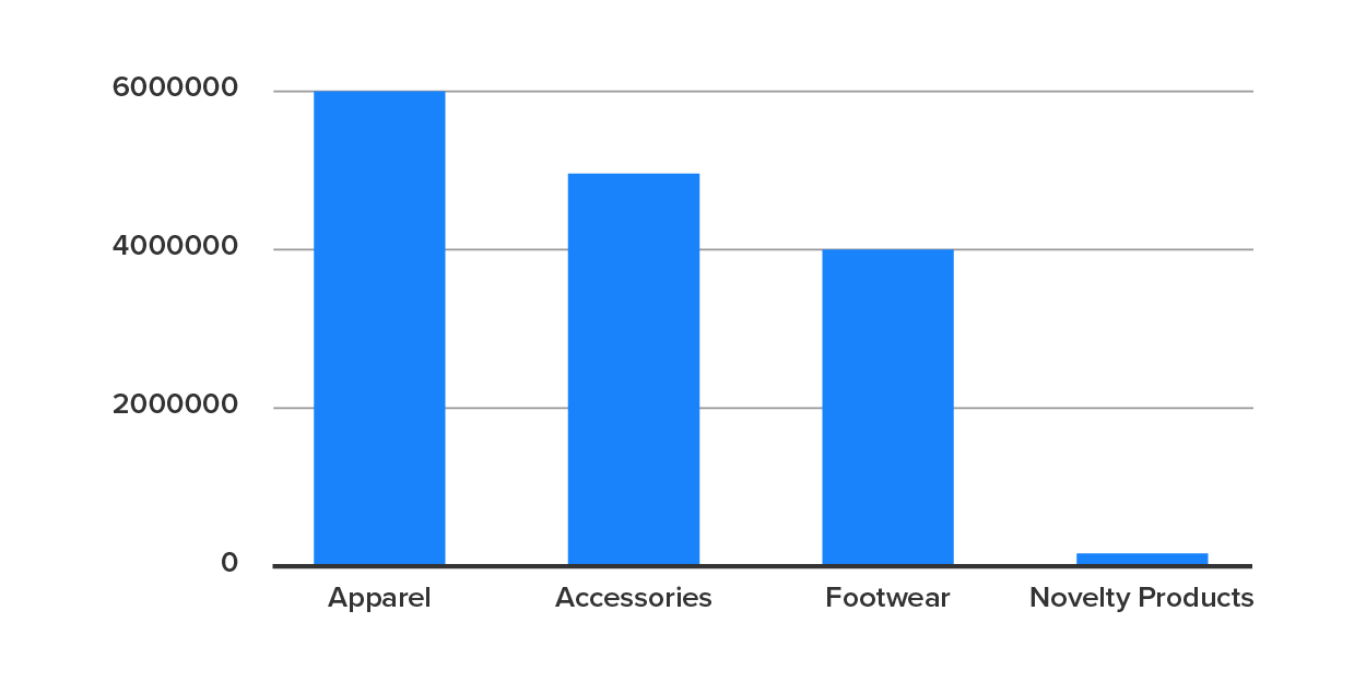
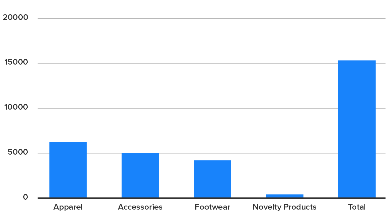
A common mistake with this graph type is including the total on the bar graph, which may even be done automatically by the spreadsheet software. It now looks like there’s one product line that’s running away from the competition, when in fact it is the total and should not be shown as parallel or comparable to the other columns.
Line graphs are used to show trends, almost always over time. This image shows revenue year by year; the trend line makes sense because it shows revenue increasing and then taking a sharp turn and decreasing. As above, it might not matter if people can read the small print; the image communicates the crisis at a glance. The presenter can indicate the turning point and indicate what changed that reversed the trend line.
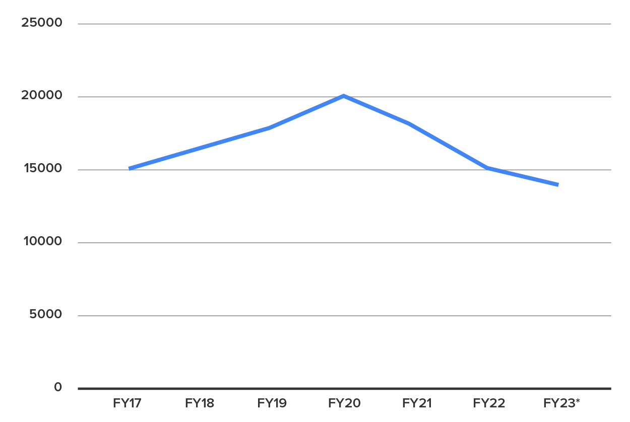
Keep in mind that a trend line is almost always used to show progression of the same value or values over time. While columns might be used to show the above values of revenue over time and send the same message, the trend line should not be used as a comparison between product lines. In fact, this would probably scare people a lot more than necessary!
Pie Charts are only used when showing the parts of a whole, such as how a budget is being spent or the demographic breakdown of an organization. For example, the same data shown above in column form can be shown as a pie chart, presuming all sales are accounted for. As before, be sure the total is not included or it will skew the graph! The entire pie represents the total.
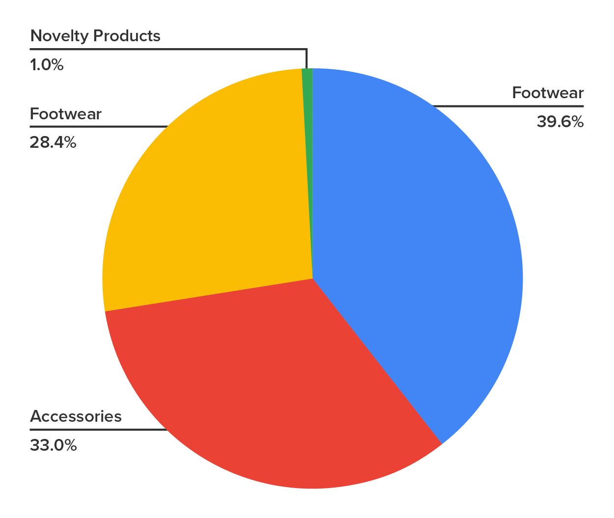
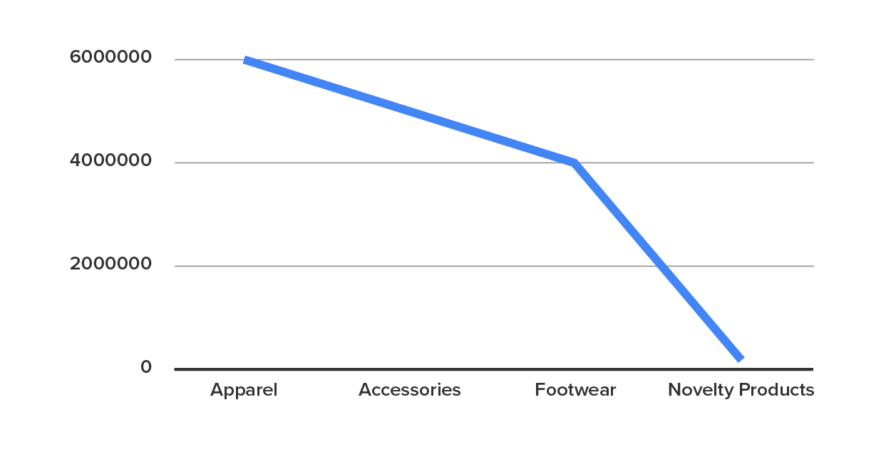
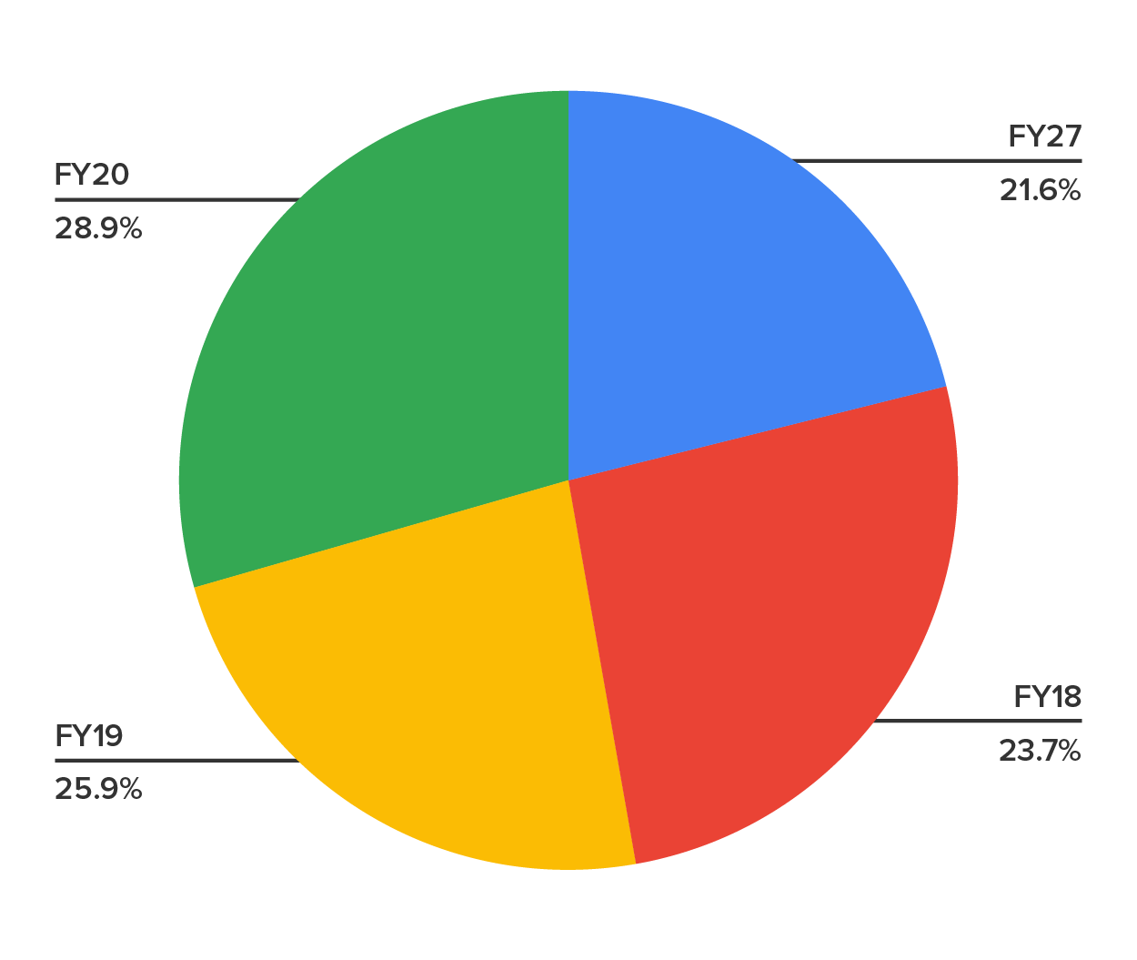
However, a pie chart is not appropriate for comparisons that are not meaningful as a whole. If one were used to show revenue over time, for example, this obscures the point that revenue increased then dropped, and there is no significance to seeing the four years as a whole.
There are numerous other options available, including “stacked” versions of both trend lines and bar graphs which can show data in far more detail. These are generally too complicated to be used in a presentation, and the best advice is to avoid them for this purpose.
A diagram is a visual representation of information that is not measured in numbers. These are also commonly used in presentations to convey more abstract or complicated ideas. These can usually be done using shapes, lines, and arrows that come with most word processing programs along with text boxes.
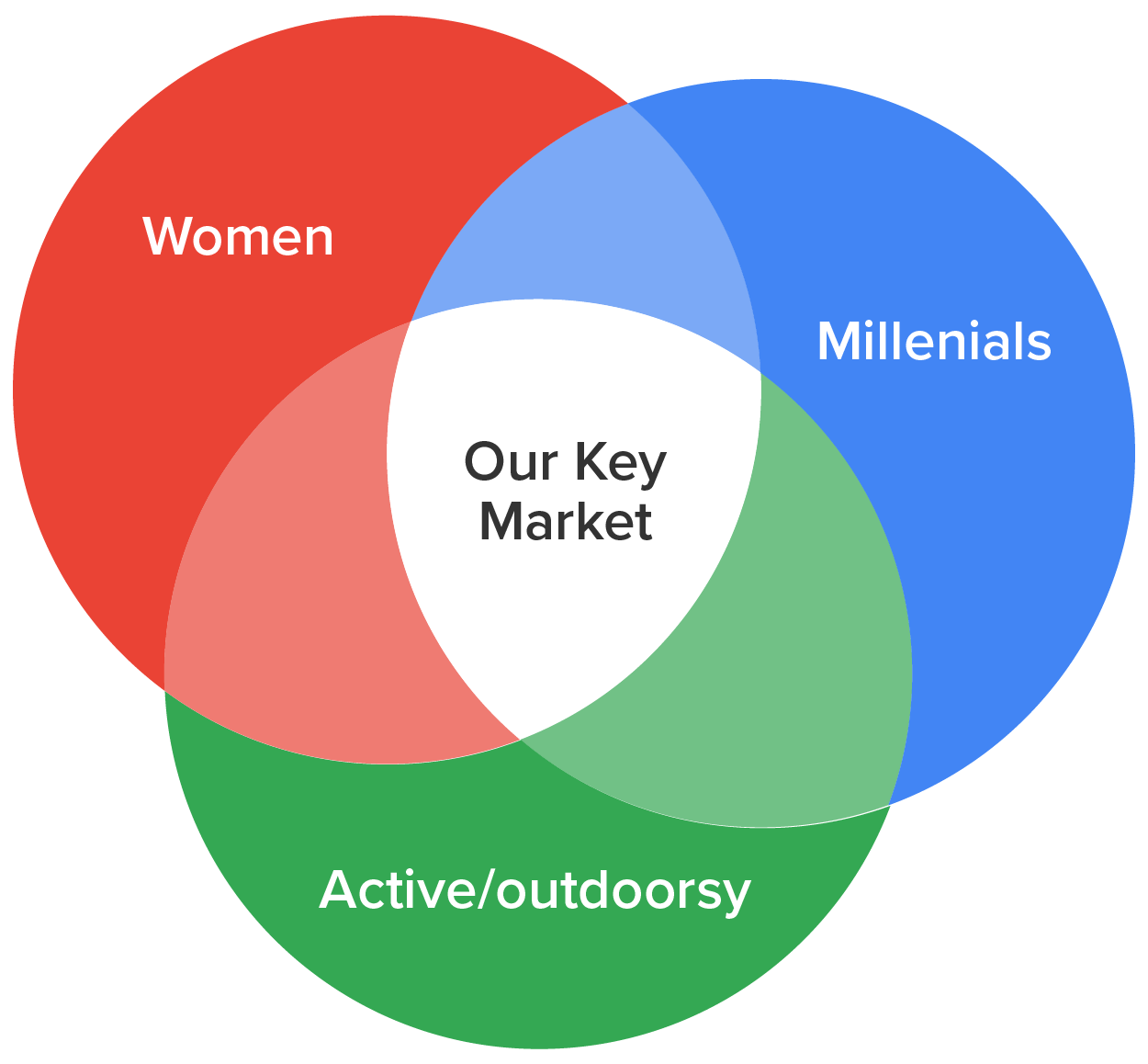
Venn diagrams are overlapping circles that show the relationships between two or more categories. Since the graph is conceptual, you don’t have to worry about the exact size of the circles or overlaps unless the diagram conveys misinformation. In this example, it may be used to stress the intersection of qualities a business wants to appeal to.
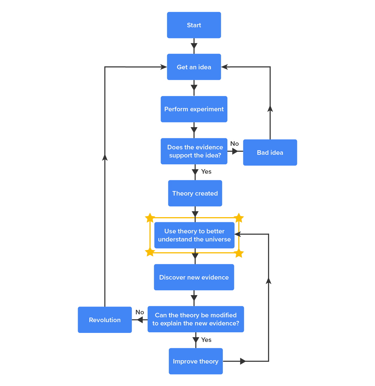
Flow charts show a process or algorithm that leads to a decision. These may be useful, for example, in telling staff what to do in certain situations.
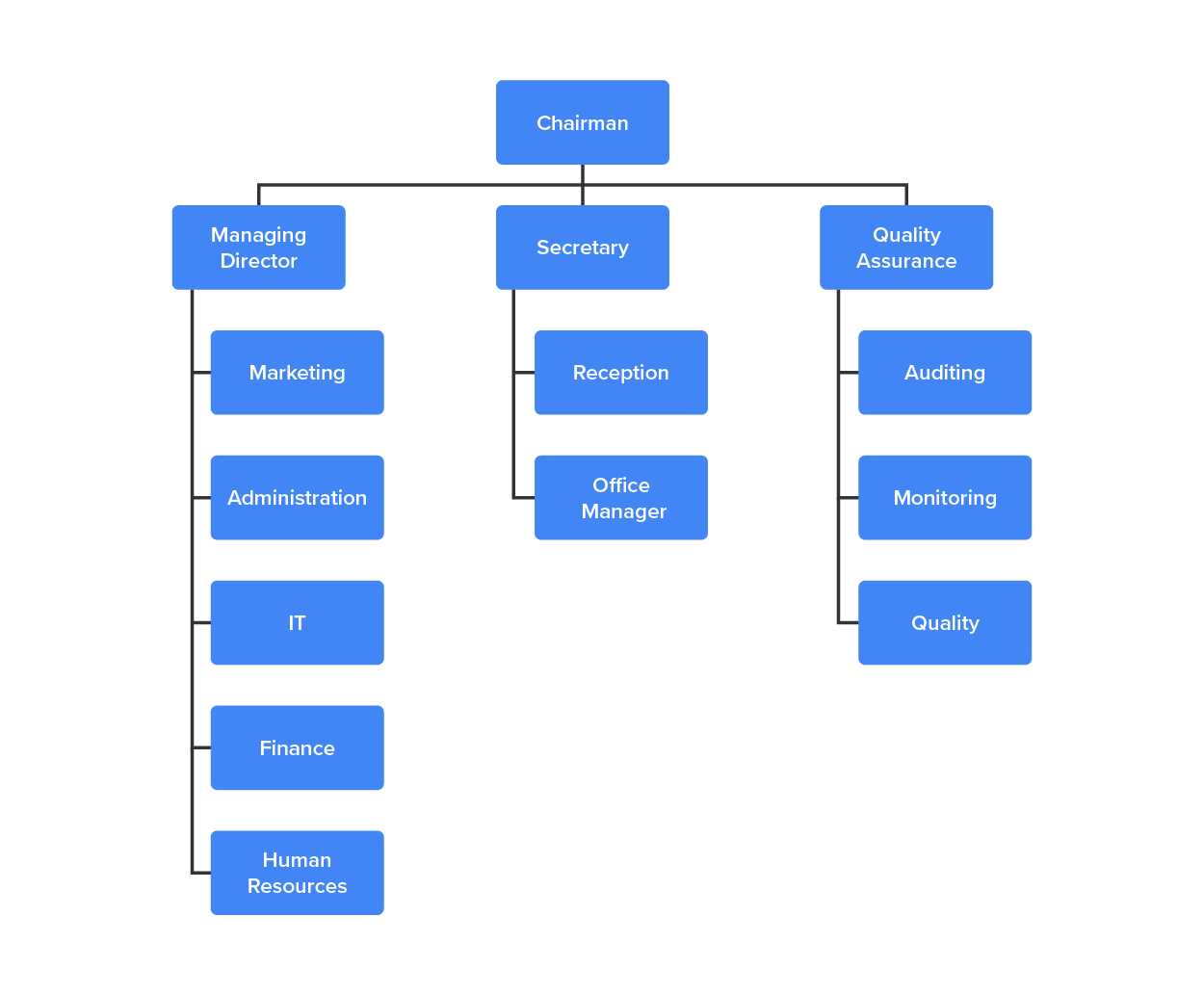
Organizational charts show the structure of an organization, and may be frequently used in orientations of new staff or describing organizational change.
As with charts and graphs, there are many other kinds of diagrams that may make it easier to convey a point at a glance and even serve instead of several slides worth of text. For example, you may use a concept map, similar to the one discussed in the previous unit, or generate a unique diagram to communicate your purpose. Just be sure it is readable across the room and suits your purpose.
Source: This tutorial has been adapted from Lumen Learning "Business Communication Skills for Managers." Access for free at courses.lumenlearning.com/wm-businesscommunicationmgrs. License Creative Commons Attribution 4.0 International. Accessed by October 2021.