Use Sophia to knock out your gen-ed requirements quickly and affordably. Learn more
×

Best-Fit Line and Regression Line

Author: Sophia

what's covered
This tutorial is going to cover what the best-fit line is used for. Our discussion breaks down as follows:

Table of Contents

1. Best-Fit Line/Regression Line

Imagine a line going through a pack of points. That line is going to be called a best-fit line, or a trend line, or a regression line. The idea of a line of best fit is that it will roughly approximate what's going on with the data in the form of a single line.

EXAMPLE

Suppose we have the following scatterplot.
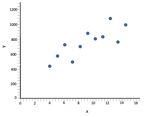
A scatterplot with the x-axis ranging from 0 to 16 at intervals of 2 and the y-axis ranging from 0 to 1,200 at intervals of 200. The points follow a moderate upward linear pattern, rising overall from left to right. The data points are approximately at (4, 440), (5, 580), (6, 730), (7, 500), (8, 700), (9, 890), (10, 810), (11, 830), (12, 1,080), (13, 760), and (15, 990).
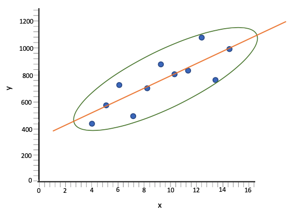
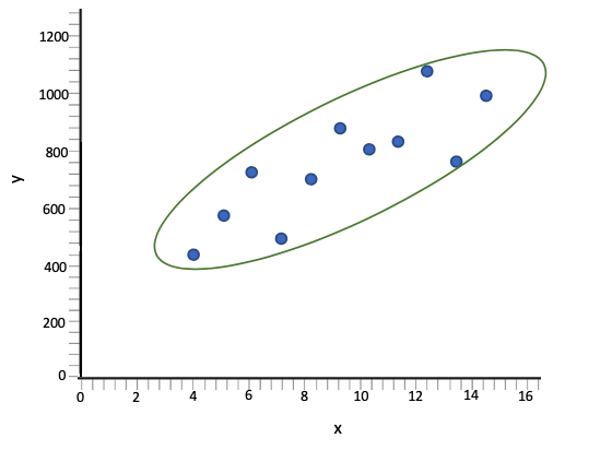
One easy way to visually draw a best-fit line is to first place an oval over the top of your points.
A scatterplot with the x-axis ranging from 0 to 16 at intervals of 2 and the y-axis ranging from 0 to 1,200 at intervals of 200. The points follow a moderate upward linear pattern, rising overall from left to right with some scatter. The data points are approximately at (4, 440), (5, 580), (6, 730), (7, 500), (8, 700), (9, 890), (10, 810), (11, 830), (12, 1,080), (13, 760), and (15, 990). A tilted oval encloses the cluster of points, extending from the lower left to the upper right.
The oval can be symmetric along what we call the minor axis, which is essentially cutting it the hamburger way, or you can cut it along the longer, major axis, which is typically called the hot dog way. You're going to cut it the longer way, which is a fairly good approximation at a line of best fit.
A scatterplot with the x-axis ranging from 0 to 16 at intervals of 2 and the y-axis ranging from 0 to 1,200 at intervals of 200. The points follow a moderate upward linear pattern, rising overall from left to right with some scatter. The data points are approximately at (4, 440), (5, 580), (6, 730), (7, 500), (8, 700), (9, 890), (10, 810), (11, 830), (12, 1080), (13, 760) and (15, 990).  A tilted oval encloses the cluster, extending from the lower left to the upper right, to highlight the overall upward trend. An upward-sloping line passes through the center of the oval to represent a best-fit line.
Roughly half the points fall above and below the line. In this particular example, about five of them are fairly near the line, three are substantially below, and three are substantially above.

big idea
The term "best-fit line" can be used interchangeably with the terms "trend line" and "regression line."

term to know
Best-Fit Line/Trend Line/Regression Line
A line that closely approximates the response values for given explanatory values when the form of the scatterplot is linear.


2. Features of a Best-Fit Line

A good best-fit line will have the following features:

  • Roughly half the points above and below the line
  • No pattern to how the points are "off" from the line

EXAMPLE

This is a poor choice of a trend line. It does not cut the "oval" the long way, and there is a pattern to how the points are above or below the line. With this trend line, any point below the line is off to the right, and any point above the line is off to the left.
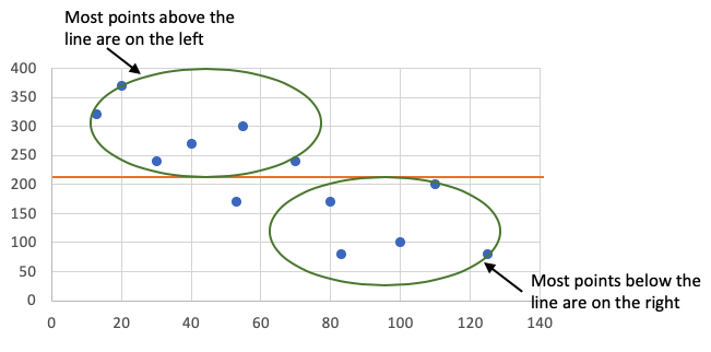
A scatterplot in a grid chart with the x-axis ranging from 0 to 140 at intervals of 20 and the y-axis ranging from 0 to 400 at intervals of 50. The points follow a downward pattern from left to right and are plotted approximately at (10, 320), (20, 370), (30, 240), (40, 270), (55, 300), (54, 170), (70, 240), (80, 170), (83, 80), (100, 100), (110, 200), and (125, 80). A horizontal line is drawn across the graph from (0, 205). An oval surrounds several points above the line on the left side of the graph, with a label reading 'Most points above the line are on the left.' A second oval surrounds several points below the line on the right side of the graph, with a label reading 'Most points below the line are on the right.'

EXAMPLE

Below is a better trend line because the points that are above and below are peppered throughout. You don't want a pattern to how the points are off from the line.
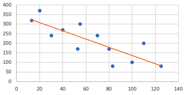
A scatterplot in a grid chart with the horizontal axis ranging from 0 to 140 at intervals of 20 and the vertical axis ranging from 0 to 400 at intervals of 50. The points follow a downward trend from the left to the right and are plotted approximately at (15, 315), (20, 370), (30, 240), (40, 265), (55, 165), (57, 300), (70, 240), (80, 160), (83, 80), (100, 100), (110, 200), and (125, 80). A straight line slopes downward, passing through some of the points, with some points above the line and others below it.


3. Uses for a Best-Fit Line

What is a trend line used for? A line of best fit is used to give approximations for values of x and values of y—even on places where there is an existing value of y.

EXAMPLE

In the scatterplot below, when x equals 6, there's a difference between the actual value of y at 6 and what the line predicts as the value of y at 6.
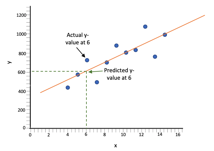
A scatterplot with the x-axis ranging from 0 to 16 at intervals of 2 and the y-axis ranging from 0 to 1,200 at intervals of 200. The points follow a moderate upward linear pattern, rising overall from left to right. The data points are approximately at (4, 440), (5, 580), (6, 730), (7, 500), (8, 700), (9, 890), (10, 810), (11, 830), (12, 1,080), (13, 760), and (15, 990). A best-fit straight line rises from left to right, passing through most of the data points. A dashed horizontal line extends from the y-axis at approximately y equals 600 to the best-fit line at x equals 6, and a dashed vertical line extends downward from that point to the x-axis. The point where the dashed lines meet the best-fit line is labeled 'Predicted y-value at 6.' The data point above the best-fit line at x equals 6 is labeled 'Actual y-value at 6.'

try it
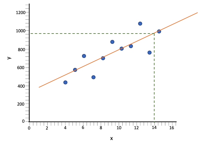
You can use this line to predict other values. What does this best-fit line predict for y if x was 14?

Go over to 14 and then up until you get to the best-fit line. Then go over to the y-axis to figure out how high it is at that point. It's at about 960. You can say that the prediction for x being 14 is y being 960.
A scatterplot with the x-axis ranging from 0 to 16 at intervals of 2 and the y-axis ranging from 0 to 1,200 at intervals of 200. The points follow a moderate upward linear pattern, rising overall from left to right. The data points are approximately at (4, 440), (5, 580), (6, 730), (7, 500), (8, 700), (9, 890), (10, 810), (11, 830), (12, 1,080), (13, 760), and (15, 990). A best-fit straight line rises from left to right, passing through most of the data points. A dashed horizontal line extends from the y-axis at approximately y equals 960 to the best-fit line at x equals 14, and a dashed vertical line extends downward from that point to the x-axis at x equals 14.

summary
A best-fit line, or regression line can approximate the general trend of what is occurring in a scatterplot—how the y values relate to the x values. The features of a good best-fit line are that it is cut down the middle, and it has a peppering of points above and below it. It will be a random scatter, as opposed to some systematic flaw in it. A line of best fit is used to give approximations for values of x and values of y—even on places where there is an existing value of y.

Good luck!

Source: THIS TUTORIAL WAS AUTHORED BY SOPHIA LEARNING. PLEASE SEE OUR TERMS OF USE.
Terms to Know
Best-Fit Line/Trend Line/Regression Line

A line that closely approximates the response values for given explanatory values when the form of the scatterplot is linear.