Table of Contents |
Categorical data is qualitative data, and it can be displayed visually in a bar graph, which will compare the number of values in each category. A bar graph is not the only way to display categorical data, but it is a common way.
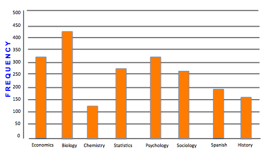
Suppose there are 2,070 students enrolled in the following college courses, which are taken by different majors. At this particular college, there are 331 economics majors, 435 biology majors, 124 chemistry majors, etc.
| Course | Frequency |
|---|---|
| Economics | 331 |
| Biology | 435 |
| Chemistry | 124 |
| Statistics | 248 |
| Psychology | 311 |
| Sociology | 248 |
| Spanish | 207 |
| History | 166 |
You begin by drawing a horizontal axis and labeling the categories beneath it. You could also label the categories from top to bottom on the vertical axis if you want. So, you write economics, biology, chemistry, and visually separate them.

Then, you need to create a vertical axis with frequency on it. The highest number in the data set is 435, so a smart choice would be to have the vertical axis frequencies go up to 450, or even 500. This way, all values will be represented.
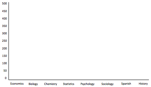
Finally, you set up a bar that goes up to the number that corresponds to that category. Therefore, economics will have a bar that goes up to 331, biology will go all the way up to almost 450, etc.
The full bar graph looks like this:
You can also use a bar graph to show relative frequency. Relative frequency shows how much of the whole each class represents. It is the percent of the values that are in each category.
How do you calculate relative frequency? Take each number and divide it by the total number.
| Course | Frequency | Relative Freq |
|---|---|---|
| Economics | 331 | /2,070 = 16% |
| Biology | 435 | /2,070 = 21% |
| Chemistry | 124 | /2,070 = 6% |
| Statistics | 248 | /2,070 = 12% |
| Psychology | 311 | /2,070 = 15% |
| Sociology | 248 | /2,070 = 12% |
| Spanish | 207 | /2,070 = 10% |
| History | 166 | /2,070 = 8% |
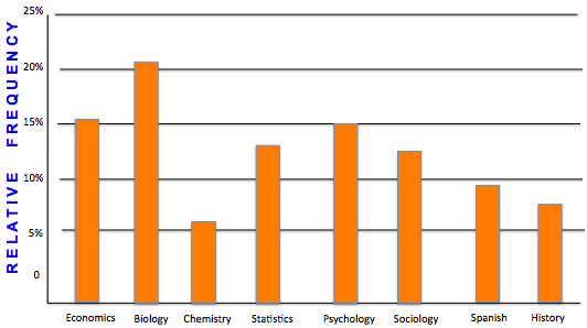
Notice that in the previous example with counts, and this example with relative frequency, the shape and size of the bars didn't change. The only thing that changed was the vertical axis and what it was measuring.
Suppose that you wanted to know about the work habits of college students, so you sample 100 students. Perhaps you want to know if they were male or female, and whether they did not work at all, worked during summer only, or had a job all year long.
The following table shows the data collected in this sample.
| Male | Female | |
|---|---|---|
| No Job | 25 | 28 |
| Summer Only | 17 | 10 |
| Job All Year | 11 | 9 |
You can create multiple bar graphs on the same set of axes and compare them by category. One way to display these items in a bar graph would be to break it up by male and female. You choose green to be males and yellow to be females.
Next, you would break the horizontal axis into no job, summer job only, and job all year.
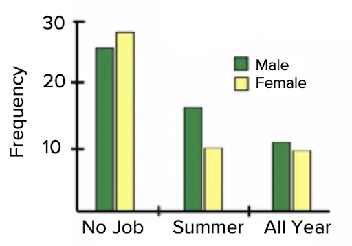
Both bar graphs would be presented side by side within each category. There are 25 males who had no job and 29 females who had no job, etc.
What this one tells us is that males are more likely than females to have a job all year and in summer, and a little bit less likely than females to never have had a job.
The other way would be to flip-flop which category is represented by the colors and which category goes on the axis. Male and female could go on the axis, and the job status could be the colors. In that case, it would look like the following graph:
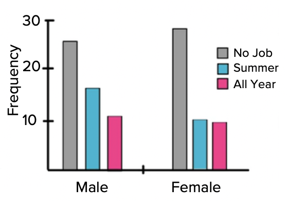
This graph will tell you that both males and females have a tendency towards not having a job, then have a summer job or have a job all year.
As mentioned, qualitative data can be displayed in a couple of different ways. As discussed above, one way is to display it in a bar graph. Another way to display it is with a pie chart (also known as a circle graph). A pie chart displays relative frequencies for each category, which considers how these categories relate to the whole.
Let's use the same set of information from the first example with the 2,070 students enrolled in college courses.
To make a pie chart, the first thing to do is to calculate relative frequencies. Remember, relative frequency is the percent of the values that are in each category and can be calculated by dividing each data value by the total number.
| Course | Frequency | Relative Freq |
|---|---|---|
| Economics | 331 | /2,070 = 16% |
| Biology | 435 | /2,070 = 21% |
| Chemistry | 124 | /2,070 = 6% |
| Statistics | 248 | /2,070 = 12% |
| Psychology | 311 | /2,070 = 15% |
| Sociology | 248 | /2,070 = 12% |
| Spanish | 207 | /2,070 = 10% |
| History | 166 | /2,070 = 8% |
Step 1: First, find the relative frequency.
Step 2: Next, calculate the central angle for each category using the relative frequency. You may recall there are 360 degrees in a circle. The central angle for economics has to be 16 percent of the circle. So, how do you set this up? You need 16% of 360 degrees. Multiply each percent by 360.
| Course | Frequency | Relative Freq | Angle |
|---|---|---|---|
| Economics | 331 | ÷ 2,070 = 16% | x 360 = 57.6° |
| Biology | 435 | ÷ 2,070 = 21% | x 360 = 75.6° |
| Chemistry | 124 | ÷ 2,070 = 6% | x 360 = 21.6° |
| Statistics | 248 | ÷ 2,070 = 12% | x 360 = 43.2° |
| Psychology | 311 | ÷ 2,070 = 15% | x 360 = 54° |
| Sociology | 248 | ÷ 2,070 = 12% | x 360 = 43.2° |
| Spanish | 207 | ÷ 2,070 = 10% | x 360 = 36° |
| History | 166 | ÷ 2,070 = 8% | x 360 = 28.8° |
Now, 0.16 times 360 gives you about 58 degrees. Therefore, your central angle, representing economics, will be approximately 58 degrees. Do the same thing with the remainder of the categories to obtain angle measurements for each of these central angles.
Step 3: Once you have determined the relative frequency of each category, you can create the sectors of your pie chart, shown below:
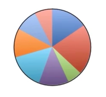
But which sector corresponds to which category? You could write the words inside each sector, labeling each with the names of the majors. It's fairly clear that the biggest slice is biology. But which ones are the rest? You need to create a key.
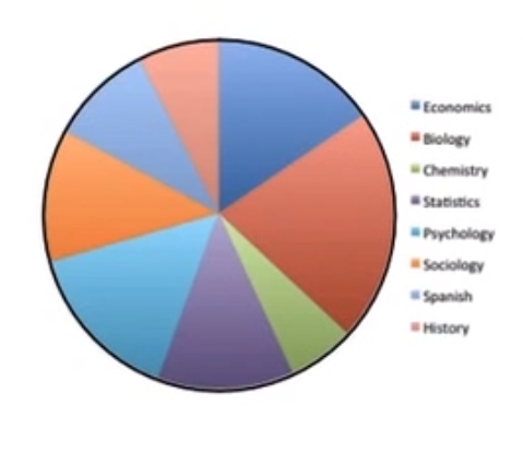
Step 4: Finally, add a key off to the side. You can either have written the word “economics” within the blue sector, or you can create a blue square and write “economics” next to it. That shows that anything that's blue means economics. You can do the same for each of the sectors.
Source: THIS TUTORIAL WAS AUTHORED BY JONATHAN OSTERS FOR SOPHIA LEARNING. PLEASE SEE OUR TERMS OF USE.