In this lesson, you will review residuals and use residuals to assess the fit of a simple linear regression model. Specifically, this lesson will cover:
1. Introduction to Residuals and Their Importance in Regression Models
In the previous tutorial, you built a simple linear regression model in Python to predict the amount of donations based on the number of social media shares a donation campaign receives for a non-profit organization.
Now, let’s take a step forward and review and explore more deeply a concept you have seen previously: residuals. Understanding residuals will help you see how well your model is performing and where it might need improvement.
This tutorial will continue from the previous tutorial, in which you have:
-
Explanatory Variable (X): Number of social media shares
-
Response Variable (Y): Amount of donations
Residuals are the differences between the actual donation amounts and the amounts predicted by your model. Think of them as little clues that tell us how accurate the model’s predictions are.
Let’s get started and see how these clues can help us improve our predictions!
1a. Residual Calculation and Interpretation
Just to refresh your memory, residuals are the differences between the actual values and the values predicted by your model. They help you see how accurate the model’s predictions are.
Residuals are denoted by e and can be found by computing  where y is the observed value of the response variable and
  is the predicted value of the response variable.
For every row in the data set, you will obtain a residual.
Let’s compute and interpret a residual from the donation prediction model for the non-profit organization.
-
EXAMPLE
Recall that you are using data from a non-profit organization to predict the amount of donations based on the number of social media shares a donation campaign receives. In the previous tutorial, you built a simple linear regression model to predict the amount of donations the non-profit will receive based on the number of social media shares a campaign receives.
Suppose you want to compute the residual for the first observation.
The first five rows of the donations pandas DataFrame look like:

And, from the previous tutorial, the summary of the model output is provided below:
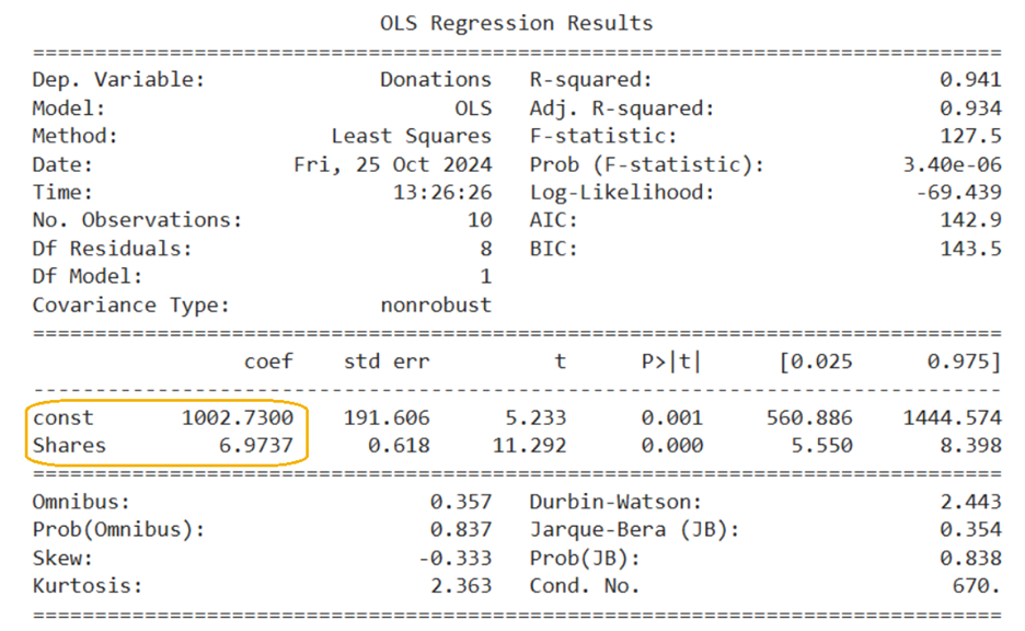
With these two pieces of information, you now have everything you need to compute the residual for the first observation.
Residual for the first observation:

y is the observed value of the response variable. That is, the first value of the response variable (Donations) in the DataFrame, which is 1,429.22.
is the predicted donation amount for the second observation. The predicted value
can be calculated using the regression equation from the model summary.

To find the predicted donation amount, substitute the value of x (Shares) for the first observation into the regression equation.

Now, you can find the first residual.
-

Interpretation of the first residual:
This positive residual indicates that the actual donations received were $77.99 higher than what the model predicted, based on the number of social media shares.
In the context of your non-profit organization, this means that for the first campaign, the model slightly
underestimated the amount of donations that would be received, given the number of social media shares.
Now that you have successfully computed the residual for the first observation, let’s move on to the next exercise, where you will apply the same process to calculate the residual for the second observation in the data.
-
Calculate the second residual by finding the difference between the observed and predicted donation amounts using the regression equation, and then interpret what this residual means in the context of the problem.
Solution:
The second residual is -279.23. A residual of -279.23 indicates that the actual donation amount for the second observation was $279.23 less than what the model predicted, based on the number of social media shares. In the context of your non-profit organization, this means that for the second campaign, the model overestimated the amount of donations that would be received, given the number of social media shares.
y is the observed value of the response variable. That is, the second value of the response variable (Donations) in the DataFrame, which is 1,420.04.
is the predicted donation amount for the second observation. The predicted value
can be calculated using the regression equation from the model summary.
To find the predicted donation amount, substitute the value of x (Shares) for the second observation into the regression equation.

Now, you can find the first residual.

1b. Finding Residuals in Python
You will now return to the example in which you previously built a simple linear regression model for a non-profit organization to predict the amount of donations based on the number of social media shares a donation campaign receives.
If you need to open your saved and downloaded file, you can refer to the previous tutorial to open the file.
You will be importing the same Excel file (donations.xlsx) that you worked with in the last tutorial that is stored in a Github repository. You will import the Excel file into Python and create a pandas DataFrame named donations using the code below.
This code below imports the pandas Python library, reads the Excel file from a URL, creates a pandas DataFrame named donations, and allows you to view the first five rows of the donations DataFrame.
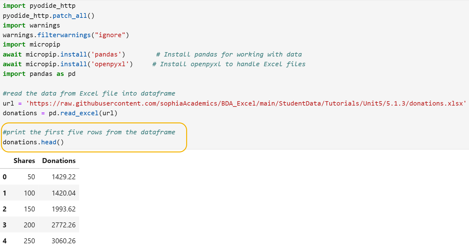
Note the code circled in yellow is new; here the head() function is used instead of print(), as in the last tutorial. Remember, the head() function is convenient if you just want to obtain a quick view of your data. For example, you can remind yourself of how the data looks and the names of the columns in the DataFrame. Below are some helpful notes on the head() function:
- head() function
- A function specific to pandas DataFrames
- Returns the first five rows of the DataFrame by default
- Useful for quickly inspecting the beginning of a DataFrame

Now, let’s revisit how we built a simple linear regression model using Python for the amount of donations the non-profit will receive based on the number of social media shares a campaign receives.
The code below builds a simple linear regression analysis using the statsmodels library. It defines the explanatory variable (number of shares) and the response variable (amount of donations) from a DataFrame, adds a constant to include an intercept, and builds the regression model using the Ordinary Least Squares (OLS) method. In addition, the new code circled obtains the residuals for each observation using Python and prints them on the screen.
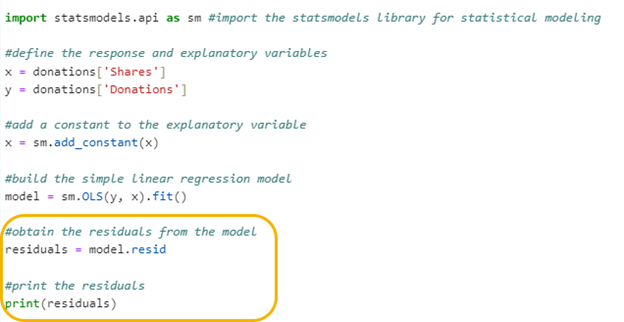
Let’s break down the last two lines of the code to understand how the Python code is producing the residuals.
Step 1: Obtain the Residuals from the Simple Linear Regression Model
residuals = model.resid
- This line extracts the residuals from the fitted linear regression model. This line of code does two things:
- model: This is the object that holds the results of your linear regression model.
- resid: This is a property of the model object that contains the residuals.
The two-level name model.resid is used to obtain the residuals from the simple linear regression model.
The residuals are placed in a variable named residuals.
Step 2: Print the Residuals
This line prints the residuals, as shown below:
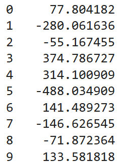
You should see that the first two residuals match the computations from the example and Try It exercise from the previous section. The slight differences are from rounding errors when computing the residuals manually.
2. Residuals Plots for Assessing the Fit of a Simple Linear Regression Model
In business data analytics, it is important to understand how well your models are performing. One way to do this is by looking at plots of the residuals. Residuals help us see the difference between the actual data points and the values our model predicts.
By “fit” of a model, what is meant is how well the model’s predictions match the actual data. A good fit means the model’s predictions are close to the real values, while a poor fit means there’s a big difference between the predictions and the actual data.
In this section, you will explore how to use residual plots to assess the fit of a simple linear regression model. By examining these plots, you can better understand the accuracy of our model and make improvements if needed. This is crucial in business data analytics because accurate models help businesses make better decisions based on their data.
There are three types of residual plots that should be investigated to assess the fit of a simple linear regression model. A description of each is provided in the next several sections.
2a. Residuals vs. Fitted Values Plots
Let’s start by examining how we can use a residuals vs. fitted values plot to evaluate the regression model.
Definition: This residuals vs. fitted values plot shows the residuals on the vertical axis and the fitted values (predicted values) on the horizontal axis.
Why Examine This Plot: To check for non-linearity, unequal residual variances known as heteroscedasticity, and check for outliers.
Non-linearity:
- In a simple linear regression, you assume that the relationship between the explanatory variable and the response variable is a straight line.
- Non-linearity means that this relationship is not a straight line. Instead, it might be curved or have some other shape.
- If the residuals show a pattern, like a curve, it suggests that the linear model is not capturing the true relationship between the variables.
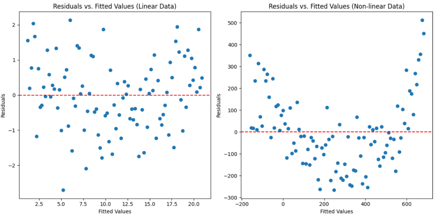
Below are two plots that illustrate what to look for in the residuals vs. fitted values plot when checking for non-linearity.
The plot on the left (Residuals vs. Fitted Values (Linear Data)) shows residuals from a linear relationship. The residuals are randomly scattered around the horizontal axis (zero line), indicating that the simple linear regression model is a good fit for the data.
The plot on the right (Residuals vs. Fitted Values (Non-linear Data)) shows residuals from a non-linear relationship. The residuals form a clear pattern, suggesting that the linear model is not capturing the true relationship between the variables. In the non-linear data plot, the curved pattern of the residuals indicates that the relationship between the predictor and response variable is not linear.
Now that using the residual vs. fitted values plot to detect non-linearity has been discussed, let’s move on to another important use of this same plot that is used to detect unequal error variances, also known as heteroscedasticity.
Unequal Error Variances (Heteroscedasticity):
- In a good linear regression model, the spread of the residuals should be roughly the same across all levels of the fitted values. That is, the residuals should have a constant variance.
- Unequal residual variances, or heteroscedasticity, occur when the spread of the residuals change. For example, the residuals might be more spread out at higher fitted values than at lower ones.
- This can be seen in the plot as a funnel shape, where the residuals fan out or widen as the fitted values increase. This indicates that the model’s residuals are not consistent, which can affect the reliability of the model’s predictions.
The “reliability of the model’s predictions” refers to how consistently accurate the model’s predictions are across different levels of the independent variable. When the residuals are not consistent, it means that the residuals (differences between the observed and predicted values) vary widely for different predicted values. In simpler terms, this means:
- If a model has heteroscedasticity, its predictions are not equally trustworthy for all data points, which can lead to less accurate and less dependable predictions in certain situations. This inconsistency can affect decision-making based on the model’s output.
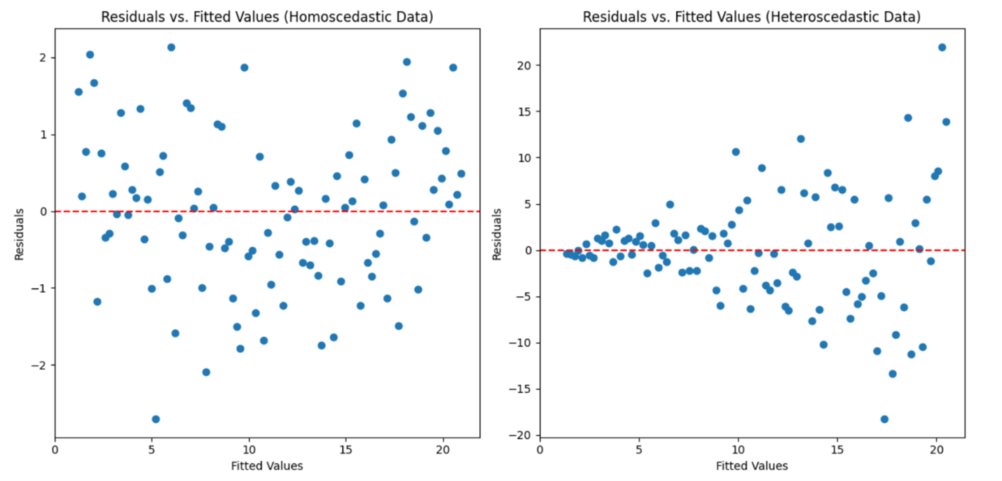
The two plots below illustrate what to look for in the residuals vs. fitted values plot when checking for constant variance of the residuals (heteroscedasticity).
The plot on the left shows residuals from data with constant variance (homoscedasticity). The residuals are randomly scattered around the horizontal axis (zero line) with a consistent spread, indicating that the model’s residuals are evenly distributed.
The plot on the right shows residuals from data with changing variance (heteroscedasticity). The residuals form a funnel shape, where the spread of the residuals increases with the fitted values, indicating that the model’s residuals are not consistent.
Outliers:
- In a simple linear regression, you assume that most of the data points follow a general trend, with some random variation. However, sometimes there are data points that are far away from this trend. These points are called outliers.
- Outliers are data points that have large residuals, meaning the difference between the observed value and the predicted value is much larger than for other data points.
- If the residuals vs. fitted values plot shows points that are far from the horizontal axis (zero line), it suggests that these points are outliers. Outliers can have a significant impact on the regression model, potentially skewing the results and leading to inaccurate predictions.
- “Skewing the results and leading to inaccurate predictions” means that these outliers can distort the overall analysis and affect the model’s ability to make reliable predictions. For example:
-
Skewing the Results: Outliers can pull the regression line away from the true trend of the data. This happens because the regression model tries to minimize the overall error, and outliers that have large residuals can disproportionately influence the model’s parameters (slope and intercept). As a result, the regression line might not represent the majority of the data accurately.
-
Leading to Inaccurate Predictions: Because the regression line is influenced by outliers, the predictions made by the model can be off. For example, if an outlier is much higher or lower than the other data points, the model might predict values that are too high or too low for new data points that are like most of the original data.
In simpler terms, outliers can make the model less reliable because they cause the model to fit the unusual points, rather than the general trend of the data. This can lead to predictions that are not accurate for most of the data. Identifying and addressing outliers is important to ensure that the model provides reliable and accurate predictions.
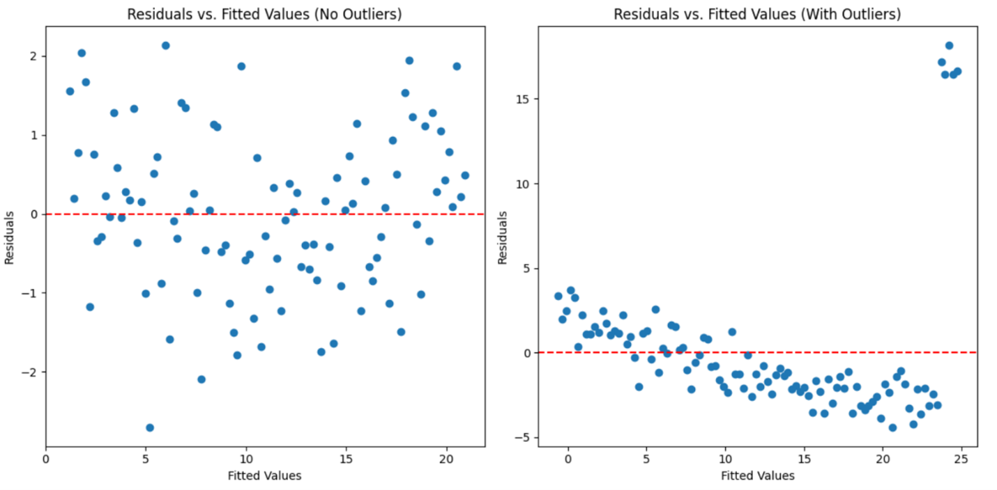
Below are two plots that illustrate what to look for in the residuals vs. fitted values plot when checking for outliers.
The plot to the left shows the residuals from a data set without outliers. The residuals are randomly scattered around the horizontal axis (zero line), indicating that the simple linear regression model is a good fit for the data.
The plot to the right shows the residuals from a data set with outliers. The residuals include points that are far from the zero line, indicating the presence of outliers. These outliers suggest that the model’s predictions may not be accurate, and the outliers need further investigation or adjustment.
The residuals vs. fitted values plot helps you check for non-linearity by revealing patterns in the residuals, assess constant variance (homoscedasticity) by showing whether the spread of residuals is consistent, and identify outliers by highlighting residuals that are far from the zero line. The residuals vs. fitted values plot is incredibly handy because it lets you spot non-linearity, check for constant variance, and identify outliers all in one go!
-
- Heteroscedasticity
- A situation where the variability of the residuals in a regression model is not constant.
- Homoscedasticity
- A situation where the variability of the residuals in a regression model is constant.
2b. Normal Q-Q Plot (Quantile-Quantile Plot)
The last item you need to check related to the residuals of a simple linear regression is to make sure the model’s residuals are normally distributed.
A normal Q-Q (Quantile-Quantile) plot is used to check this model assumption.
How it works:
-
Plotting Points: You plot the residuals on a graph against what we would expect if they were perfectly normal.
-
Straight Line: If the points form a straight line, our residuals are likely normal.
-
Deviations: If the points stray far from the line, our residuals might not be normal, indicating potential problems with our model.
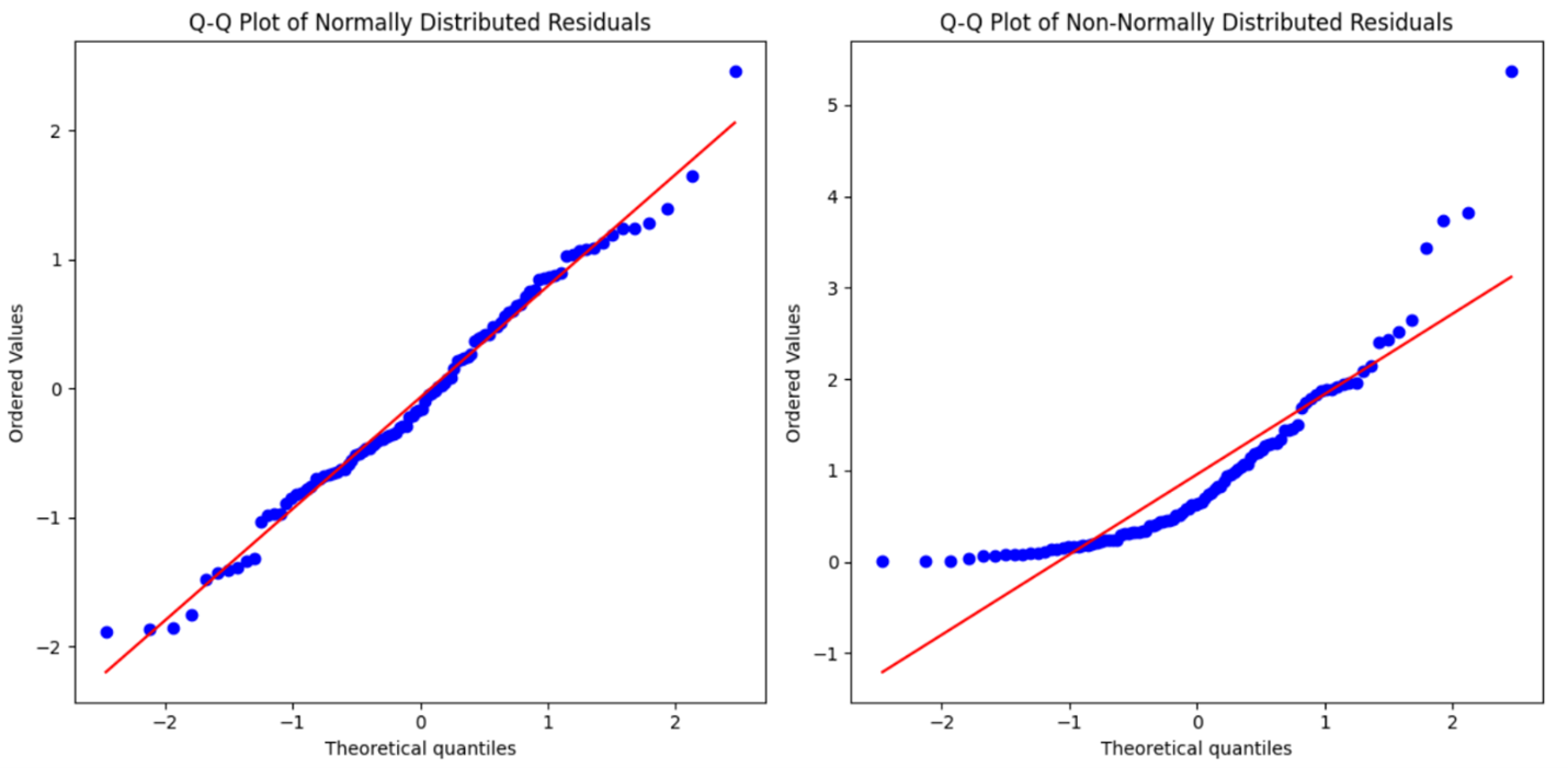
Below are two Q-Q plots that illustrate the difference between normally distributed residuals and non-normally distributed residuals.
The plot on the left shows the Q-Q plot for normally distributed residuals. The points closely follow the straight line, indicating that the residuals are normally distributed.
The plot on the right shows the Q-Q plot for non-normally distributed residuals. The points deviate significantly from the straight line, indicating that the residuals are not normally distributed.
There is a bit of an art to reading Q-Q plots. While there are no strict rules, here are some general guidelines to help you interpret them:
-
Close to the Line: If the points closely follow the straight line, the residuals are likely normally distributed. Small deviations are usually acceptable.
-
Systematic Deviations: If you see systematic patterns (e.g., a curve or an S-shape), this suggests that the residuals are not normally distributed.
-
Outliers: A few points far from the line might indicate outliers, which can affect normality.
-
Overall Pattern: Look at the overall pattern rather than focusing on individual points. Significant deviations from the line, especially in the tails (ends) of the plot, suggest non-normality.
In practice, minor deviations are often acceptable, especially in large datasets. However, if the deviations are substantial or show a clear pattern, it indicates that the residuals are not normally distributed, and you might need to consider using a different model.
3. Constructing Residual Plots in Python
You will now return to the example in which you previously built a simple linear regression model for a non-profit organization to predict the amount of donations based on the number of social media shares a donation campaign receives.
The code below, which is enclosed in the orange box, is a review from the last tutorial. The code builds a simple linear regression analysis using the statsmodels library. It defines the explanatory variable (number of shares) and the response variable (amount of donations) from a DataFrame, adds a constant to include an intercept, and builds the regression model using the Ordinary Least Squares (OLS) method.
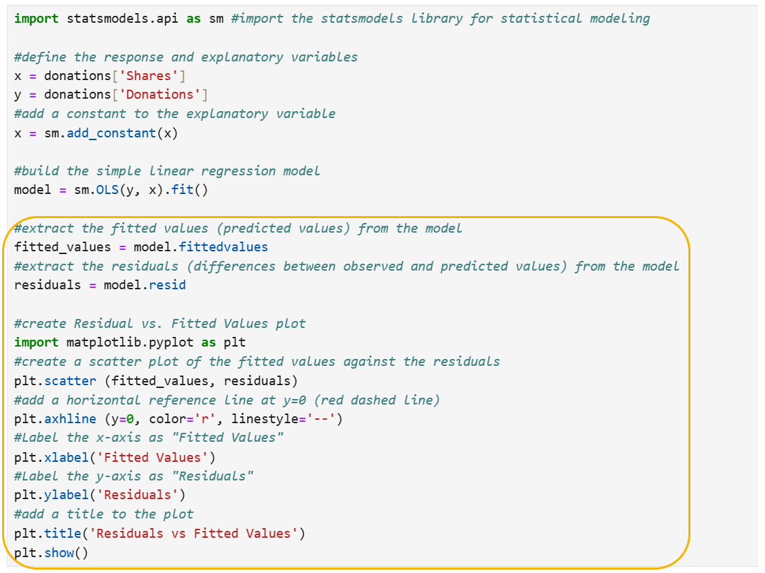
Let’s break down the lines of code that produce the residuals vs. fitted values plot.
fitted_values = model.fittedvalues
-
Purpose: This line extracts the fitted values from the regression model.
-
Explanation: model.fittedvalues gives you the predicted values of the response variable (Donations) based on the explanatory variable (Shares) and the regression model.
residuals = model.resid
-
Purpose: This line extracts the residuals from the regression model.
-
Explanation: model.resid provides the residuals, which are the differences between the observed values (actual Donations) and the fitted values (predicted Donations).
import matplotlib.pyplot as plt
-
Purpose: This line imports the matplotlib.pyplot library, which is used for creating plots and visualizations.
-
Explanation: matplotlib.pyplot is a popular plotting library in Python.
plt.scatter(fitted_values, residuals)
-
Purpose: This line creates a scatter plot of the fitted values against the residuals.
-
Explanation: Each point on the plot represents a fitted value and its corresponding residual. This helps visualize the relationship between the fitted values and the residuals.
plt.axhline(y=0, color='r', linestyle='--')
-
Purpose: This line adds a horizontal reference line at

-
Explanation: The red dashed line at
 helps us see if the residuals are centered around zero, which is ideal for a well-fitted model.
plt.xlabel('Fitted Values')
-
Purpose: This line labels the x-axis as “Fitted Values.”
-
Explanation: It helps identify what the x-axis represents, making the plot easier to understand.
plt.ylabel('Residuals')
-
Purpose: This line labels the y-axis as “Residuals.”
-
Explanation: It helps identify what the y-axis represents, making the plot easier to understand.
plt.title('Residuals vs Fitted Values')
-
Purpose: This line adds a title to the plot.
-
Explanation: The title describes what the plot shows.
plt.show()
-
Purpose: This line displays the plot.
-
Explanation: It displays the plot so you can see it.
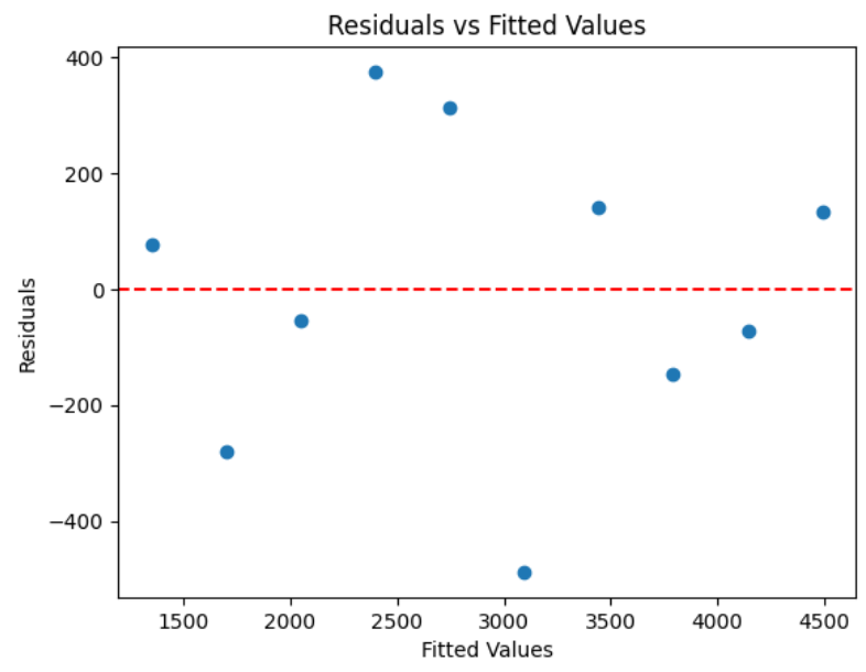
The residuals vs. fitted values plot is shown below. The residuals vs. fitted values plot shows no clear pattern indicating non-linearity, consistent spread of residuals suggesting constant variance, and no points far from the rest indicating no significant outliers.
-
Check out this video on creating a fit values vs. residual plot using Python.
Now that you have examined the residuals vs. fitted values plot to assess non-linearity, constant variance, and outliers, let’s move on to creating a Q-Q plot to further evaluate the normality of the residuals.
The code below creates a Q-Q plot for the donation data:
#create a Q-Q plot of the residuals with a 45-degree reference line
sm.qqplot(residuals, line='45', fit=True)

#add a title to the Q-Q plot
plt.title('Q-Q Plot of Residuals')

#display the Q-Q plot
plt.show()
Let’s break down the lines of code that produce the Q-Q plot.
sm.qqplot(residuals, line='45', fit=True)
-
Purpose: This line creates a Q-Q (quantile-quantile) plot to compare the residuals to a normal distribution.
-
Explanation:
- residuals: The data being plotted, which are the residuals from the regression model.
- line='45': Adds a 45-degree reference line to the plot. If the residuals are normally distributed, the points should follow this line.
- fit=True: Adjusts the plot to fit the data better.
plt.title('Q-Q Plot of Residuals')
-
Purpose: This line adds a title to the plot.
-
Explanation: The title describes what the plot shows.
plt.show()
-
Purpose: This line displays the plot.
-
Explanation: It displays the plot so you can see it.
The Q-Q plot is shown below.
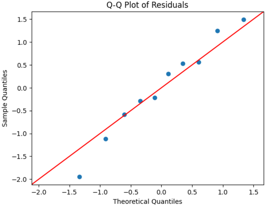
The Q-Q plot for the donations data shows that the residuals closely follow the 45-degree reference line, indicating that the residuals are approximately normally distributed. This suggests that the assumption of normality for the residuals in the regression model is reasonably met, supporting the reliability of the model’s predictions.
-
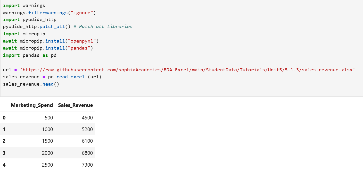
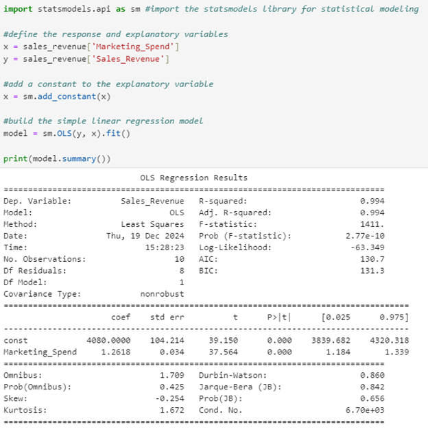
You are a data analyst working on an analytical project. Your task is to use Python to build a simple linear regression model that can predict sales revenue based on marketing spend.
You will use the excel file from this link:
https://raw.githubusercontent.com/sophiaAcademics/BDA_Excel/main/StudentData/Tutorials/Unit5/5.1.3/sales_revenue.xlsx.
The sales_revenue.xlsx file contains the historical data of sales revenue based on marketing spend for 10 observations for 10 months. The two columns are described below:
-
Marketing_Spend: The amount of money spent on marketing (in dollars).
-
Sales_Revenue: The revenue generated from sales (in dollars).
- Import the Excel file and create a pandas DataFrame named sales_revenue.
- Use Python to build the simple linear model.
- Create a residuals vs. fitted values plot.
- What information does the residuals vs. fitted values plot tell you about the fit of the simple linear regression?
- Create a Q-Q plot.
- What information does the Q-Q plot provide you?
Solution:
1. The code below will create a pandas DataFrame named sales_revenue and print the top 5 rows of the DataFrame.
2. The code below will build the simple linear model, where Sales_Revenue is the response variable and Marketing_Spend is the explanatory variable.
3. The code below extracts the residuals and the fitted values (predicted values) and creates a residual vs. fitted values plot.
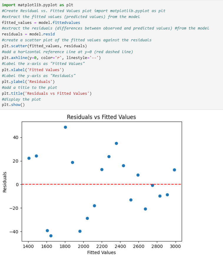
4. The residuals vs. fitted values plot for the revenue prediction data shows no clear pattern indicating non-linearity, consistent spread of residuals suggesting constant variance, and no points far from the rest indicating no significant outliers.
5. The code below creates a Q-Q plot for the residuals.
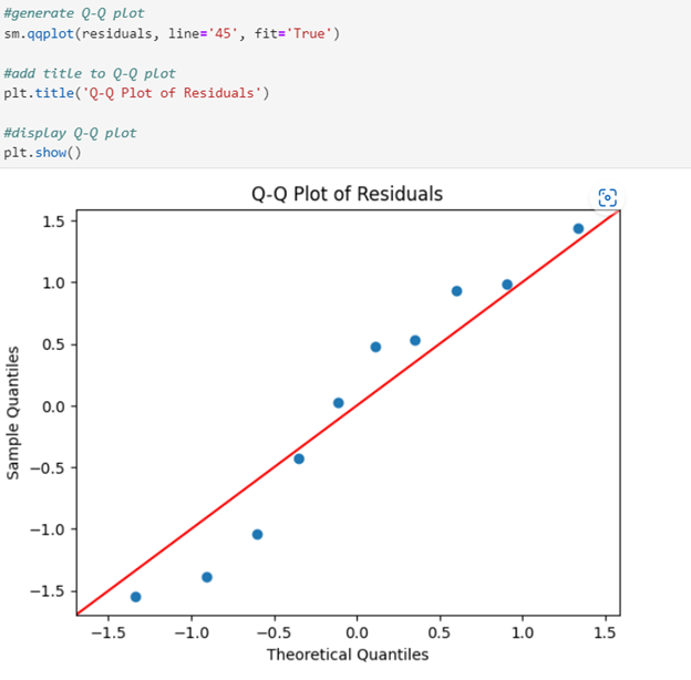
6. The Q-Q plot for the marketing spend data shows that the residuals closely follow the 45-degree reference line, indicating that the residuals are approximately normally distributed.
-
Check out this video on creating a Q-Q plot to understand the relationship between marketing and sales revenue.
-
If one of the residual assumptions in your linear regression model is violated, here is what you can do:
-
Non-Linearity: If the residuals show a pattern (like a curve), it means the relationship is not a straight line. Try using a different model that can handle curved relationships to better capture the non-linearity. For example, adding a squared term, like squaring the explanatory variable (x), to the model.
-
Heteroscedasticity: If the spread of residuals changes (like a funnel shape), it means the residuals do not have constant variance. You can try transforming your data (for example, using a log transformation) to stabilize the variance.
-
Non-Normality: If the residuals do not follow a straight line in a Q-Q plot, they might not be normally distributed. Consider using a different model or transforming your data to meet the normality assumption.
In this lesson, you reviewed residuals and learned how to use them in assessing the fit of a simple linear regression model. Using a real-world example of a non-profit organization predicting the amount of donations based on the number of social media shares a campaign receives, you examined how to calculate and interpret residuals, and how to find them using Python. Additionally, you explored various residual plots in Python, such as residuals vs. fitted values and normal Q-Q plots, to visually assess the fit of your model.