Table of Contents |
Color has physiological and psychological effects that often determine its uses in environmental design; it affects us physically, mentally, and emotionally. Colors can make a statement, call forth a response, create an atmosphere, and more. Therefore, it's helpful to know how color is being used in specific fashions every day to help dictate responses, trends, and behaviors.
In the color wheel graphic below, notice the column on the right labeled "Color Meanings." This information is a great reference to basic color psychology, the term used for the psychological influences of color on the mind.
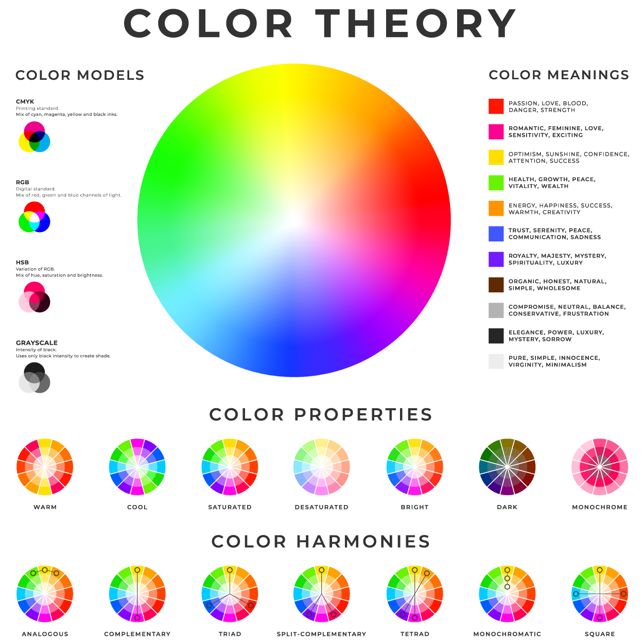
The psychological influences of color can be positive or negative depending on the nature of the design and the environment in which the user is exposed to it.
IN CONTEXT
For example, red is frequently used in Western society to draw a user’s attention or to alert them to danger, or to stimulate feelings of love and passion. We see this in the real world in the form of stop signs, traffic lights, fire trucks, etc. To understand why we react to certain colors, we must understand that our brains have learned to assign meaning to colors based on personal, cultural, and generational experiences.
All human life developed through tribal cultures with dependencies on the natural environment. Elements associated with red, such as fire, blood, berries, and fruit, had extremely positive and negative connotations depending on the circumstances. Humans struggling against the cold and darkness sought warmth and protection with fire. However, a forest fire or a burning shelter had life-threatening implications. Hunters seeking food and fighting for survival were excited by the red blood of an animal or the harming of an enemy.
On the contrary, seeing your own blood or red fluids on a member of the same group was terrifying in a time with no, or at best an extremely limited, ability to treat serious wounds. Red berries on a bush or fruit in a tree could mean sustenance or sickness, and even death, depending on toxicity. In the modern world, red means stop, hot stove tops cause burns, and red hearts on Valentine’s Day symbolize love and passion. Red is also a color that stimulates hunger, which links back to our hunter-gatherer roots.
To see how this is applied in our environmental surroundings, pay attention to fast-food restaurant signs the next time you take a drive through town. Take note of how many restaurants use red in their branding.
This provides a one-two punch of color psychology. A person driving down the street notices a big, red sign because the human brain is hardwired to recognize the color as a sign to be alert for potential dangers or opportunities. When the user identifies the red object as a nonthreatening sign, a hunger sensation is triggered subconsciously. When paired with yellow, red causes an even stronger hunger response.
EXAMPLE
The color red is said to have a physiological effect in that it increases blood pressure, circulation, and pulse rate. It's also said to stimulate your sense of smell and improve appetite. On a psychological level, it's been a color associated with anger, yet also passion, vitality, ambition, and awareness.EXAMPLE
Blue has the opposite effect of red in that it slows down pulse rate, lowers blood pressure, and can lower body temperature and even deepen your breathing. On a psychological level, the color blue is linked with eliminating mental stress, helping you relax, and providing you with mental clarity. But if it's too dark of a blue, then it can lead to depression.Because color can have such a physical and mental impact, it's often used in chromotherapy, or color therapy, which is a complementary medical method for treating disease with color. In fact, some hospitals use blue paint in certain rooms and hallways to provide a calming atmosphere.
Think about what was mentioned earlier about color being able to raise or lower blood pressure. In chromotherapy, colors are often said to correspond to and stimulate different areas of the body.
EXAMPLE
Red is said to stimulate adrenal glands and help increase stamina or energy, while blue can stimulate the pituitary gland, which then regulates breathing patterns.EXAMPLE
Consider a single mom who's been working all day, picks up her kids late from school, then finally gets home, where the first thing the kids do is put a hole in the wall. Now imagine that the wall is painted a fiery red. That color isn't going to help lower her blood pressure at this point. However, chromotherapy could help with that stress by maybe lowering her blood pressure or putting her in a more relaxed state.Color is also used symbolically across cultures.
In Western culture, red is symbolic of love and passion, but in Eastern culture, red is symbolic of prosperity and good fortune, so you'll see this color often used for New Year's celebrations and traditional weddings.
In Western cultures, white is symbolic of purity and peace; however, in Eastern cultures, white is symbolic of death, so it is often used in funerals. The gi is the traditional uniform worn by practitioners of Okinawan and Japanese martial arts like karate, judo, and aikido. Traditional gis are always white, emulating the samurai practice of wearing white burial garments underneath their armor to show their willingness to give their lives in battle. In Western culture, the color of death and mourning is black, so that's what is worn at funerals and during times of mourning. Black is also associated with power, authority, and seriousness. Villains wear black, as do businessmen, politicians, and some police.
Holidays are a good example of cultural perspectives toward color. Whether one celebrates certain holidays or not, they are pervasive in culture, branding, and marketing. Traditional Christmas designs prominently feature the colors red and green. Red and green are complementary to each other, meaning that they exist on opposite sides of the color wheel. When thinking about Christmas, memories from our personal and cultural experiences call up images of Santa Claus in a red suit, green Christmas trees, red-bowed wreaths, and boughs of holly. White is sometimes introduced in traditional Christmas color schemes to represent snow.

From a historical aspect, red and green are used in Christmas-themed designs for symbolic purposes. In Nordic societies, evergreen trees were cut down in the winter and brought into homes to remind people that the winter wouldn’t last forever, and life would return to the world in spring. Red holly thrived in the winter, another reminder that life went on. As Christianity spread through the pagan world, many of these traditions became Christianized, and some of these color symbolisms took on new meaning. For many, the new message of life in winter found in the evergreen tree and holly has come to mean eternal life through salvation, and the red and white that once represented berries and snow has come to mean sacred blood and purity.
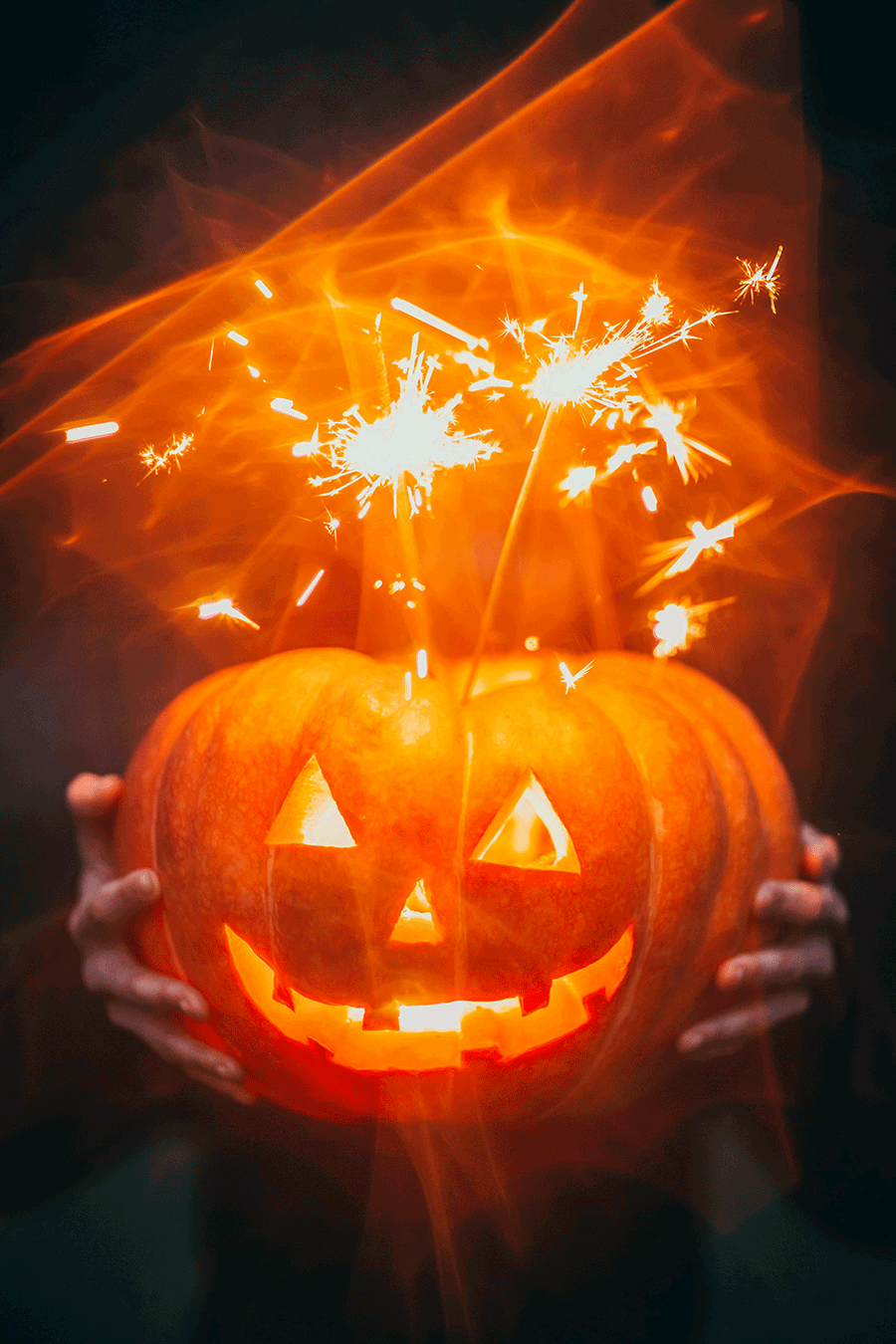
Halloween and Easter have their own color associations and symbols. The traditional orange and black of Halloween represent the bounty of the harvest and the coming darkness of the winter months. While black still conjures up thoughts of darkness and things lurking in the shadows, it once carried a message to prepare for the long winter and to harvest the bounty of the summer and stockpile for the months ahead. As immigrants from the British Isles came to the New World, they quickly discarded turnips as the traditional carving media for Jack-O-Lanterns and adopted the large, orange pumpkin found in the Americas. The pumpkin has become so pervasive as a symbol for Halloween that many assume the orange in the holiday’s colors is derived from it.
While Easter is both a secular and religious holiday, the holiday is associated with new life and rebirth. The pastel colors of Easter eggs and seasonally dyed chicks reflect colors associated with babies, tying into the message of life returning with the spring. While the lamb also has significance as a symbol in the Christian faith, lambs, bunnies, and chicks are emblematic of new life. Eggs themselves are symbolic of the concept of the soul, rebirth, fertility, and eternity. Dyeing them colors reminiscent of baby clothes deepens their symbolism in regard to life and birth.

Color has practical uses, like wayfinding, which refers to visual systems which assist the viewer in finding a location or following a certain path within an environment.
Take a look at this map of Brooklyn, New York.
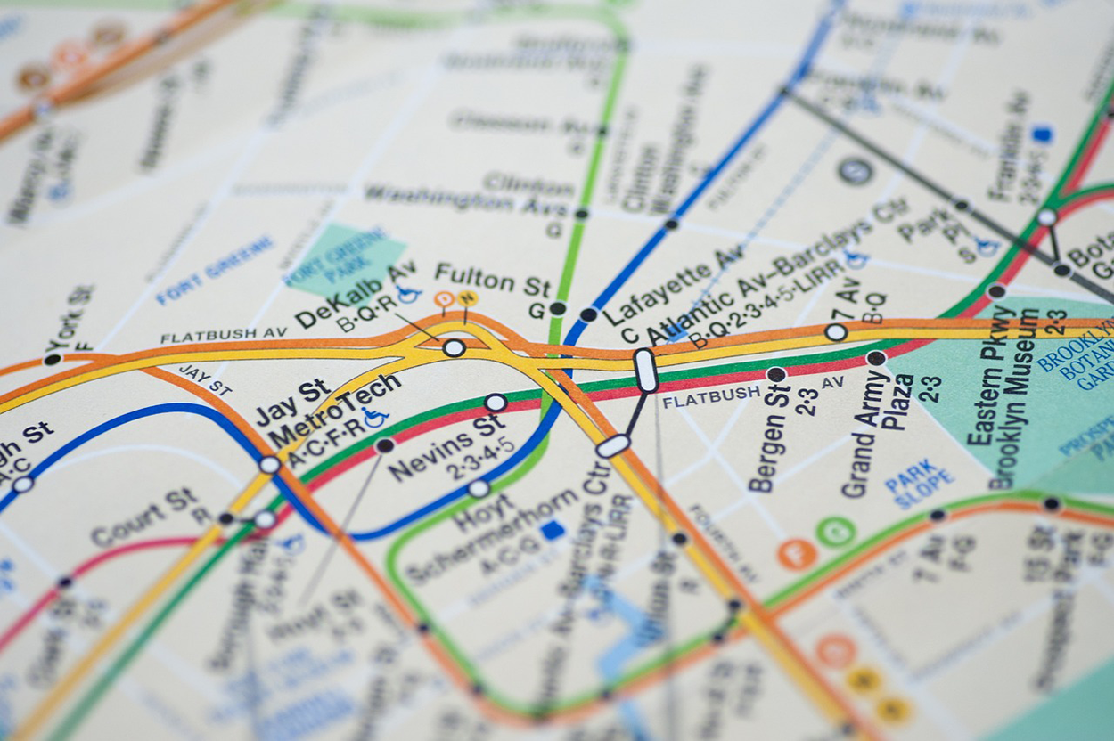
Since zones are color-coded, the viewer is able to assess his or her current or desired location a lot quicker than if this map were entirely black. This map gets put to use every day to help people find their way around Brooklyn. Different thoroughfares are identified by different colors to help users identify different routes by type.
You can imagine how this would get exponentially more difficult if you were trying to navigate around town, and every zone and line was just a singular color.
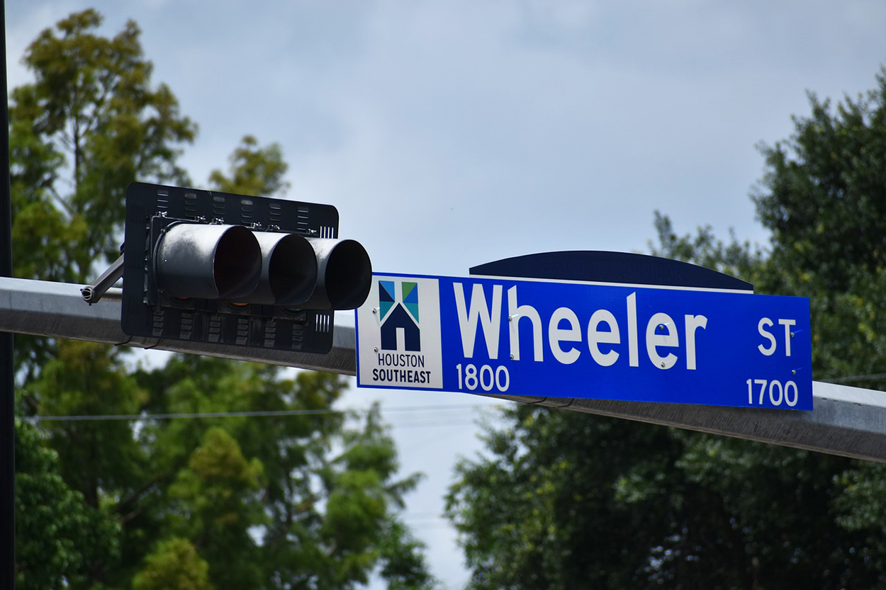
Street signs are also examples of color used for wayfinding. Black and white street signs are used for simple information such as speed limits, and red is used on signs that require a person’s immediate attention. Cities may use consistent colors to mark their streets. The image below shows a blue and white street sign, identifying Wheeler Street in Houston, TX.
Street signs in New York City have a variety of different colors with specific meanings. For example, streets in New York designated historic districts are brown, while streets in business districts are blue.
Wayfinding demonstrates a practical use of color to supplement route names and numbers, making navigation easier.
Color also plays an important role in trends. Companies and organizations try to predict the next annual trends in color usage, and this is called color forecast.
An area where color trends are relevant is web design. Web design is in a constant flux, with new technology emerging all of the time. Social media happens in real time, and internet users are in tune with shifts in fashion and color trends. Users form opinions of websites and social media pages in seconds. Color is a powerful influencer, so in order for a design to be relevant, its color pallet should reflect current trends. It’s important to remember that when creating a design, you are creating for the end user, and not yourself. Designs should incorporate colors that are popular with user demographics. Avoid designing with your favorite colors unless they align with current trends.
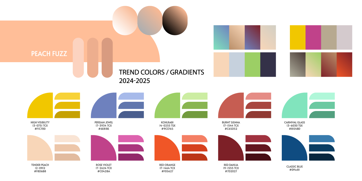
The image below shows trending colors and gradients for 2024–2025. Notice that the colors are identified by name and hexadecimal value. Including the hexadecimal value ensures that users can match the color using a digital media application.
While we touched on this idea earlier, we can now look more in depth at the different characteristics of common colors.
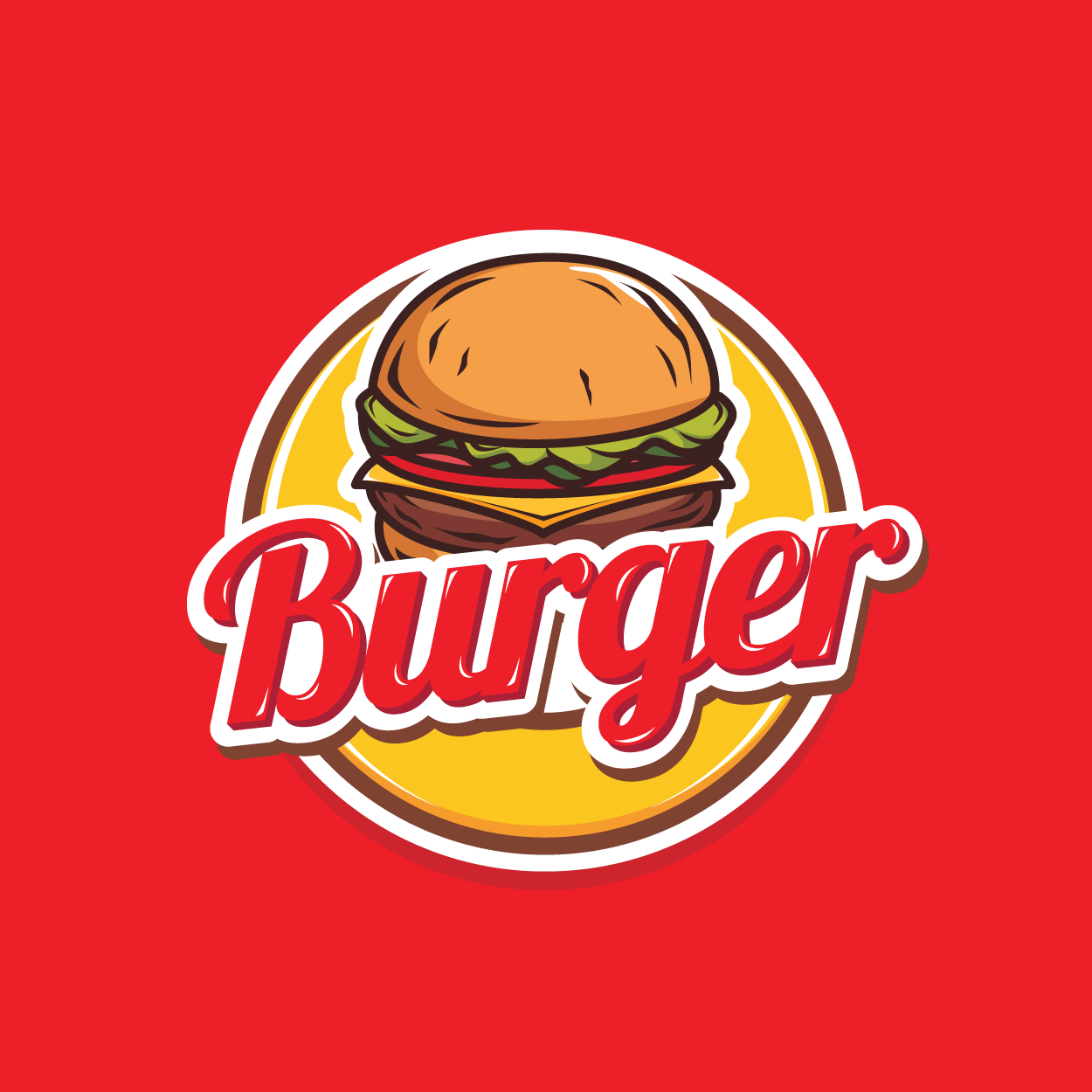
Red is often associated with passion and hunger, as mentioned previously. It has the power of attraction. Red is used a lot in restaurant or food product logos, such as Coca-Cola, McDonald's, and KFC. Red also gets our attention and triggers alarm. The majority of transportation companies in the United States paint their trucks red so drivers will notice the tractor trailers more easily and avoid accidents.
Orange is meant to be a vibrant, playful, and energetic color. It's heavily used in industries where children are the focus. Think of the Nickelodeon logo, for instance. Orange also draws attention and is often used to make people alert, but without the heightened alarm of red. This is why hunters and construction workers wear bright orange vests.

Yellow is meant to represent happiness, warmth, and oftentimes caution. But yellow itself can be an overpowering color, so it's difficult to use. Therefore, you'll notice that yellow typically gets used with other colors. This is especially true when it comes to food chains because they want you to feel happy with the food you're about to purchase. You can see yellow used in the logos for McDonald's, Burger King, and other fast-food chains.
Green is associated with nature, health, and renewal. You'll see green used a lot in eco-friendly, recycling, or agricultural companies.
Blue is used quite often in corporate logos because it's a professional color associated with trust, authority, and loyalty. Blue is pervasive in branding for technology companies. For instance, think of Intel, IBM, Facebook, and Twitter. The association with trust, authority, and loyalty is one of the powerful communication aspects of this color.
Purple tends to be associated with royalty, elegance, education, and religion. You'll see purple commonly used in religious institutions and educational organizations.
Pink is representative of beauty. Pink is often used in beauty-related or fashion-related logos, or companies dealing with children's toys, such as Barbie.

Brown is meant to be a reliable, earthly, neutral color. You'll see it commonly used for agriculture, construction, and sometimes food-related products, such as coffee and chocolate.
White is a pure, clean color. It's often used in logos to create negative space. For instance, think about the Adobe logo. Apple loves using white in its products as well. White resembles purity and innocence in Western culture.
Black is authoritative, mysterious, bold, and sophisticated. You'll often see black used to create a sense of mystery in high-end products, such as a black luxury car or a sleek black television.
Source: THIS WORK IS ADAPTED FROM SOPHIA AUTHOR MARIO E. HERNANDEZ. PLEASE SEE OUR TERMS OF USE.