Table of Contents |
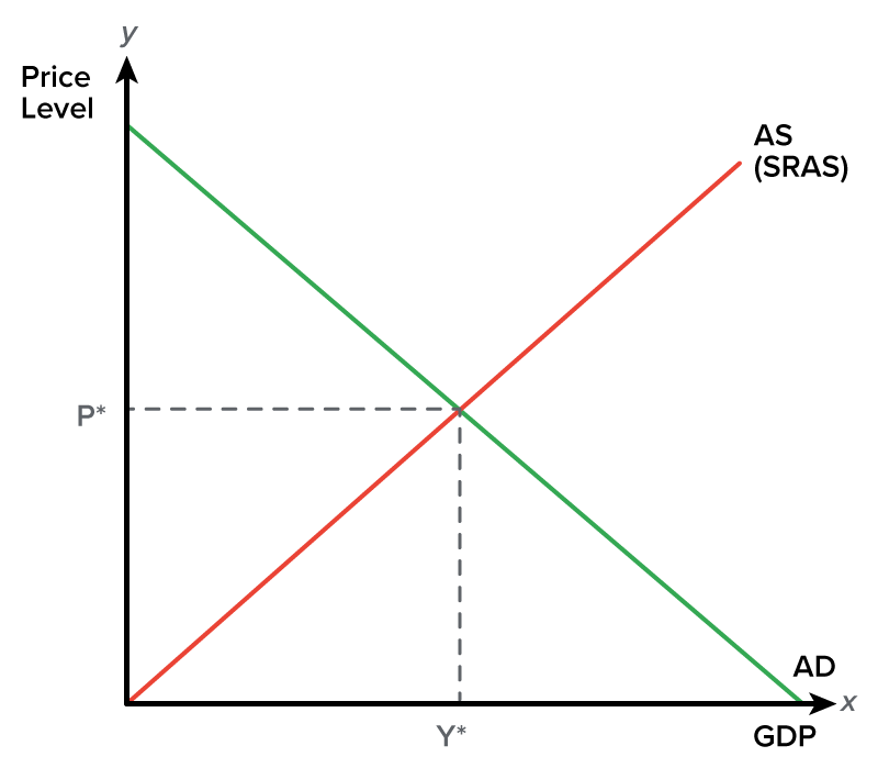
Let’s begin by looking at the aggregate supply/aggregate demand graph. Note that, in microeconomics, the x-axis generally represents quantity (as in the quantity of one specific item), but here, it represents overall quantity or all output in an economy, which is GDP.
The y-axis represents the overall price level, not just the price of a specific item.
We will start by discussing aggregate demand (AD). It is the total amount of goods and services demanded in the economy at a specific point in time and at a prevailing price level.
Here is what an aggregate demand curve looks like. Recall that it is a downward-sloping curve and represents an inverse relationship between price level and real GDP.
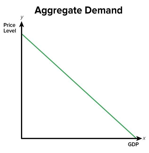
This indicates that people will want to purchase more as the overall price level falls. So, as prices go down, people want to buy more. As prices go up, people want to buy less. However, it is important to note that when we say “people” want to purchase more, we are actually referring to different groups of people, which comprise the aggregate demand formula.

If you recall from the lesson on GDP, GDP equals consumer purchases, investment outlays by businesses, government spending, and net exports. This is what comprises aggregate demand.
So, would aggregate demand really comprise the sum of all demand curves for everything in the economy? Well, sort of, but let’s think about it differently.
In microeconomics, demand curves slope downward because, as the price of something specific falls, people buy more of it. We cannot use this same analysis when looking at aggregate demand.
However, there are three reasons why aggregate demand slopes downward:
As prices in the economy fall, people feel like they are wealthier. Now, they would not necessarily be wealthier, but because their money can go further, people will tend to buy more.
The part of aggregate demand that is increasing here is the C component. Consumer purchases will increase because of the wealth effect as prices fall. The wealth effect is defined as the perception that wealth has increased, resulting in an increase in consumption, or the C component of the aggregate demand formula.
As prices go down along the y-axis, this increases the amount of money circulating in the economy, which tends to drive down interest rates.
As interest rates fall, people will buy more items that require loans, like cars, houses, appliances, and furniture—items considered to be durable goods.
Again, this is impacting that C component of the aggregate demand formula, though it refers to different types of consumer purchases—those requiring loans.
Also, falling interest rates will impact business investment. Businesses will take advantage of lower rates and invest more in their companies. Basically, we see C and I being impacted by anything that is interest-sensitive because of the interest rate effect as the price level falls.
Therefore, the interest rate effect dictates that as interest rates fall, consumption increases because of the decrease in the cost of borrowing. As a result, purchases and business investment (consumption, C, and investment, I, respectively) both increase.
Finally, aggregate demand curves slope downward because of the exchange rate effect. As price levels in the United States fall, our goods become relatively cheaper to foreigners because our exchange rate falls.
When that happens, foreigners will try to take advantage of this by buying more from us, so exports (X) are going to increase.
At the same time, as our exchange rate falls, our dollars will not go as far when purchasing items from other countries. Therefore, we buy less from other countries, and imports (M) decrease.
Exchange rate movements impact demand. Domestic currency depreciation—meaning that as our price level comes down, our exchange rate goes down—increases the cost of imports, resulting in a potential decrease in imports, or M. A lower domestic exchange rate also increases foreign demand for domestic goods, increasing our exports, or X.
Now let’s turn our attention to aggregate supply. There are two aggregate supply curves.
The aggregate supply curve on the graph at the beginning of this lesson is the short-run aggregate supply (SRAS) curve. SRAS is the total amount of goods and services supplied in an economy in the short run.
In the short run, the aggregate supply curve does slope upward, as shown below.
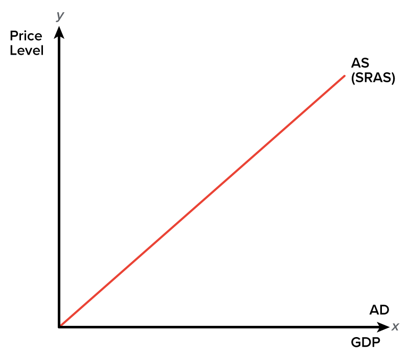
Again, aggregate supply is the total amount produced at various price levels. It slopes upward in the short run because businesses can actually produce more as price levels rise for several reasons:
The long-run aggregate supply curve (LRAS) is the total amount of goods and services supplied in an economy in the long run. This is a vertical or straight up-and-down line.
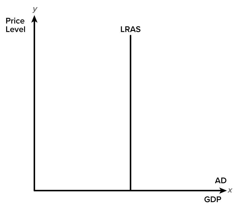
The idea here is that we can ramp up our production in the short run, but this can really only get us so far. In the long run, we have a limited amount of resources, such as materials and workers. Therefore, that vertical line represents the current potential for how much we can produce.
Now, in order for that potential or production capacity to change, something else would need to change to increase our ability to produce more.
EXAMPLE
The invention of new technology might increase production capability and shift the supply curve over and to the right.Now, the intersection of the SRAS curve and the aggregate demand curve will give us equilibrium.
Y*—note that it is now on the x-axis—represents the equilibrium level of production or output, also known as real GDP.
P* on the y-axis represents our current price level.
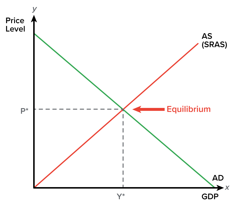
In upcoming lessons, we will be using this graph to show what happens to the new equilibrium price level and real GDP when factors such as aggregate demand or aggregate supply change.
Source: THIS TUTORIAL WAS AUTHORED BY KATE ESKRA FOR SOPHIA LEARNING. PLEASE SEE OUR TERMS OF USE.
